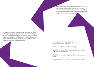
The typeface decided upon was that of a sans serif. This decision was made as it expresses that of modernism much more effectively than that of a serif font. Another reason in which I came to this decision is that I felt the text would be easier to read when surrounding by shape forms.
Although not completely finalised I feel that this design expresses both minimalist and postmodern aspects more effectively than that of design one, primarily as the design decisions feel a lot more informed.


No comments:
Post a Comment