Caslon

In 1720, the English gunsmith William Caslon turned his hand to typeface design, and in 1722 designed a typeface in his name. The typeface took cues from Dutch Baroque types, which were then used extensively in England. Because of their remarkable practicality, Caslon’s designs met with instant success. Caslon was the Helvetica of it’s time; a legible and all-round typeface which saw widespread use. And three centuries later, this typeface is still as popular as ever.
Baskerville

Where Caslon was born for profit, Baskerville was born out of love. John Baskerville was inspired by the Caslon typeface and sought to rationalise it. Baskerville is classified as a Transitional typeface as it sees a less humanist letterform than that of Caslon. In turn, Baskerville has inspired other notable typefaces such as Didot and Bodoni, both of which are of the Didone or Modern era.
Clarendon

Clarendon is a bold slab-serif typeface, originally designed by Robert Besley in 1845. It was the first typeface to be copyrighted and became hugely successful after it’s release. It was produced for Oxford University’s Clarendon Press and used as a dictionary display face. The most notable use of this typeface is possibly in the Sony logo where an extra-wide variant of Clarendon is set in uppercase.
Gill Sans

Eric Gill took inspiration from Edward Johnston’s typeface for London Underground, which he had worked on while apprenticed to Johnston. Gill Sans is described as having absolutely legible-to-the-last-degree letters by Gill himself. The typeface works well for both text and display work and has been used by British Rail until 1965, Penguin Books in the 1930’s and is currently used by the BBC.
Transport

Another British typeface associated with transportation is the appropriately named Transport. Created for the Department of Transport by Jock Kinneir and Margaret Calvert, this highly legible, sans-serif typeface is used on road signs throughout the UK. This typeface works great for bold and clear headings.
Bliss


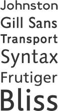
For the creation of Bliss, type designer Jeremy Tankard studied 5 typefaces; Gill Sans, Transport, Johnston, Syntax and Frutiger.
“In developing Bliss, forms were chosen for their simplicity, legibility and ‘Englishness’ (where forms are typically softer, more flowing and generous in their curves)” — Jeremy Tankard
The resulting typeface has a great deal of charm and warmth, whilst remaining legible and practical. Once more, this typeface works great for body text and headers alike. Only time will tell if this recent addition will become a classic like those that inspired it.
Gill Sans
Gill Sans is often identified as the font used by London Underground rather than Johnston (see above). Seen apart it's an understandable confusion, but next to each other there are obviously significant differences.
Eric Gill designed Gill Sans in 1926, and was used by the London & North Eastern Railway (LNER) in 1929. Interestingly Gill had previously worked for Edward Johnston as an apprentice, where he contributed to the development of the Johnston font.
Gill Sans has seen an resurgence in it's popularity due to the widespread over-use and mis-use of the 'Keep Calm and Carry On' posters from wartime Britain:

No comments:
Post a Comment