In order to gather the strongest front cover possible, I decided to explore multiple avenues including that of colour schemes, typefaces and composition.


I began by exploring the general background colour, in an attempt to emphasise not draw attention away from the illustration. I found that the grey tone gave an overall droll feel towards the design, although creating a somewhat eery atmosphere. The White approach on the other hand seemed to appear much cleaner and didn't distract from the minimal imagery and type. Du two thus I feel that the white would be much more effective at targeting a younger demographic.

I also explored an approach in which involved the illustration as the background. I felt this approach combined all aspects on the book together developing a whole. Although I liked this approach, I felt that involving a white background allowed it to appear minimal, an aspect in which I feel important to target it towards a younger audience.


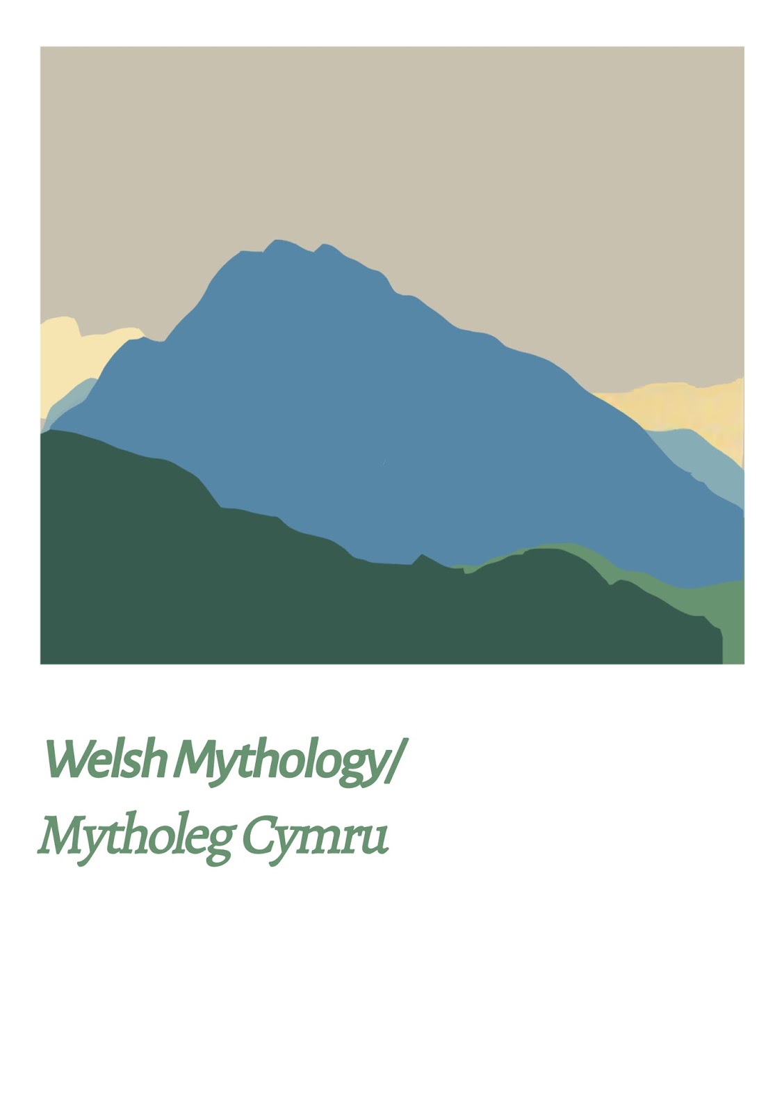
Typefaces were explored, with the most effective being that of a strong serif font. Although the design is aimed towards a younger audience I felt that a serif would give structure and express the trading of the Welsh nation.

Composition was also explored, with designs in which highlight the illustration being most effective.

I then explored with colour and tone in an attempt to develop a colour pallets than expresses the subtle natural tones of the Welsh landscape.

From these experiment I have completed the above image, during the following stage I will gather a crit and explore further with my work.
No comments:
Post a Comment