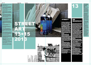
When developing this first spread I decided that it would be effective to overlay the caption onto the image. I decided upon doing this as I felt that it expressed an approach similar to that of modern designs, a factor in which would be highly recognisable to that of the target audience, as it is a factor often resembled within magazines. An example of a similar approach to this is shown below.
A factor also considered when developing this spread was to leave space for the bind, due to this the pages are highly centred and favour that of the right side. Although this currently doesn't appear that strong, it will once the bind has been put in place.
Although legibility was before questioned with the texts appearing alongside one another I personally feel that the two are both legible due to the consistent welsh on left, english on right approach. When thinking about the pages general layout I found that the 2nd page seemed somewhat boring and didn't appeal that widely to a younger audience due to the vast amounts of text appearing daughting. Due to this I decided that an acetate overlay should appear upon this page, separating the english from the welsh. Red text has been used in the above image to display what text would appear upon the overlay.


No comments:
Post a Comment