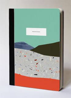
In order to gather a greater insight into books targeted at the audience, I began some research into books specifically designed for that of a younger, more contemporary audience.
Design doesn't always have to be over complicated, with this design showing how effective minimal deisgn can be. In someways this design may even be more eyecatching than that of others, due to the title standing so prominent against the imagery. The subtle tones also allow this to occur.
These designs are probably some of my favourite with the top right standing out to me, as it not only mimics the sound waves but also Shropshires very flat landscape. Each design appears consistent, but they all express themselves as individuals. This is definitely something in which I will attempt to mimic within the imagery of my book. I also feel that the white background allows the image to be expressed to its full potential without over complicating the design.
This minimal approach no doubt stands out to a young audience, with its simplistic yet intriguing appearance. The sleeve also adds an extra element to the design, wanting the consumer to open the book and look within.
This modernist style is highly popular at the moment and is often expressed through fashion and travel magazines. With a similar approach being taken on Next television advertisements currently. I feel that the usage of photography would allow for a deisgn in which is contextually accurate as all the places mentioned within the tales are actual locations. As the vast amount of consumers will have visited these iconic Welsh landmarks it may also create a euphoric feeling around the designs.
This minimal approach expresses a map, again something in which may relate to the consumer. The hobbit books are also highly mythical so this may also be taken into consideration. Within ad posters for the Hobbit breathtaking imagery has also been used, again something in which I may explore with further.
Extremely minimal, I feel that this deisgn would not allow the consumer the relevant information in which should be present within my deisgn.
The above designs follow a pattern format in which expresses wider deisgn through patterns. Although I feel that this is effective I believe that the second deisgn appears far too crowded and thus mature. Whereas the transparent approach exhibits lively colours in which will interact with the consumer.
Again all three designs maintain differing but simplistic approaches, in which section of the relevant text in order to express clarity rather than impact. This is definitely a realm in which I am likely to explore,


No comments:
Post a Comment