
Multiple images have been used in order to create this interesting design layout. The use of multiple images allows them to be seen as a collective rather than that of individual images, thus if my images are to be focused upon it is important that they are contained individually. This allowing the consumer to study them extensively.

Photomontage has been used to allow text and image to coincide and appear as if part of one image. Visually engaging, this piece would most certainly interest that of the target audience, although a similar approach may not be taken with my images, as the photo quality is not high enough, due to being taken on an iphone 6.

Text heavy, this approach explores multiple ways in which to paragraph text, a factor in which is highly important when attempting to engage a young audience due to their short attention spans. Breaking large paragraphs up is definitely a skill in which may be expressed within the book. Paragraph indents have also been used in order to engage further with the audience.

Minimal, this design approach allows for the consumer to gather relevant information themselves. Less text heavy than the previous piece, the text is able to be consistent without the user losing concentration. When developing the layouts for my book a similar approach may be taken, with each page containing a different amount of information, allowing the book to seem less daunting.

Again minimal, this book appeals to those interested in aesthetics. The following pages hue is determined by that of the image, a factor in which allows the book to maintain consistency. If I were to place a coloured layer below the text a similar approach may be taken.

Overlapping text and image is an effective way in which to fill negative space. This also allows for the attention to be constantly focused upon the imagery. This is also a format you rarely see in book design and thus its unorthodox nature expresses an interesting approach.

Full bleed imagery works extremely well, ensuring that the design is not compromised. This may be an approach in which I will consider as it appears extremely professional. This form of design is also common within books designed for that of a younger audience.
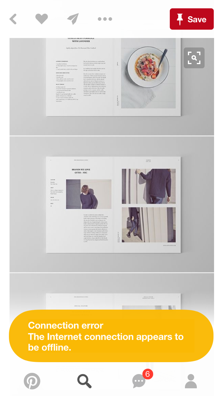
Modernist in style, this clear layout is easy to navigate yet aesthetically pleasing. The grid system used allows for a playful yet restricted approach, one in which engages yet informs. As my deisgn is to inform I belive a grid system should be put in place.


When imagery crosses over the double page spread it allows for a central viewing point. A factor in which allow beautiful imagery to be expressed. Although my image quality isn't that good, it would still be manageable up to an A4 scale and thus this approach may be taken within my book. When completing this I must ensure that the stitch is not upon that page.


General layout structures were studied in order to gather a basis of the grid. As I have not worked fully with a grid before I believe that this project will give me the opportunity to do so. As I do not want each page to appear the same I may adopt different grid systems in order to keep my book thoroughly engaging.
No comments:
Post a Comment