From the research collected it was decided to explore mindmaps in order to correlate all the information in which had been previously discovered from that of the books plot, book covers and general feedback.

Firstly general themes within the book were highlighted in order to gain some initial ideas upon iconography that may be used to express such information.
Racism was a key aspect expressed with the idea of a black and white seperation being widely discussed. This in turn highlighting segregation during this period within America.
The obvious idea of birds and blood was noted, although it may be suggested that multiple people within the competition will already be completing this theme and thus a less generic approach should be taken. When looking at the original cover a tree was used in placement for this, and thus maybe a similar approach may be taken within my design in order to 'highlight' the classical aspect of the book.
30's/60's designs were also discussed as this is when the book was set/was published.

In order to challenge these concepts further key iconography was discussed, with relation to the contextual aspects within the book's narrative.
Key ideas included that of a black and white divide, a clock face in order to express how long it took the jury to decide Tom was guilty, beheaded flowers in relation to the beheading of the neighbours flowerbed, a child's perspective f the court case and minimal tree's.
Initial Drawings
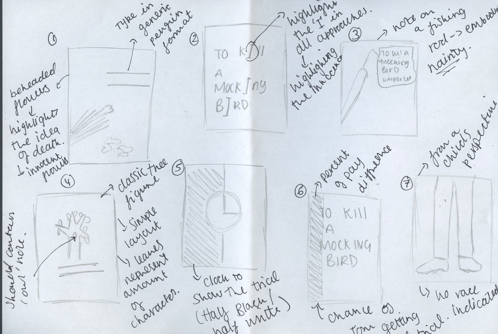
Image 1
The first sketch expresses beheaded flowers with petals falling to the ground. Not only does this dictate the key event within the plot but it also express death, another influential theme. Flowers are also frequently expressed as innocent, pure and delicate. As a result of this the decapitation of the flowers may symbolise a loss of innocence, and underlying theme of the metanarrative.
Image 2
The second design is that of a typographical approach. Focusing upon the key idea of innocence the 'I' within each approach has been highlighted.
Image 3
As the children within the book use a fishing rode to deliver messages to Boo it was decided to involve this iconography within a design. The books name and author is hand rendered upon a note in which falls at the end of the fishing line.
Image 4
A tree approach was completed in order to comply relevance towards that of the classic cover. Leaves have been used in order to dictate the number of characters within the novel. A 'owl hole' will also be present in order to comply to key themes expressed within the book.
Image 5
A clock approach highlights the amount of time the jury took to decide upon Tom's verdict. The page would be parted into black and white in order to highlight the racial tensions of the time.
Image 6
Again another typographical approach, but unlike previously the partitioning of the black and white cover would favour white in order to express the prejudices of the time.
Image 7
As the novel has been written in the perspective of a child (most likely a fabricated version of events to which Harper Lee witnessed herself), it was decided to complete a design in which would follow a child's perspective of the trial, whereby race was not a key factor.
No comments:
Post a Comment