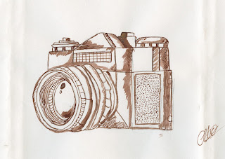
As the illustration approach was said to make the design appear more personal, it was decided that this aspect should be maintained throughout the project, although the design should be somewhat manipulated through CAD in order to complete a design in which appears eyecatching, yet hand rendered. A camera was decided upon due to an uprise in the usage of 35mm as a result of a purely digital upbringing, with the camera allowing the consumer to physically take pictures, and gain physical copies, unlike that of a smart phone.
First of all the design was expressed simply, in order to express how the design may appear if it was purely scanned and added to a background. From this it is fair to suggest that the design would not be eyecatching and thus not engage the consumer. The illusuation also appeared somewhat detailed, and thus it was decided to expresses a simpler version in an attempt to gain the consumers attention.
Second example
Once the image was developed it was scanned and then explored with digitally, as this was a quick approach no attempt was made to blend the background and foreground. A large contrast was developed through this approach, one in which personally felt impactive. When discussing the alterations with one of my peers it was suggested that the first attempt appeared more suiting to the demographic, as aesthetics are highly important to generation X. It was also suggested that the contrast of the white surrounding the design worked well, and that this alongside the vivid colour palette should be transfered to the first approach.
Further Inspiration
From the feedback, it was decided that a collage approach may work effectively with vast, bright colours. In relation to this, it appeared that this style is used subtly in many products design. This including Cheerios. The cut and paste style allows for an organic, nature feel towards the product, one in which is handmade and personal. These being key features in which the card set aims to express.
The cut and paste approach does not initially stand out as a white background has been used. Generally speaking in terms of packaging white is frequently used as it highlights a clean, healthy product. Thus it would be fair to suggest that in another context a bright, eyecatching background may allow for a more engaging response.
From this it was decided to explore extensively with the colour palette.
Composition and colour
Composition was explored with in order to develop an approach in which appears interesting to the target audience. Generally speaking the chosen demographic like design in which appear strong, are easy to 'read' and maintain some form of composition in which differs from that of general designs. As a result of this a smaller scale design was explored in which forces the consumer to look further at the cards design. Personally I felt this design to appear difficult to see, and thus it would not stand out upon the shelf.
The illustration itself was developed using the Hue tool on photoshop in order to express a fresh, new perspective. The colour blue was selected in order to compliment the purple background. In turn developing a design in which compliments itself.
Colour was widely explored in order to find the correct approach. The above design expresses a dark purple, the most hated colour internationally and thus is a prime example of how colour pallets may be effected by culture. Dark purples can also be a colour of mourning in many countries and thus this must not be used within the design.
A juxtaposition has been developed through the colours as traditionally purples are associated as being feminine, and blues masculine within British culture. In reference to other cultures this is not always the case, with Greens etc appearing masculine. By using a mixture of the colours, it has allowed for a design in which appeals to both genders alongside religions.
The composition was again centralised, a factor in which one of my peers suggested to be boring and thus further compositions were explored.
In conjunction to the feedback, a pattern approach was developed in order to express a design in which would stand out on the shelf compared to the competitors. As this is also a competion brief, I believe that the judges would also find this card impactive as its bold colours and vivid pattern instantly stand out. Greens and further purples were added to the cards design in order to include both sterotypical and non sterotypical gender colours. As a result of this it is fair to suggest that although the card has been developed for a female target audience, the card does not comply to typical gender traits and thus appears non-offensive.
Feedback
When discussing my finalised design with my peers it was stated that to gain a set this style must be followed further throughout the range, and thus the usage of an ink approach is highly important. It was also stated that vivid colours should again be used in order to convey this.


No comments:
Post a Comment