
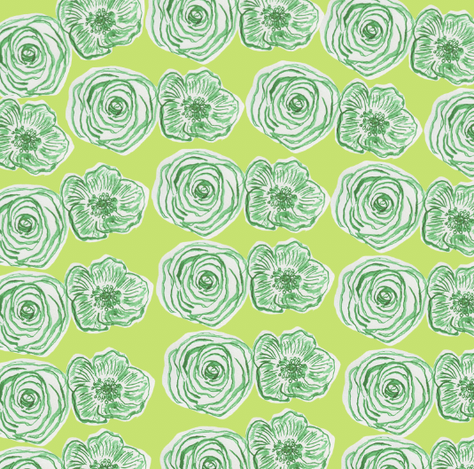
Generic flowers were developed using ink in order to express a delicate yet peaceful design in which may be expressed through multiple occasions. Green was selected as the other designs focus largely on secondary colours and thus I wanted this to be further embedded. The usage of a green card is also very different to what is currently on the market and thus this is where my card will stand against its competitors.


Blue was explored with as a background in order to connote a calm atmosphere, although I felt that this contrasted too greatly against the delicate nature of the design. When showing my peers this example they suggested that the colour palette should stay green in order to promote the idea that the card set is environmental as well as aesthetical.


Hues of green were explored with. Brighter greens felt somewhat intimidating whereas lighter greens seemed to highlight the delicate nature of the card. As a result of this a colour was selected in which was light in order to highlight the delicate nature, but also expressed some levels of saturation to make the card appeal to a younger demographic.
No comments:
Post a Comment