Approaches were firstly completed in order to gain a great idea upon the effects of the cards. Real life versions were also developed so that I was able to take my designs to Thursday's critique, whereby i could gain mass feedback surrounding my initial ideas.
Generic Patterns
Generic patterns were explored in order to see the effects of vivid colours upon a simple design. Multiple designs/colours were explored in order to promote the diversity of a design such as this. Generally speaking although I visually enjoy these designs i am unsure upon the occasion whereby the consumer is likely to buy a product such as this other thank a thank you note, as I believe the design to be too open for a key event. I will discuss my concerns within the critique to allow for further feedback upon the topic area.
Retro theme
The retro style patterns follow a simple line drawing effect, with vivid colours being used for a contrasting background. Reds and oranges have been used in order to further embed the retro theme, with the monotone style being highly relevant throughout the 70's. The design I believe to most effective within this approach is that of the block flowers, as the centralisation of the piece amongst the large contrast draws the consumers eyes to the product. Again these cards do not maintain type so that they can be used for multiple occasions, and thus increasing the profit margin.
Linoprint
The linoprint design although expressing textures, does not feel visually engaging as the general aesthetic of the piece feels somewhat boring due to the lack of details present, as I often feel that linoprints should be detailed as otherwise they do not appear effective. The rustic nature of the print does not appeal to me personally and thus this will be discussed within the critique as I feel my judgement may be paired.
Ink drawing
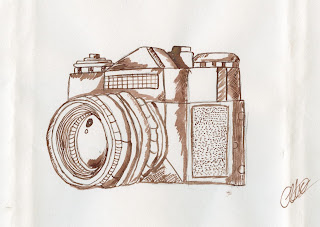
Developed with ink this approach of a camera is effective and appears personal to the consumer. The hand rendered nature stays away from the generic CAD developed cards and thus a design like this appears far more personal and bespoke. The card may also be scanned and digitally printed for mass production. Other key iconography would have to be explored before making this design.
Critique
When discussing my current designs at the critique mass feedback was given in which I believe to influenced my decision greatly. some of the key information is expressed below:
- Although generic patterns are eye catching they need to contain iconography relevant to events as the watermelon does not feel effective.
- The usage of no typography is strong and allows the consumer to make their own decision upon the event it should be for.
- The linoprint was not eye-catching compared to that of other designs.
- Bright, bold colours effectively gain the consumers attention
- Compositions in which involve movement gain attention
When discussing which design I should take further it was suggested that the ink drawings were most effective, as their non CAD nature appealed widely. It was also suggested that the colours should be manipulated in order to gain a more visually impactive design. In terms of appealing to different backgrounds it was suggested that research should be conducted into these cultures, and key iconography.


No comments:
Post a Comment