


The silhouette of a bike is the obvious route to follow when designing a pictogram for that of bike storage, but I wanted to experiment with different ways to communicate this. For this reason when gathering research I also looked upon keys and locks to promote security, as well as traditional bike symbols. When gathering research I aimed to look for simplistic designs that differ to that of the iconic bike pictogram, but still contain similarities.

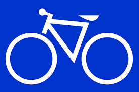
When developing my ideas I experimented with structure, balance, stroke width and complexity. I learnt that the key and lock did not effectively communicate that of bike storage, and that the most simplistic bike structures worked best. This primarily being due to more complicated structures appearing illegible from a distance.

The second design, in which explores the usage of double strokes appears graphically my favourite, but due to its context is the weakest. The thin lines would be illegible on a smaller scale and therefore would not be applicable for pictogram design. When deciding upon a final pictogram I found it difficult to choose between the remaining two pictograms, as they both contain unique components in which give them diversity to that of the original. After contemplating between the two designs, I decided upon the 3rd, this being due to it being more easily interpreted. I believe that this design is easier to view due to humans in our culture reading from the left to right, thus we must also perceive images in this context. The stroke width is also thicker in this design, allowing it to appear more legible.
No comments:
Post a Comment