
Quick sketches were developed in order to outline different ways in which the envelope may be formulated. As the theme within the notesets is very different from the rest of the design I wanted to explore a design in which would mimic the rest of the set more. Although I did not want typography to be expressed within the sets (to open the design up to a broader audience) I feel it necessary to do so in this case as otherwise the consumers will not realize that they are purchasing notecards. A full typographic approach was explored although I do not believe that this would comply to that of the rest of the set. The design in which stood out to myself the most was that of typography upon a banner, as this may express the cut and paste method.

From the initial drawings a quick illustration was developed in which outlines the format in which the design may take. The typography is placed upon a banner and centralised within the design therefore allowing to be instantly recognised by the consumer. The typography used would be hand rendered in order to comply to the 'homemade' nature of the collection.


A wide variety of banner approaches and typographical pieces were explored. When scanned in, I felt that the type did not appear prominent against the banner therefore the hierarchy of the design was not clear. The design also appeared very flat, a factor in which does not comply to the vivid colours used. The design also appeared somewhat immature. When discussing this with my peers they suggested that I should explore with C.A.D typography. This in turn promoting hierarchy alongside a clean and clear atmosphere.


As I wanted to maintain a hand drawn approach within the typography I explored with the development of my own typefaces. Two approaches were developed one in which focuses upon a prominent capital approach and the other in which explores a handwritten simplistic style. The two approaches follow general rules of X and Y height in order to produce a legible typeface.
In terms of style the first approach did not appear as if would stand out within a crowd, whereas the second felt very impactful. Although capital letters can appear somewhat intimidating I would suggest that they do not in this case due to its hand written approach and natural curvature of the lines.
When discussing the two typefaces with my peers they also suggested that they preferred the general style of the second typeface with it being commented upon as 'niche and interesting'. As these are two traits in which I would like the set to maintain I decided to explore with this typeface further.


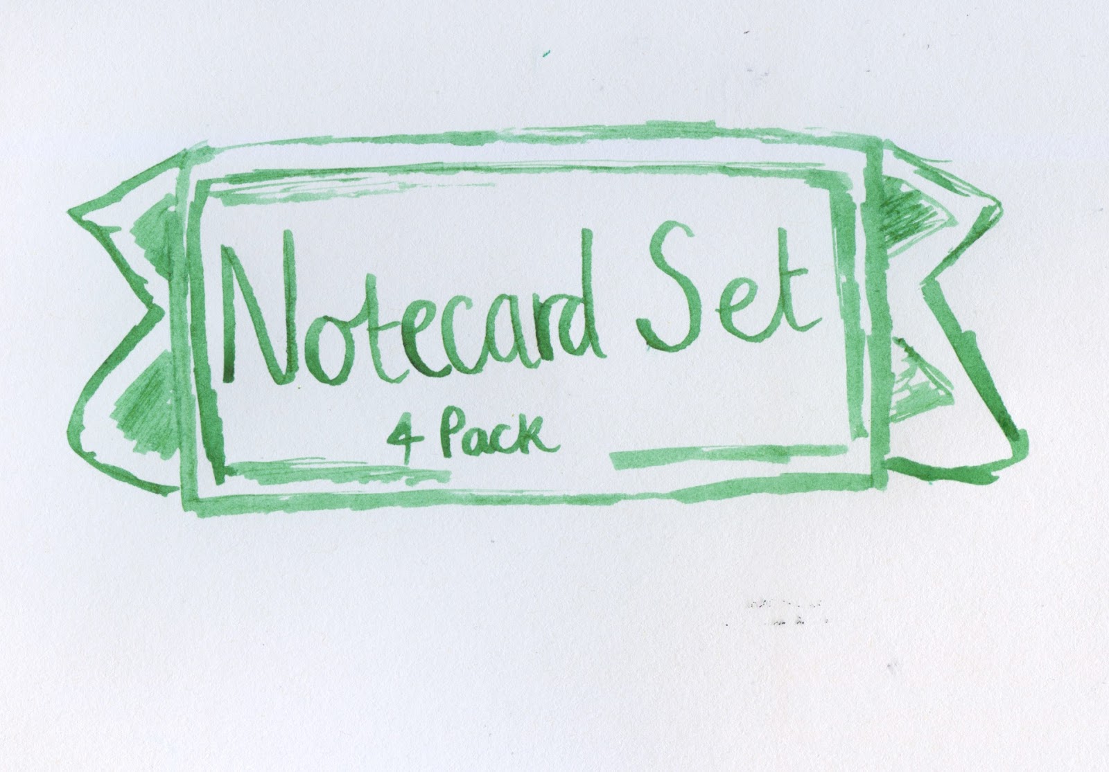
A banner approach was then explored with. The general design was simple to ensure that the typography was not over powered. A range of colour compositions were explored with, the white and black text approaches appearing the strongest. When discussing this with my peers they suggested that the black approach was far more impactful and that when placed upon a shelf would gather the consumers attention from a further distance than the white approach.
In order to comply to the cut and paste nature of the collection the banner was then cut out from a darker blue. The edges were purposfully made off balance in order to express the homemade, niche cut and paste method in which is expressed within the rest of the collection.

From this the banner and typography were then added upon another layer of blue. Blue being selected due to its calming nature, and that its the worlds favourite colour. The colour pallets also complies to that of the rest of the set.
Envelope formatting
When looking at the structure of the envelope it became apparent that there were multiple ways in which the envelope may be structured, a large influence within this was that of the sealing flap. Multiple shapes were explored in order to highlight the different ways in which the flap may be expressed. In general design terms a triangle approach is most commonly used and thus it was decided to stay away from this approach. A semi circle approach was also outlined although I believe this to appear friendly the cost of this envelope would be more expensive than that of a generic envelope due to the glue not being spread within a straight line but rather a curve.

In terms of design for an sophisticated market envelopes usually follow that of a rectangle flap. This was widely noted within more expensive cards during the research stage. As a result of this it has been decided that this approach will be used to format the envelopes. This applies to all the general envelopes and not due the note set.

Simple nets were outlined to give myself a greater understanding upon how the nets work before developing them on CAD. Measurements were also outlined so that a strong, valid approach could be made.

To allow for consistency the net was then produced using CAD. Measurements were explored taking into consideration the envelopes in which may be stored inside the set.
Feedback
When discussing my work with my peers they suggested that the general structure of the envelope was strong and thus would work effectively. They also agreed with the rectangular approach appear more up market, and appeared far more adult than that of a curved design. Although the structure was commended they suggested that the design itself was very weak, too minimal and that the approach did not appear as if it was part of the set. When looking back at the approach I realised how plain the design was in comparison to that of the pattern designs completed for the other aspects of the set. As a result of this I felt it important to look back at effective pattern used previously.
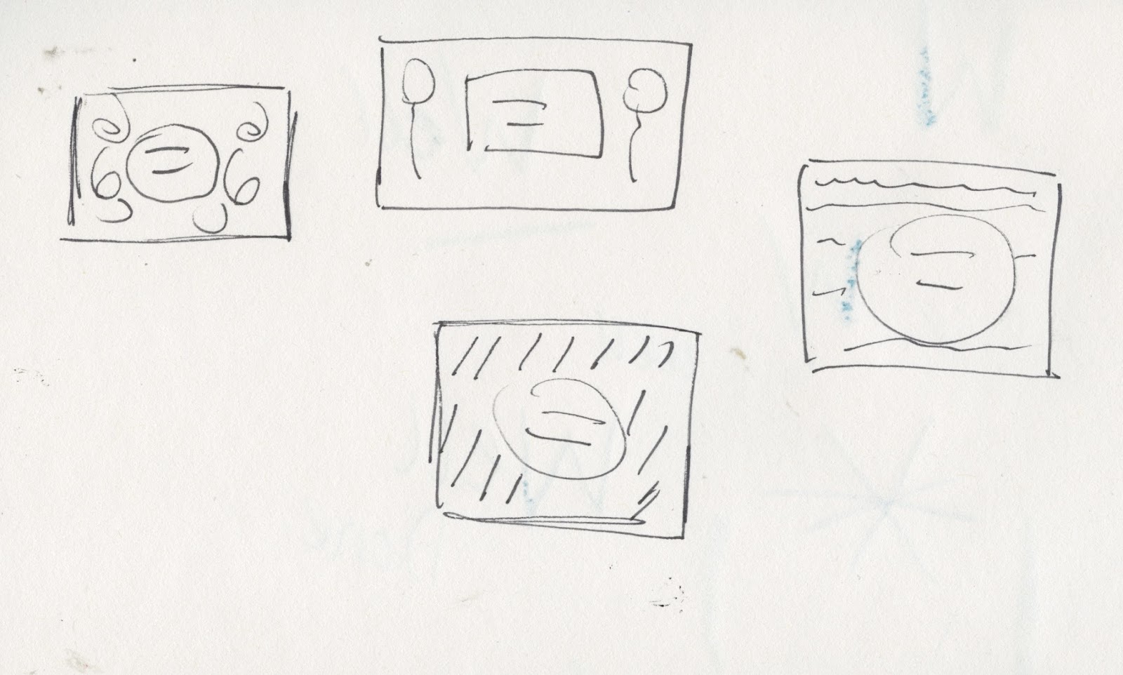
The simple quick sketches outline different formats in which the cover may take, borrowing the cut and paste designs from that of the cards. The balloon approach was outlined although I felt that this made the notecards appear as if developed specifically for a birthday. other approaches included that of a flower design, streamers and love heart effect. After a large consideration it was decided that the streamers would be used as they appear somewhat more of a pattern than specifically streamers. The design may also be applied to that of a celebration of education.
CAD


Using the pre-developed streamers, a pattern was explored with for that of the envelopes design. The usage of the streamers again expresses continuity throughout the set.
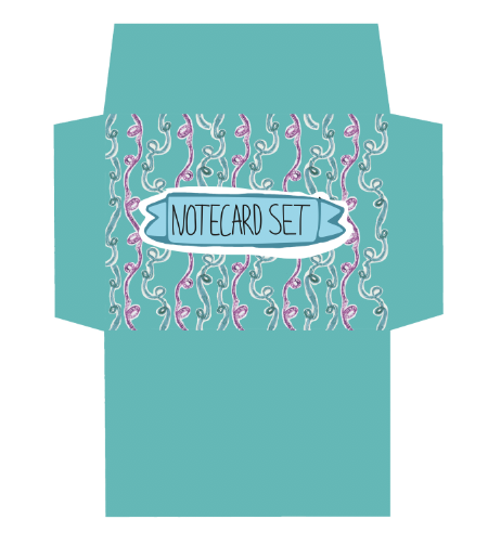
The previous banner approach was explored with, although this did not feel suiting to the new design developed. A white background was included to mimic that of the cut and paste method, although i believe that this still felt ineffective. The very CAD heavy type, did not coinside well with the hand rendered elements implemented within the design.


The typography used focuses upon a hand rendered approach. A script was used in order to promote femininity within the design. Again the white background was used in order to promote legibility, as well as implementing the cut and paste method within the design.
Mock up


Mock ups were developed in which focus upon the structure and durability of the product. The flap efficiently closed when the cards were placed inside, promoting the idea that the cards should be safety stored. The mock up was sealed together using glue. This damaged the cards and thus this will not occur within the actual design. The gluing of the envelope also meant that the cards could not be stored within the mechanism after opening. As a result of this it was decided that a clear sticker will be used in order to seal the mechanism.
No comments:
Post a Comment