Thursday, 27 April 2017
Final piece & feedback-penguin
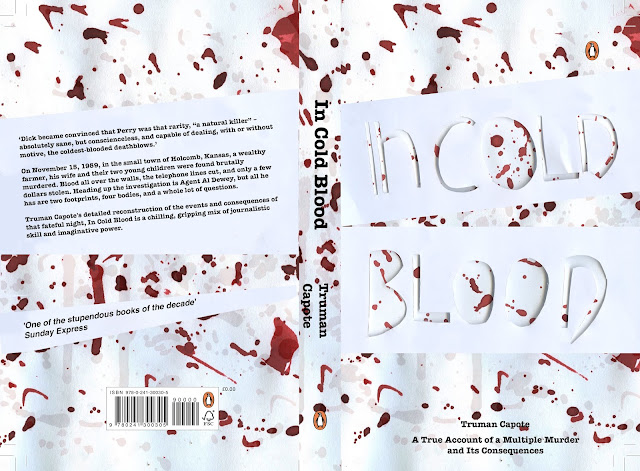
When taking the final book cover to the critique mass feedback was gained. First of all it wa mentioned that all the typography was with in upper case, other than the 'n' this then making the deisgn feel unbalanced and immature. I had not previously recognised this and thus this was a key point made.
The gory nature of the sliced typography was said to be effective although further gore could have been developed by exploring with harsher lines/cuts. It was also suggested that the typography could have been filled with blood in order to express the aggressive nature of the killings.
Thirdly,it was suggested that the layered blood approach was strong, although very generic. This resulting in a deisgn in which may not stand out. A large contrast was said to be developed between the red blood and white background. A factor in which would suggest that the book cover design would stand out to the judges, as well as when placed upon a shelf. In turn combatting the previous blood comment.
When discussing the body copy, it was suggested that the typewriter approach was effective, although the bold may be somewhat overpowering. It was also suggested that the author's name should be increased in size, as he himself is a selling factor.
When discussing the likely hood this deisgn will get picked, it was stated that it had a very low chance, as blood approaches will be very common. It was also stated that the deisgn didn't look as if it was for a non-fiction book, due to the illustrative style used, therefore making it appear appear non-fiction.
Labels:
incoldblood,
OUGD503
Subscribe to:
Post Comments (Atom)

No comments:
Post a Comment