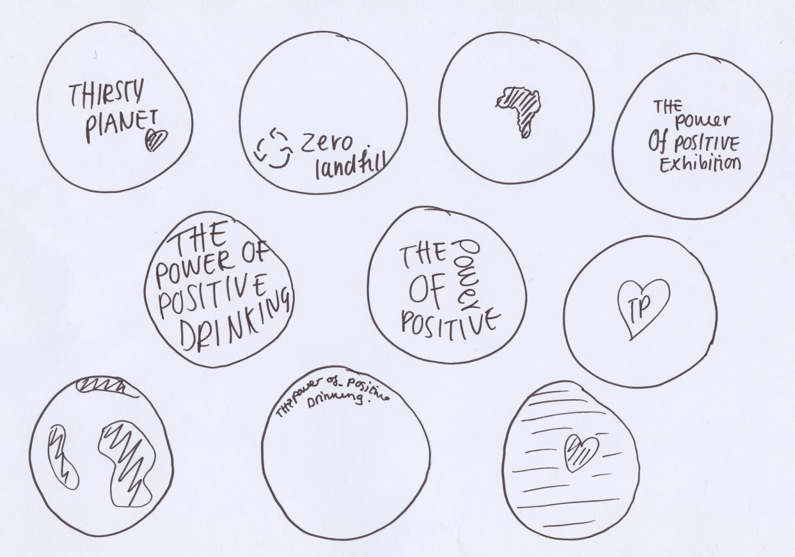
The decorative aspect of the bottle was then explored, with initial drawings being outlined. The designs follow the same form of iconography/type as the snapchat filter and posters in order to embed the different aspects of the brief as a brand.


A vast majority of designs were explored with for the clear water holder. As the main reason behind this was to promote the brand, I personally felt that designs in which clearly stated the logo were most effective. As the company purchasing the water dispenser will want a design in which is suitable for meetings I belive that the monochrome effects are the greatest. I also like the idea of the text being engraved onto the bottle in order to promote a more classic look.
Final design

From the designs developed, it was decided that the baisc logo would be most effective. The disper does not have to appear detailed, but rather suiting to an office environment. As a result of this a minimal approach was selcted, as office materials often do not contain mass design. Colour will be further explored for that of the mock up.
No comments:
Post a Comment