Friday 28 April 2017

Leeds International film festival and hyde park picture house

Leeds Queer film festival


We are creating a space to showcase queer cinema with a focus on independent and DIY films. We aim to screen films that elevate and prioritise the voices and work of those most marginalised within our queer communities. We also welcome films from queer people that don’t explicitly have a ‘queer’ focus. We are not for profit and any money raised goes towards supporting queer filmmakers as much as possible and we aim to make the festival as affordable and accessible as we can. The festival is organised by volunteers and is open to newcomers each year


The Leeds International Film Festival

The Leeds International Film Festival (LIFF) is the largest film festival in England outside London. Founded in 1987, it is held in November at various venues throughout LeedsWest Yorkshire. In 2015, the festival welcomed over 40,000 visitors and showed over 300 films from around the world, shorts and features, commercial and independent.

LIFF is a qualifying film festival for the Academy Awards and the winning films in the Louis Le Prince International Short Film Competition and World Animation Award are eligible for the Academy’s Short Film Awards. The festival’s British and Yorkshire short film competitions are BAFTA qualifying.


Short Film Awards
Louis Le Prince International Short Film Competition- £1,000 Prize
World Animation Award- £1,000 Prize
Best British Short- £1000 Prize
Yorkshire Short Film Competition- £500 Prize
Dance Short Film Competition- £500 Prize
Music Video Award

Chance to  give young talent the opportunity for exposure, as well as rewarding them for their contribution.


Work largely with The Hyde Park picture house


Despite the outbreak of war in August 1914, the Hyde Park Picture House was built and opened ready for business on the 7th November 1914. The pages of the Yorkshire Evening Post were almost entirely devoted to news of the war but a small advert announced the opening of the new Picture House. It proudly proclaimed itself to be "The Cosiest in Leeds". 

The first film to be shown at the picture House was Their Only Son, billed as a patriotic drama and was followed the next week by the famous invasion drama An Englishman's House. Although few new cinemas could be built during the war years audiences continued to grow. By September 1914 over 6000 men had enlisted in Leeds and the cinema provided news bulletins, war footage and morale boosting dramas as well as the escapism of lavish productions. In the years to come the cinema would become the highlight of many people's week.

A vibrant heart within the thriving Hyde Park community. Over time it became the backdrop to many little off screen dramas. It was a hot spot for young couples and many a romance blossomed in the back row. The advent of the talkies in the late 20's didn't hurt the stride of the little Picture House in the slightest and a quick conversion to sound was easilly enough achieved but the road was now open for many a new hurdle. The 30's saw the building of several new city centre 'super cinemas' capable of seating up to 3000 people at once.

The 50's saw the development of television. In the 80's it was video, the 90's was the new multiplex surge and the new millenium brought with it DVDs and the full power of the internet. BUT with all these changes the Picture House is all the more able to be a constant, a regular friendly face in an ever changing social landscape.



Leeds Festival

The first festival, at a site in the grounds of Temple Newsam, including Red Hot Chilli Peppers and Blur was in 1999.

The event is 'twinned' with the Reading Festival so that the same line-up appearing at both venues over three days.


Musical fireworks

A weekend ticket would have cost you £80 for that initial 1999 Leeds event.

Unfortunately, the early years of the festival in Leeds were often as notable for controversy as for the musical fireworks.

For instance in 2001, with Eminem's appearance taking most of the musical headlines, police were pelted with stones and other missiles when violence erupted at the end of the festival.

A group went on a rampage of what the police called "mindless violence and damage" in the campsite. More trouble followed next year, Kate Skelton (then a student in Leeds) said "a nasty combination of alcohol-fuelled mob mentality and a few cigarette lighters led to the burning of toilet blocks and vandalism on a massive scale."

So it was under a bit of a cloud that Leeds Festival moved to its current home, in Bramham Park, for the 2003 event. Acts appearing that year included Metallica, Linkin Park, and White Stripes.

Melvin Benn, managing director of promoter Mean Fiddler, tried to reassure local residents over the switch.


Part of the Temple Newsam site ablaze in 2001


Millenium Square

Millennium Square is a large city square in Leeds, West Yorkshire, England. It was Leeds' flagship project to mark the year 2000, and was jointly funded by Leeds City Council and the Millennium Commission. Total cost of production was £12m.

It is bordered by many of the city's most famous landmarks, including the Town Hall,Leeds Civic Hall, Leeds General Infirmary, Leeds City Museum, Leeds Academy andLeeds College of Art. Millennium Square has become a focal point for events in the city centre of Leeds. The site has hosted performances such as outdoor theatre, concerts by bands including Embrace, Kaiser Chiefs, Meat Loaf, Snow Patrol, The Specials, Fall Out Boy and The Academy Is... operatic and orchestral performances, as well as civic ceremonies, fairs, markets and street entertainment. There is also a large BBC screen which shows major sporting events including Wimbledon, and football World Cups andEuropean Championships which draw large crowds. On the first Sunday of August every year the Square is host to the first part of Leeds Pride and in winter each year a temporary ice rink, known as 'Ice Cube', is set up before being taken away in early spring. For the past few years during November & December, there has been a GermanChristmas Market selling Hot drinks & Foods, jewellery and textiles.

On April 30, 2001, the former President of South Africa Nelson Mandela appeared on stage in the square to open the adjoining Nelson Mandela Gardens and was given the Freedom of the City. He famously mis-acknowledged the crowd by saying how happy he was to be in Liverpool.

The garden which won an award for the Council at Chelsea in 2004 was re-created at the south of Millennium Square. It was seriously damaged in May 2008 by a mass water-fight organised over social networking sites

Suffragette movement in leeds (Hyde Park)

On the 26th ofJuly 1908 100,000 people attended a suffragette demonstration on Woodhouse Moor, organised by the Womens Social and Political Union.


Mary Gawthorpe
was the leader of this march, being highly involved with politics from a young age.

The next stepping up of the Suffragettes’ campaign was a big demonstration at the opening of Parliament on 23 October 1906. Mary and a large group of women had gathered in the central lobby (many more outside). When they learned the government would not support a suffrage bill, Mary leapt on a chair and began to address those in the lobby. The police arrived and bundled the women into the streets, where the protest continued. 10 arrests were made and the women were bailed to appear in court the next morning. Mary was sentenced to two months imprisonment and found out about the appalling conditions in Holloway Women’s Prison. After five weeks the women were all released, because of the by-election pending in Huddersfield, where it was realised that the imprisonment of women demanding the vote was electorally embarrassing. The Liberals just held on to the seat. On their release Mary and Annie Kenney spoke to a huge crowd gathered to acclaim them, and there was a big banquet in honour of the ex-prisoners at the Savoy Hotel. The action against women’s demonstrations became increasingly violent, and Mary was so badly injured by stewards at a meeting in February 1907 that she was too ill to appear in court. The internal injuries that she suffered were one cause of a great deal of ill health that she suffered on and off thereafter. Not necessarily connected was the appendicitis for which she was operated on at the New Hospital for Women in London – by Elizabeth Garret Anderson – the first woman to qualify as a doctor – in August 1907.


The day on Woodhouse Moor was a great success with a resolution put advocating ‘Votes for Women’. It was carried by a huge majority as reported in the Leeds Mercury. The image was in a collection of newspaper cuttings which once belonged to Leonora Cohen (1873 – 1978), a suffragette who lived in Leeds but gained notoriety when in 1913, in order to publicise her cause she attempted to break the glass showcase in the Jewel House of the Tower of London containing insignia of the Order of Merit. A note wrapped around the iron bar she used read “This is my protest against the Governments treachery to the working women of Great Britain.” She was arrested several times over the years, once when she went on a hunger and then a thirst strike while in custody in Armley Prison.


Events that have altered Leeds


  • Leeds suffered one of its worst ever disasters in December 1975 when fire ravaged Kirkgate Market.
  • Serial killer Peter Sutcliffe – the Yorkshire Ripper – butchered 13 women during a reign of terror that began in 1975.
  • The miners’ strike of 1984 and 1985 put Yorkshire at the heart of a titanic struggle between Margaret Thatcher’s government and union leader Arthur Scargill’s pitworkers.
  • The eyes of the entertainment world repeatedly turned to Leeds during the 1980s as Roundhay Park played host to some of the biggest names in music. Acts hitting the stage included The Rolling Stones, Bruce Springsteen, Michael Jackson, Genesis and Madonna. U2 and Robbie Williams also rocked Roundhay Park in 1997 and 2006 respectively.
  • Thousands of well-wishers packed Leeds’s Millennium Square in 2001 to greet former South African leader Nelson Mandela during his first official trip to the north of England.
  • First ever M&S
  • Developed the x-ray
  • Last gas lit cinema (Hyde park picture house)
  • Leeds United played the first black FA Cup finalist
  • First ever film 
  • Leeds is the inspiration behind pudsey bear 
  • Sir Edmund Happold was born in Leeds in 1930
  • Leeds is home to the longest running West Indian carnival in Europe
  • Hosted the worlds biggest wedding
  • Kaiser Chiefs 
  • 100,000 people pass through Leeds train station everyday 
  • Live at Leeds by the who

Thursday 27 April 2017

evaluation

When thinking about the overall project it is evident that there are both strong and weak areas. One of the initial struggles with this brief was that it was very open, and I personally found it difficult to develop a range in which was contextual. As a result of this I explored with my own personal ethics, of design being accessible by all.

When developing the culturally appropriate range, it was evident that vast amounts of research had to be conducted into non offense deisgn. This research was then embedded within the design in order to format a relevant, suitable design. This research could have been explored further with focus groups being developed whereby an array of people from different cultures joined together and assessed my work.

The cards were initially formatted as these are the most accessible part of the collection in terms of pricing. As there had to be four cards developed this also meant that different designs should be placed. The card designs themselves were bright, colourful and impactful. The illustrative style also directly targets women. Some design iconography was said to not be appropriate for all cultures (for example alcohol) as a result of this, these designs were removed.

Following the same illustrative style the rest of the set was developed. A colour pallete was developed throughout in order to ensure that of the designs appeared cohesive.

The notebook designs were developed in conjunction to this, although I felt that the busy pattern in which they express does not comply to this. Large white backgrounds are also expressed through the illustrations, a factor in which has not been mimicked within the rest of the set.

The notecard collection is fun and innovative, although I am unsure whether the outer packaging and the product link. As the cards themselves maintain a 'university', educational feel, I believe that the streamer effect upon the envelope is not representative as this suggests some form of a celebration. I also believe that the design could have been pushed further with envelopes being developed in order to contain each notecard.

The gift bag design is sturdy and practical, although handles could be added in order to promote a more user friendly design.


When overviewing the products as a whole I would suggest that the collection is powerful, and maintains a strong concept. I would also suggest that the physical building of the products will allow my designs to stand out to the YCN judges.

Project report

When referring back to responsive, it is evident that it is a large module in which contains multiple components. The briefs selected were: Thirsty planet (group collaborative brief), UK greetings, To kill a mockingbird and In cold blood. All the briefs in which were selected were done so in order to further my own personal design skills, as well as relating to design areas in which I would like to explore within the future.

One issue in which arose throughout the projects was the uncertainty of the levels of work in which needed to be completed for the brief variations. Although it was evident that outcomes had to be derived, I felt somewhat unsure upon how much written analysis had to support this.

The mini book cover briefs were developed as day briefs, with direct focus being placed upon them. This was effective, as all ideas were fresh. This also allowed for designs with condense concepts to be derived.

When re-visiting the workings for 'in cold blood' it became evident that  the original design idea was not altered much in order to develop the final outcome. If I were to revisit this design I would definitely aim to complete more development, as I belive the book's design could be pushed further. The reasonings behind why it was not relate largely to that of time management.

As the 'in cold blood' approach did not express my creative skill, I decided to explore further when developing the cover for 'to kill a mockingbird'. My own illustrative style was explored, as I usually do not explore with illustration within my designs. From this the outcome was far greater than I originally intended, with myself personally liking the outcome. My mock up was expressed on social media with positive comments being drawn. I also belive that this piece would be an effective portfolio piece.

The larger brief of UK Greetings was whereby I struggled to grasp a concept. As the brief was very open I initially found it difficult, as a conceptual designer, to develop something so aesthetical. As a result of this I developed my own sub-brief in which highlights cultural bias within card design. From this I was able to conduct my own contextual research in which informed the brief.

As there were multiple components to develop for the brief, I constantly aimed to push the boundaries and develop more designs than mandatorily required. This was in order to allow my efforts to be projected to the judges.

In terms of time management, I felt that the thirsty planet brief was neglected. The designs were developed extensively although relevant feedback wasn't gathered and thus I often found myself making personal judgements. Working as a group found some issues, including that of conflicting ideas surrounding style. When working in the group I always attempted to be as accessible and friendly as possible in order to promote a friendly working atmosphere. 

To kill a mocking bird -final feedback

The book cover was taken to the final critique, whereby it gained mass attention. Both positive and negative criticisms were made surrounding the design.

First of all, it was suggested that the general colour palette of the deisgn was not enthusiastic, but rather plain. The colours used were said to be bland, and therefore not stand out upon a shelf. One member stated that brown is the second most disliked colour, thus this expressing negativity towards the deisgn.

The concept of the book cover was said to be strong, with the twisted branches mimicking that of the tree of good vs evil. Although stating this, it was suggested that the tree approach has already been explored with on mass scale and thus may not be that effective.

The illustrative style was said to be fun, and engaging with mass details being explored. I felt this to be a positive aspect of the deisgn as I was previously unsure upon my illustration skills. It was also suggested that the composition was strong as the tree branches somewhat 'build' themselves around the text.

The typography was also said to be strong, with the idea of using a script font to embed the naivety of a mockingbird being highlighted. It was also suggested that this helped to separate the author's name from the title.

Final Evaluation-In cold Blood

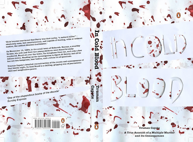
When thinking about the book covers concept, I would suggest that all design decisions are justified. The reasonings behind the blood have been outlined, in order to express the gory nature of the design. Although this is a very 'stereotypical' approach I would suggest that there are reasonings behind it. Other elements of the covers design help to lift the design away from the stereotypical approach. The hand rendered scalpelled typography, embeds an innovative style towards the piece.

The typewriter typeface was used in order to embed historical aspects of the novel within the design. This felt effective, although it was suggested that the type should not be bold, as this reduces legibility. The author's name should have also been increased in size in order to promote the idea that the author himself is a key selling point. This could have been done through hierarchy/scale.

The general aesthetic of the cover's design is bold and effective, although I personally believe that further development would have been needed in order for the design to get attention from the judges. The scalapled approach is effective alongside that of the blood splatters, although the nature of the deisgn feels unrealistic, and therefore would not suit the fiction genre.

I am also unsure upon the contrast derived within the piece, as I belive the white to appear very clinical. Blue undertones have been used where text is expressed in order to promote legibility. Legibility was further promoted by flush left, and other aspects mentioned within Vigneli's cannon.


Final piece & feedback-penguin


When taking the final book cover to the critique mass feedback was gained. First of all it wa mentioned that all the typography was with in upper case, other than the 'n' this then making the deisgn feel unbalanced and immature. I had not previously recognised this and thus this was a key point made.

The gory nature of the sliced typography was said to be effective although further gore could have been developed by exploring with harsher lines/cuts. It was also suggested that the typography could have been filled with blood in order to express the aggressive nature of the killings.

Thirdly,it was suggested that the layered blood approach was strong, although very generic. This resulting in a deisgn in which may not stand out. A large contrast was said to be developed between the red blood and white background. A factor in which would suggest that the book cover design would stand out to the judges, as well as when placed upon a shelf. In turn combatting the previous blood comment.

When discussing the body copy, it was suggested that the typewriter approach was effective, although the bold may be somewhat overpowering. It was also suggested that the author's name should be increased in size, as he himself is a selling factor.

When discussing the likely hood this deisgn will get picked, it was stated that it had a very low  chance, as blood approaches will be very common. It was also stated that the deisgn didn't look as if it was for a non-fiction book, due to the illustrative style used, therefore making it appear appear non-fiction.


Responsive book submission proof


Wednesday 26 April 2017

How we communicated

As a group we communicated largely through that of facebook and text. As I live with Dom it was much easier for us to meet up and discuss ideas. In some cases I did attempt to contact the group with no response being made, but I believe that this was due to the platform used.


I would also suggest that at times I felt it difficult to voice my opinions as I did not want to offend anyone. I believe it would have been far easier to give constructive criticism if I was not friends with the members. A key example of this is when megan suggested that it was okay to have three different elephants as part of the campaign. As I did not personally believe this to be true, I attempted to communicate this in a friendly manner.

Final group feedback

When showcasing my final ideas to the group, it was discovered that they thought the designs would coincide well with their own. As the uni water dispenser contains red, megan decided that this would be the most effective water bottle in which to use. Dom also went onto state that his glasses could be engraved in order to promote the brand identity further.

Uni water dispenser

When thinking about the needs of the univeristy water dispenser, it became apparent that it had to be sleek, fun and user friendly.


From the initial drawings, further shapes were developed. These focused upon curvature, as research suggested that a younger audience prefer innovative design. The curves also allow for a design in which appears friendly and welcoming. 

The idea of a guard enclosing the bottle was added in order to promote the idea that only members can use the feature. 


A range of ideas were explored in which focus on the design aesthetic of the brand. It was difficult to do this, and make the deisgn look mature as the imagery present was hand developed and somewhat 'childlike'. 


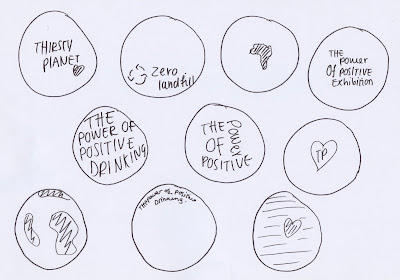
A slogan was explored from that of the brand guidelines. The slogan 'the power of positive drinking' was selected as this promotes the brand as a charity but does not explore shock tactics. A chrome has been used in order to promote a sleek professional look, with the red heart being used in order to promote a more playful approach. 


Final Design


The final design explores an engraved typeface similar to that of the office water dispenser. Although they are for different purposes it is essential that continuity is maintained.

Final office

Final office dispenser 

The final office dispenser is as shown above. The bottle itself is re-changeable, but can only be replaced by another thirsty planet water container, in turn promoting the water sales.

The design aesthetic is minimal in order to be in keeping with the office background in which it will be maintained. The chrome effect of the tripod promoting this, as well as a high quality sustainable product. When looking into product design it became evident that designs are often made heavier in order to promote a higher quality product. This may be a design factor in which is introduced to this product.


Materials? 


As I wanted to express some form of material knowledge upon the competition boards, I asked a product designers about how he would construct the design. He suggested that chrome itself was very expensive and thus a chrome effect should be used. He also stated that the plastic would be made out of HDPE, a strong plastic in which is food and beverage safe.

Design of the fountain


The decorative aspect of the bottle was then explored, with initial drawings being outlined. The designs follow the same form of iconography/type as the snapchat filter and posters in order to embed the different aspects of the brief as a brand. 


A vast majority of designs were explored with for the clear water holder. As the main reason behind this was to promote the brand, I personally felt that designs in which clearly stated the logo were most effective. As the company purchasing the water dispenser will want a design in which is suitable for meetings I belive that the monochrome effects are the greatest. I also like the idea of the text being engraved onto the bottle in order to promote a more classic look. 


Final design 


From the designs developed, it was decided that the baisc logo would be most effective. The disper does not have to appear detailed, but rather suiting to an office environment. As a result of this a minimal approach was selcted, as office materials often do not contain mass design. Colour will be further explored for that of the mock up. 

form (office dispenser)


When thinking of the form of the office water dispenser, it became evident that shape was a key factor. The fully round spheres felt somewhat unbalanced, and thus projected a naive design, whereas the square designs did not project the friendly nature of thirsty planet. 

As a result of this it was decided that a compromise between the two should be made. As a result of this design idea 6 was selected. This design feels balanced, and promotes a 'classic' approach to a water dispenser. 

The tripod aspect of the approach exhibits maturity, as well as relating to the three countries in which are supported by pump aid. 


The height of the product was outlined in order to gain a greater stance upon scale. The measurements were decided upon in relation to the height of a general kitchen counter to a upper cupboard. This is to ensure that the product can be easily stored, and could be used within a staff room. 


The tripod approach allows the design to stand out from its competitors. 


The way in which the dispenser would work was highlighted, in order to ensure that the dispenser would fully work. As this is a manual dispenser no electronics would need to be inputted and thus the design is environmentally friendly.

Feedback session with group

The group again met in order to gather feedback surrounding the designs in which we had completed for the 'new' outlined aim. During the session we discussed each others work, as well as suggesting paths in which to take.


From my original drawings the above designs were selected as the most relevant. It was stated that a chrome effect could be used in order to make the designs appear more professional. It was also stated that the two water fountains did not have to mimic one another, and that there design style could alter as they relate to different purposes. 


When giving feedback on Megan and Dom's pieces, it became evident that there approaches were very minimal and thus I decided that this must be captured within the fountains in order to project them as a set.  


Water dispenser Drawings


Drawings were developed in order to explore visual representations of my ideas. 


A range of designs were explored in order to gain the strongest possible outcome. Firstly the form was primarily explored, as I believe this to be the first feature in which engages with the consumer. An elephant design was explored whereby water comes out of the trunk. This felt very immature, and therefore did not truly represent the brand ethos. 


Further designs were developed focusing upon the university dispenser.  The sphere contains the water, promoting the concept that all the world deserves fresh, clean water. The idea that you are able to see the water also makes this design stand out from that of its competitors. 


The above designs focus upon that of the office water dispenser. Around 70cm in height, the water dispers is small and compact and therefore would be able to be placed upon multiple surfaces, for example a desk. The idea of the dispenser is that it will be used in high power business meetings in order to promote the brand to a demographic in which has a disposable income.

A tap is placed upon the fountain, in which is easily opened through a manual lever.


The water bottle aspect of the design was explored with in terms of shape. A heart approach was explored although this did not feel professional and thus was eliminated.


When discussing the structure with my peers they suggested that the more oval dispenser felt most suiting, as this felt more balanced.

Water dispenser visual research

Visual research was conducted into pre-existing water fountains. This was to gain a general idea surrounding what is currently available upon the market. 


Smaller, desk built water fountains like the above, are highly effective for office use. When in meetings with professionals, water dispenser design is essential as the company do not want to portray the wrong image to the client. 

An example of ways in which companies use material goods is that of the pen company. Pens range from £100 plus, and thus it is more about the experience of using the pen, and its reception by the client. As a result of this I would propose that an innovative, classic look must be taken for the water fountain. 


Covered in chrome, this design explores a sleek yet cold approach. The aesthetic is very modern and thus connotes high power, and technological advances. When thinking about this design in comparison to the thirsty planet brand, it is evident that a design such as the above would not be appropriate as it does not connote the same friendly, organic feel as the rest of the branding. 


Companies often have their own water fountains developed in order to highlight their brand further. This is usually apparent in banks and private dentists. The above design although containing the companies logo, are not very innovative and thus I am to push the design and structure of the water fountain further. 


Both hot and cold water dispensers can be bought and thus it is important that this feature is decided upon, I will ask the group for feedback upon this.


A fun caricature could be developed although this may appear immature. The above design looks as if it has a young target audience, and thus I do not believe that a similar design would promote thirsty planet in a professional manner. 


See-through glass approaches appear mature. The idea that you are able to add your own elements (such as depicted above) allows an extra component to be added to the design. This also allows the water to appear fresh and hydrating. 


The above design shows a basic water dispenser. The form of the water dispenser could be relatively simple, as long as the design is impactful. 

Meeting with group

Straight after the crit, the group met in order to develop further ideas surrounding distribution strategies, and to enlist new roles.


A mind map was developed in order to record our ideas. 


Mass discussions were held surrounding how we could make the campaign different to what is expected by the judges, in turn allowing ourselves to stand out. Distribution through shops was highlighted, as well as the idea of making design relating to the 'thirsty planet meal deal.'

We also began to think about places the water may be distributed for free in terms of marketing. Some of these are listed below.

  • Sporting events
  • Marathons
  • London marathon
  • Hospitals
  • Blood donation (made to drink water before and after)
  • Dentists
  • Leeds city of culture 2020


As Simon previously suggested water dispensers are a good way in which to gain attention for a brand we also highlighted this. The idea of a loyalty scheme was discussed, in which entails paying a fixed price per year, to get a free water bottle and unlimited thirsty planet water through a specific dispenser. These being placed in offices/universities.

When discussing the different aspects of water fountains, design factors were listed. It was decided that two water fountains would be developed, one for office use and the other for within universities. It was also outlined that a water bottle should be developed for the university dispenser, and glass designs developed for that of office use. 


When deciding upon roles Megan suggested that she would like to develop the water bottles. Dom then went onto suggest that he would like to develop the glasses, and thus I took on the role of developing the water fountains. 


From this we then set each other guidelines


Alice
  • Develop two water fountains 9one for university, one for office use)
  • The thirsty planet branding should appear present on the designs 
  • A sleek feel should be maintained, although the colour pallet should be limited. 

Megan 

  • Develop a range of bottles in order to promote university students 
  • focus upon the brands colours

Dom
  • Develop a range of glass wear
  • the products should be suitable for office use. 


Intermediate crit

Within the intermediate critique with Simon and John, five groups were placed together in order to gain feedback upon ideas and current designs. Before the crit our group met up and discussed the key outputs of the group. These are listed below.

  • The geofilter and lens filter 
  • Screenprinted posters 
  • Digital poster 
  • Social media campaign 
  • app


Outcomes taken to the crit 


When taking the outcomes to the crit, it became evident that this design tactic was not a suitable way in which to target a demographic. It was stated that young people very rarely see a poster and feel as if they desire the product, especially when marketing water. Due to the positive tone of these posters, they also cannot connect to the audience on an emotional level, meaning they will be passed by as white noise. Due to this, more mediums of communication are to be explored. It was suggested that we should focus around product distribution channels as a medium to appeal to the audience, directly associating the brand with the product.

It was stated that to promote the brand the water had to be more assessable to the demographic, being placed in meal deals etc. The pricing should also be cheaper than its competitors in order to ensure the price conscious consumer invests.

It was also suggested that an effective way in which to market the brand would be to tap into key events and use this as a basis of the marketing strategy. It was also suggested that exploring water fountains, and office equipment would be an effective way in which to market to a younger, employed audience.

When discussing the snapchat filters with my peers, they went onto suggest that the filers would still be appropriate as they are effectively getting the charities name recognised.