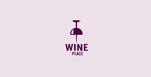
1. Use a Visual Double Entendre
Some of my favorite logos in the world utilize a technique that I like to call a visual double entendre, which is an overly fancy way to say that it has two pictures wrapped into one through clever interpretation of a concept or idea.
This logo takes on the shape of a thumbtack, which suggests “location” or “place,” but it also clearly looks like an upside down wine glass. Logo designs that use this technique come off as clever and memorable. Viewers love the little mind game that you’re playing and are more prone to appreciate a design because of it.
One of the most important considerations for logo design is the color palette. This is not a superficial decision, color carries meanings and communicates ideas.
Sometimes you’re pegged to the colors of a brand, but other times you’ll have the freedom to explore. I love the rich palette used in the Zion logo below.
The colors here grab you and pull you in, they bring life to the illustration and give further context to the shape of the landscape. That being said, remember that a good logo is versatile and will still function well in grayscale:
Beyond a grayscale version, I like to also provide clients with a true single color version, using only black and negative space. This would be a little tricky with the logo above, but definitely possible.
3. Avoid the Cliché
Every few years or so, some new fads come along in logo design. I personally love to study design trends and you might even find me suggesting jumping onto a few bandwagons to keep up with the times, but with logos I just hate it when a bunch of designers use the same idea over and over.

5. Everybody Loves Custom Type
While we’re on the subject of being unique, there’s almost nothing that can give your logo a unique feel quite like some awesome custom lettering.


No comments:
Post a Comment