How humans view logo shapes

Our subconscious minds respond in different ways to different logo shapes. Straight lines, circles, curves and jagged edges all imply different meanings and so a skilled logo designer can use shape to infer particular qualities about the brand.
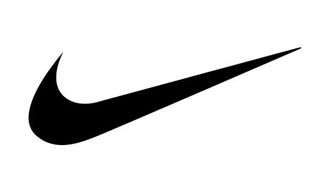
Think, for example, of the Nike Swoosh: the combination of curves ending in a sharp point offers a strong suggestion of movement.
Particular logo shapes send out particular messages:
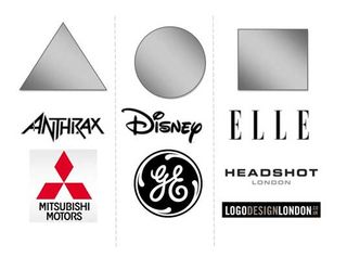
Circles, ovals and ellipses tend to project a positive emotional message. Using a circle in a logo can suggest community, friendship, love, relationships and unity. Rings have an implication of marriage and partnership, suggesting stability and endurance. Curves on any sort tend to be viewed as feminine in nature.
Straight edged logo shapes such as squares and triangles suggest stability in more practical terms and can also be used to imply balance. Straight lines and precise logo shapes also impart strength, professionalism and efficiency. However, and particularly if they are combined with colours like blue and grey, they may also appear cold and uninviting. Subverting them with off-kilter positioning or more dynamic colours can counter this problem and conjure up something more interesting.
It has also been suggested that triangles have a good association with power, science, religion and law. These tend to be viewed as masculine attributes, so it's no coincidence that triangles feature more prominently in the logos of companies whose products have a masculine bias.
Our subconscious minds associate vertical lines with masculinity, strength and aggression, while horizontal lines suggest community, tranquillity and calm.
The implications of shape also extend to the typeface chosen. Jagged, angular typefaces may appear as aggressive or dynamic; on the other hand, soft, rounded letters give a youthful appeal. Curved typefaces and cursive scripts tend to appeal more to women, while strong, bold lettering has a more masculine edge.
How to apply logo shape psychology

Before you start designing a logo for your client, write down a list of values and attributes that the logo should convey. (This is one of the reasons you need to get to know your client and their business as well as you possibly can.) Ask your client to compile a list of corporate values or take a close look at their mission statement.
Once you have a feel for the message the logo needs to disseminate, you will be able to look at how to match this up with not only logo shapes, but also colours and typefaces as well.
Use these three elements in combination to your advantage: for example, if you pick a strong shape but find it too masculine, then introduce a colour or colours that will tone down the male aspect.
Gestalt theory

To extend your use of psychology to a deeper level, brush up on the Gestalt theories of German psychologists from the 1920s. They hold that the human brain unifies the visual elements it sees to form a whole that carries significantly more meaning. People form patterns out of similarly shaped objects, while objects that differ from the group become a focal point of the image.
Another Gestalt principle, closure, is often used in logo design; this is when an object is incomplete but there is enough detail for the human eye to make the whole picture. A good example of this is the panda logo used by the WWF, shown above.
The logo shapes you incorporate into your designs become an intrinsic element in the message they will convey to the company's customers and the wider public. Once you understand the psychology behind logo shapes you will be able to use this knowledge to create powerful brands for your clients.
No comments:
Post a Comment