This timeplan was followed, with the 26th-28th of feb being used to complete all blogs. When thinking about design boards these shall all be completed by easter, as I would like to print all prior briefs out ready for submission at this time.
Wednesday, 28 February 2018
Timeplan
Before starting the brief, an initial time plan was developed in order to organise the project. The time plan suggested that the first day (8th feb) would consist of research, with the second day (9th feb) being used to physically develop the design. As I was currently undergoing a couple of other projects of at the time, it was stated that the blogs would be fully completed by the end of febuary, allowing myself a 'clean palette' for march.
Evaluation
With a quick turn over, the fast paced nature of this brief has presented that I can work efficiently under pressure. As this years previous briefs have largely been built up of collaborations, conclusions may also be drawn surrounding time management, as if I am enthusiastic about a project and don't have any obstacles, I am able to quickly develop a set brief.
When thinking about this brief as a whole I would suggest that it was rather straight forward and followed a linear thought process. Design ideas were gathered, feedback gained and final resolutions contributed.
When over looking the final piece, it may be suggested that the design is a little complex and may have been more likely to win if it were stripped back, although saying this, the design presented was largely justified and focused largely on concept. Other judgements surrounding why my logo was not selected may be implemented if direct feedback is later given, which can go on to inform following projects.
Portfolio piece

When thinking about the final outcome in terms of a portfolio piece it is key to mention that my portfolio does not currently maintain any logos, and thus, this design should showcase my versatility.
As I want my portfolio to exhibit a range of skills, I believe that including this design would showcase that I am sufficient at logo design. As my portfolio currently maintains two editorials and a packaging brief, this will also appear attractive to a range of studios.
To further promote a range of skills within my portfolio, I shall go onto develop a variety of briefs including: campaigns, branding, and beverage packaging briefs.
Competition brief
As this small week brief was a competition brief, the outcome is highly important, as if I were to win then I would be able to promote a professional, client based piece of work within my portfolio.

Unfortunately my design was not selected and therefore it must be considered as to whether this brief will be placed within my portfolio. After a brief discussion with my peers, it was decided that the brief would still be positioned within my portfolio as it promotes myself as an individual who is willing to take on challenges and promote a varied body of work. It was also suggested that it shows excellent time management and that I am able to produce fast outcomes when under pressure.
A benefit of participating in this brief is that I will also gain some professional feedback in which may be used to influence my future designs.
Tuesday, 27 February 2018
Competition boards
Competition boards were devised highlighting key elements of the design process and expressing the concepts behind each logo design, in turn providing the consumer with sufficient information to select the logos. Mock ups were also devised to give real life variations, showcasing how the logo would work in context.


Final variation

Key elements have been drawn from the original logos in order to devise a design in which effectively showcases the merging of the two schools. The local environment has also been implemented within the design to showcase the coming together of a community. Golden wings have been used in order to showcase the uplifting of the school, implemented that it will provide achievements.
Mock ups


As my prefered final design is that of the first variation this has been pused within the competition boards through mock up variations, placing the design at the fall front of the ideas. The mock up variations also present the design in a real life situation for the consumer, making them more intrested in the final product.
CAD variations

The first logo variation explores the identity of Owlcotes surrounding area, specifically Pudsey Park, this in turn envisaging the local community within its design.To showcase the joining together of the two schools key aspects from the original logos have been implanted within the new design.
Aspects of the Pudsey Primrose Hill logo have been envisioned through the colours used within the design, with other elements including the logo shape and stars being drawn from the Pudsey Waterloo Primary logo. This ensuring that both original schools are represented within the design.
To comply to the written brief, wings have been added to the logo shape, embedding the new name within the logo design.
The general aesthetic promoted throughout the design showcases Owlcotes Multi-Academy Trust as a fun learning environment giving the potential for children to ‘spread their wings’ and embark on future adventures and opportunities.


1st cad variations
A variety of CAD variations were devised from the previous drawings developed showcasing diversity whilst offering the consumer options.

The first design explores that of a typographic piece, highlighting the Academy's new name. Owl wings have been implemented within the design making the word appear as if it is taking flight. Hierarchy has also been presented through the typography to ensure key information is instantly available to the consumer.
When discussing this design with my peers they suggested that the wings should be presented in a way in which lifts the entire logo, rather than just the 'O'.

Bold and impactive, this design explores a fun characterful way in which to represent the surrounding area of Pudsey. The usage of an owl has been implemented in order to coincide with the set brief.
When discussing this with my peers they suggested that maybe the owl could be removed from the design with wings being placed upon the side of the circle, showing that the school will uplift the children who attend.


Drawing from the original shape of Primrose Primary School logo, the third design showcases a strong illustration of an owl in flight, promoting strength and achievement.
When discussing this with my peers they suggested that the colours should be further explored in order to create a visually pleasing design.
Owlcotes second sketches

From the initial sketches some secondary sketches were devised in order to condense the previous designs. Key trends and iconography pieces have been taken from these including the usage of the owls wings.
As you are able to submit multiple logos, I will develop the above designs further, making more more accurate pieces and select a final three to submit. Therefore giving the consumer choice but not over complicating things.
Design 4 from above may be explored further in terms of location and mimic that of pudsey park, with design 1 showcasing a famous owl breed, highlighting the stability of the school.
Owlcotes initial drawings

Initial sketches were developed in order to showcase a variety of ideas. A range of shapes were explored in order to create a fun, playful design. This will be further implemented with the usage of colour within the final outcome.
The usage of owl iconography was also implemented in order to relate to the original brief, with either physical a physical owl being displayed or its wings.
Although a range of designs were developed, it became evident that some are more visually striking than others. An example of this is that the logos in which contain iconography are more effective than typographical approaches on their own. As a result of this the stronger ideas will be taken forwards, with a crit being used to help decided upon this.
Critique
After showing my peers the initial sketches comments were made surrounding the logos expressed, it was suggested that logos in which contained shapes felt more rounded and appeared to mimic primary school logos much more effectively. It was also suggested that the usage of an owls wings felt effective when 'rasing' type as it demonstrates the school rasing the children academically.
As a result of this CAD developments will be made surrounding different ways in whic this can be implemented.
Analysis of schools current values
In order to gain a better understanding of the two schools merging, the original schools were researched with their aims and goals being analysed, in turn showing a basis of values in which the design can be based off.
Primrose Hill Primary School
All children enjoy learning in our happy, safe and caring school. We are inclusive for all pupils and provide a broad and balanced curriculum which engages pupils and inspires them to be lifelong learners.
We aim for our pupils:
We aim to develop a strong partnership with parents and carers and encourage their involvement in their child’s education.
Primrose Hill Primary School
- To have high expectations of children both academically and in social behaviour so promoting positive expectations and attitudes.
- To provide a caring and supportive school environment, to develop lively minds and bodies by stimulating pupil’s interest and curiosity.
- To enable children to discover their culture and the world around them. To appreciate and cope with the ever changing world in which they live and for which they will eventually become responsible.
- To foster a sense of self-respect and respect towards others by promoting the Primrose Hill School Behaviour Code, Polite-Happy-Safe and for the children to accept responsibility for their own actions.
- To encourage attitudes of independence yet co-operation and for children to value the need for perseverance and self motivation.
- To give each child equal opportunity regardless of gender, ethnic origin or disability and to stand against racism and all forms of discrimination in an atmosphere of mutual respect.
- To deliver the National Curriculum and where appropriate to the needs and talents of our pupils to go beyond it. To provide a curriculum of breadth and depth which focuses on a core of English, Maths and Science enhanced by the richness and variety of the foundation subjects.
- To strive for our pupils, as a group, to achieve at least the national averages and to achieve individually to maximum potential. We will always be aware of a need to raise standards.
- To develop a strong partnership with and encourage the involvement of parents/carers in their child’s education.
- To create an awareness of leisure and learning opportunities available in the vicinity of the school.
- To foster a pride and appreciation of our children’s achievements.
Pudsey Waterloo Primary School
All children enjoy learning in our happy, safe and caring school. We are inclusive for all pupils and provide a broad and balanced curriculum which engages pupils and inspires them to be lifelong learners.
We aim for our pupils:
- To be confident and independent
- To enjoy learning and achieve well
- To have high expectations of themselves and to be proud of their achievements
- To be motivated to achieve
- To become well-rounded life-long learners
- To positively contribute to the community
- To display respect and empathy towards others
We aim to develop a strong partnership with parents and carers and encourage their involvement in their child’s education.
- We expect everyone to have respect for others and themselves.
- To be positive about their learning, our school and what they can achieve.
- To have a willingness to reflect on how they can do their best and be their best.
- To display resilience to respond well to challenges and overcome difficulties.
- We all work as a team to ensure Waterloo is a happy, enjoyable and successful school for pupils, parents and staff.
From this similarities can be drawn from the values presented by each school, this have been listed below:
- To promote academic/social development
- To provide a caring school environment
- Promote independence amongst children
- Promote equal opputunities
- To ensure the children enjoy learning
- Ensuring children respect others
Logo shapes
How humans view logo shapes
Our subconscious minds respond in different ways to different logo shapes. Straight lines, circles, curves and jagged edges all imply different meanings and so a skilled logo designer can use shape to infer particular qualities about the brand.
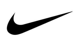
Think, for example, of the Nike Swoosh: the combination of curves ending in a sharp point offers a strong suggestion of movement.
Particular logo shapes send out particular messages:
Circles, ovals and ellipses tend to project a positive emotional message. Using a circle in a logo can suggest community, friendship, love, relationships and unity. Rings have an implication of marriage and partnership, suggesting stability and endurance. Curves on any sort tend to be viewed as feminine in nature.
Straight edged logo shapes such as squares and triangles suggest stability in more practical terms and can also be used to imply balance. Straight lines and precise logo shapes also impart strength, professionalism and efficiency. However, and particularly if they are combined with colours like blue and grey, they may also appear cold and uninviting. Subverting them with off-kilter positioning or more dynamic colours can counter this problem and conjure up something more interesting.
It has also been suggested that triangles have a good association with power, science, religion and law. These tend to be viewed as masculine attributes, so it's no coincidence that triangles feature more prominently in the logos of companies whose products have a masculine bias.
Our subconscious minds associate vertical lines with masculinity, strength and aggression, while horizontal lines suggest community, tranquillity and calm.
The implications of shape also extend to the typeface chosen. Jagged, angular typefaces may appear as aggressive or dynamic; on the other hand, soft, rounded letters give a youthful appeal. Curved typefaces and cursive scripts tend to appeal more to women, while strong, bold lettering has a more masculine edge.
How to apply logo shape psychology
Before you start designing a logo for your client, write down a list of values and attributes that the logo should convey. (This is one of the reasons you need to get to know your client and their business as well as you possibly can.) Ask your client to compile a list of corporate values or take a close look at their mission statement.
Once you have a feel for the message the logo needs to disseminate, you will be able to look at how to match this up with not only logo shapes, but also colours and typefaces as well.
Use these three elements in combination to your advantage: for example, if you pick a strong shape but find it too masculine, then introduce a colour or colours that will tone down the male aspect.
Gestalt theory

To extend your use of psychology to a deeper level, brush up on the Gestalt theories of German psychologists from the 1920s. They hold that the human brain unifies the visual elements it sees to form a whole that carries significantly more meaning. People form patterns out of similarly shaped objects, while objects that differ from the group become a focal point of the image.
Another Gestalt principle, closure, is often used in logo design; this is when an object is incomplete but there is enough detail for the human eye to make the whole picture. A good example of this is the panda logo used by the WWF, shown above.
The logo shapes you incorporate into your designs become an intrinsic element in the message they will convey to the company's customers and the wider public. Once you understand the psychology behind logo shapes you will be able to use this knowledge to create powerful brands for your clients.
How Do Bright Colours Appeal to Children?

Children prefer brighter colors from an early age because their eyes are not fully developed yet. They perceive these colors better than fainter shades. Bright colors and contrasting colors stand out more in their field of vision. As children constantly strive to make sense of their environments, objects that are stark and bright are more stimulating and interesting. One of the first ways they learn to sort things by is color. Colors are some of the earlier words they tend to learn, which is why the easily named, more basic colors appeal to children.
School colours
Although I am unsure upon what colour Owlcotes will use from their uniform etc, research was undergone into the variety available to help influence the design.


Although schools are able to pick their own colours they generally select: Green, Blue, Black, Yellow, Red, Orange or Purple. As a result of this it is important that the Owlcotes logo's colours can be altered.
Colour theory

Primary Colors: Red, yellow and blue
In traditional color theory (used in paint and pigments), primary colors are the 3 pigment colors that cannot be mixed or formed by any combination of other colors. All other colors are derived from these 3 hues.
Secondary Colors: Green, orange and purple
These are the colors formed by mixing the primary colors.
Tertiary Colors: Yellow-orange, red-orange, red-purple, blue-purple, blue-green & yellow-green These are the colors formed by mixing a primary and a secondary color. That's why the hue is a two word name, such as blue-green, red-violet, and yellow-orange.
Psychology of colour
Misconceptions around the psychology of color
As research shows, it’s likely because personal preference, experiences, upbringing, cultural differences, and context often muddy the effect individual colors have on us. So the idea that colors such as yellow or purple are able to evoke some sort of hyper-specific emotion is about as accurate as your standard palm reading.
But there’s still plenty to learn and consider if we humbly accept that concrete answers aren’t a guarantee. The key is to look for practical ways to make decisions about color.
The importance of colors in branding
In a study titled “Impact of color on marketing,” researchers found that up to 90% of snap judgments made about products can be based on color alone, depending on the product. Regarding the role that color plays in branding, results from another study show that the relationship between brands and color hinges on the perceived appropriateness of the color being used for the particular brand (does the color “fit” what is being sold?).
A study titled “Exciting red and competent blue” also confirms that purchasing intent is greatly affected by colors due to their effect on how a brand is perceived; colors influence how customers view the “personality” of the brand in question. Who, for example, would want to buy a Harley Davidson motorcycle if they didn’t get the feeling that Harleys were rugged and cool?
Additional studies have revealed our brains prefer immediately recognizable brands, which makes color an important element when creating a brand identity. One journal article even suggests it’s important for new brands to pick colors that ensure differentiation from entrenched competitors — personally, I think we’re getting into minutiae without additional context, such as how and why you’re positioning against a direct competitor, and how you’re using color to achieve that goal.
When it comes to picking the “right” color, research has found that predicting consumer reaction to color appropriateness is far more important than the individual color itself. If Harley owners buy the product in order to feel rugged, colors that work best will play to that emotion.
Psychologist and Stanford professor Jennifer Aaker has conducted studies on this very topic, and her paper titled “Dimensions of Brand Personality” points out five core dimensions that play a role in a brand’s personality.

Colour and sex

Men’s and women’s least favorite colors

What I can gain from this...
From the information gained it is evident that colours influence the consumers decision about a brand and therefore the colour of Owlcotes may effect the ways in which the target audience perceive it. The appropriateness of colour was highlighted as some colours may convey the school as one dimensional. It was also suggested that a new brand should pick colours that show differentiation from entrenched competitors in order to stand out. In relation to the schools 'competitors' further research may be conducted.
Logo's in form
Monogram Logo: Monograms & Ciphers
Monograms have two or more letters in which one letter forms part of another. Ciphers contain two or more letters interplaced, which are not dependant on each other.


As the original brief does not state that typography should be presented within the logo, research was undergone into ways in which type could be playfully implemented. Monograms & Ciphers were research as they may be a way to express the name without physically depicting it.
A broad range of logos were studied varying in weight and scale, showcasing how diversity can be promoted through logo design.
Logotype, Laurence King


Further logo's were studied with a focus being placed upon the shape of the logos and how type can be used to mimic a shape. Examples of typefaces being altered to complete shapes was highlighted as this may be an effective way in which to developed an owls silhouette within the Owlcotes brief.
Logobook, Ludovic Houplain

The Pantone logo is a key example of a logo in which is highly diverse and transferable, as its monochrome exterior can be presented with any colour, relating to the brand itself. As a result a similar design may be implemented within the Owlcotes brief so that the design can appear alongside many colours.
Target audience
Target audience
When thinking specifically who the target audience it is key to note the variety of target audiences available.
The primary target audience is that of Owlcotes Academy Trust as they have set the brief and will therefore be the ones selecting the desired logo.
The secondary audience is that of the parents who may choose to send their children to the new academy. As this is a new school the parents may be sceptical of whether or not this school will be efficient and therefore this needs to be presented with the design.
The tertiary target audience is that of the children themselves as they will want to be part of an enthusiastic, fun learning environment.
Primary research
As the information surrounding what the memebers of Owlcotes Academy Trust has been outlined within the brief research was undergone into what the secondary and tertiary audience would want from the new academy. To complete this, two separate studies were conducted with study one gaining a better understanding of what parents want from a school and the second study what children want.
Study one
Name:Roy
Sex: Male
Occupation: Manual labourer
Age: 54
Children: two girls (8, 6)
Relationship Status: Married
What would you like from a school: Strong curriculum, diverse, offers languages, after school clubs.
Name:Cathy
Sex: Female
Occupation: nurse
Age: 42
Children: Three girls (22, 12, 8)
Relationship Status: Married
What would you like from a school: excellent/outstanding ofsted report, e-safety, good sports, fun learning environment
Name:Kate
Sex: Female
Occupation:Headhunter
Age: 30
Children: one girl, one boy (6, 2)
Relationship Status: single
What would you like from a school: fun learning environment, special needs facilities, languages.
Name:Veronica
Sex: Female
Occupation: Shop assistant
Age: 22
Children: one boy (3)
Relationship Status: single
What would you like from a school: Creative environment, fun, safe
Name:Luke
Sex: Male
Occupation: Builder
Age: 35
Children: one girl (4)
Relationship Status: single
What would you like from a school: Safe, anti-bullying, after school clubs.
Although parents largely commented upon activities and resources in which they would like the school maintain, they also suggested that they would like the school to present a fun learning environment to present potential for their children. Other comments suggested that the school should be safe, creative, and offer after school clubs.
Study two
Name: Ruby
Age:8
Gender: female
What would you like from a school: fun, lots of friends, playground toys
Name: Zara
Age: 6
Gender: female
What would you like from a school: fun playtime, arts classes.
Name: Joe
Age: 10
Gender: male
What would you like from a school: friends, sports days, football pitch
Name: Zack
Age:5
Gender: male
What would you like from a school: games, fun, playground toys
The children asked focused largely upon the social side of school suggesting they want a fun school whereby they can make friends, and enjoy playtime.
Comments..
When commenting upon the two studies it is evident that the parents are much more focused upon the academic presence of the school and the children are more interested in the social aspects. Therefore it may be suggested that the logo should present a professional, fun learning environment.
Cleverbox studio
The UK's leading school logo design and branding experts
Case study-London East Provision

The project commenced with branding development, working from the ground up to help the client establish their new name and creative direction.
Using the logo as a base, our creative team used bright, energetic solid block colours paired with a dark charcoal as a colour palette across the website and prospectus designs. Teamed with a contemporary font, this gave us a visual look and feel to take forward.
A larger page count on the prospectus allowed us to make a booklet that was both informative and engaging. Authenticy was critical, with a focus on real students and their experiences at LEAP.
The LEAP website showcases their powerful photography and provides visitors with a user friendly locations pannel, vacancies page and latest news.


Cleverbox were asked to develop a contemporary, smart and professional brand that would unify the Post 16 provision offered across the Harris Federation. As one of the largest Sixth Forms in London, with more than ten sites and an already well-respected and diverse curriculum, the main aim of the new identity was to establish an image of a whole, united Sixth Form.
Ensuring that it would appeal to young people in and around London, we put the proposed concepts through a consultation with current students. The resulting design is modern and sophisticated with a focus on aspirational outcomes.
The theme of raising aspirations continues on the Harris Sixth Form website through high-impact animated header images. Strong calls to action compel users to interact with the Course Finder module, which provides detailed course information and the ability to filter courses by campus location.


Case study-Chesham Grammar School

Chesham Grammar wanted a school website that gave their students a voice and to present them in a professional manner. With prominent photography across the website, the students are the focus point. Key line boxes attract attention to headlines and call-to-actions.


Case study-London East Provision
The project commenced with branding development, working from the ground up to help the client establish their new name and creative direction.
Using the logo as a base, our creative team used bright, energetic solid block colours paired with a dark charcoal as a colour palette across the website and prospectus designs. Teamed with a contemporary font, this gave us a visual look and feel to take forward.
A larger page count on the prospectus allowed us to make a booklet that was both informative and engaging. Authenticy was critical, with a focus on real students and their experiences at LEAP.
The LEAP website showcases their powerful photography and provides visitors with a user friendly locations pannel, vacancies page and latest news.


Case study -Harris Sixth Form
Cleverbox were asked to develop a contemporary, smart and professional brand that would unify the Post 16 provision offered across the Harris Federation. As one of the largest Sixth Forms in London, with more than ten sites and an already well-respected and diverse curriculum, the main aim of the new identity was to establish an image of a whole, united Sixth Form.
Ensuring that it would appeal to young people in and around London, we put the proposed concepts through a consultation with current students. The resulting design is modern and sophisticated with a focus on aspirational outcomes.
The theme of raising aspirations continues on the Harris Sixth Form website through high-impact animated header images. Strong calls to action compel users to interact with the Course Finder module, which provides detailed course information and the ability to filter courses by campus location.


Case study-Chesham Grammar School
Chesham Grammar wanted a school website that gave their students a voice and to present them in a professional manner. With prominent photography across the website, the students are the focus point. Key line boxes attract attention to headlines and call-to-actions.


Info gained...
- Block colours present energy and enthusiasm
- Contemporary typefaces showcase that the schools are modern and offer the best learning credentials.
- The logo should appeal to those study there and their parents
- The design should express the 'voice' of the school and how they want to be perceived.
Owlcotes as a brand so far
In order to gain a better understanding of Owlcotes community trust, research was undergone into pre-existing information available upon the internet. As the school has yet to open there is no live website, nor little press surrounding its opening, with the only formation being that of the schools opening confirmation and a picture of its exterior.

As little more knowledge has been gained, this means that the brief should be re-studied, with key terminologies being outlined in order to promote a design for this currently non-existing brand.
Owlcotes Multi-Academy Trust are looking for an artist to design a new logo, to celebrate the union of the two schools and welcome the new academy. The logo will be used online (website, social media, etc.) as well as in print (letterheads, promotional materials, official documentation, etc.) and, as such, should be simple yet eye-catching and recognisable. Due to the new name, they would like the logo to feature an owl in flight, or an owl’s wings, and allow space for the addition of the new school motto (wording to be confirmed). Owlcotes Multi-Academy Trust are offering £250 to the chosen artist for full use of their design.
From highlighting the key information within the brief, it becomes evident to what is expected. Highlighting that the logo should promote a celebration of the merging of schools, whilst being eye-catching and recognisable. The logo should also feature some form of owl, and should leave additional space for the slogan.
Owlcotes research
How to make an effective logo design
Keep it simple.
The moment you cram too much stuff into a single logo, it becomes confusing to its audience. Remember that logos are often minimized to miniscule sizes, especially when used on merchandise like keychains or letterheads. How are you going to fit all those details into such a tiny space?
Keep it relevant.
What’s the first thing you think of when you go to the oceanarium? Probably the color blue, or a dolphin, or a whale. An oceanarium logo will not make sense at all if you use a monkey, or perhaps, a zebra. This is one thing that you should be careful about in designing logos. You have to keep all the elements relevant. Think about the image of the brand and make sure your design is consistent with this image.
Don’t be afraid to experiment.
Just because all other banks in your area uses gold in their logo does not mean you have to do the same thing. If other pastry shops you look at use rolling pins in their logo, it doesn’t mean that you have to follow suit. Explore and experiment even if it goes against the norm.
Of course, you just have to make sure that you keep your design relevant. You can probably use an image of a unicorn eating a cupcake for a store named “Unicorn Cakes”, but that image would not make as much sense if the business is named something like “The Sweet Shop”.
Before you even start working up a logo design concept, ensure you research your target market thoroughly. Your client should be able to provide some information about their competitors to get you started.
Compare all the logos in their competitive set. This research may well reveal some entrenched branding conventions in that market sector, and that can sometimes help your process by playing on familiar visual associations.
But bear in mind that many of the world’s most recognisable logo designs stand out specifically because they eschew trends and think differently.
Monday, 26 February 2018
Iconic logo designs

The I Love New York logo seems ubiquitous and eternal today, but it was designed by Milton Glaser in 1977 for the New York State Department of Commerce in a moment of inspiration during a taxi ride through his beloved city. So universal is the design that ‘to heart’ has now become a verb, colloquially speaking.

Though it's hard to imagine a simpler logo than the white type against a blue bar, all run across a red thick-stroked circle, the London Underground logo is one of the world's most recognisable. Branding buses, stations and subways in England's capital, it has become an imperishable symbol of the city that created it – and has been more than a hundred years in development.

The red cross emblem is an incredibly economical symbol, but one that delivers its meaning – of neutrality and protection – in the most effective ways.
It's a simple mark, but one that conveys its message immediately. With no exact specification of red, and the only guidelines instructing that the cross should always have arms of equal length and be shown on a white background, the red cross emblem is easily displayed in places where materials to create perfect design might not be available.


The Nike emblem is one of the world's most recognisable, and it's often the simplest ideas that are the best – as proved by this mark created by Portland student Carolyn Davidson in 1971. Paid $35 for the logo at the time, she later, in 1983, received a gold swoosh ring embedded with a diamond and an envelope containing Nike stock from founder Phillip Knight. It's perhaps one of the most interesting – and most widely reported – stories in logo design history.
Subscribe to:
Comments (Atom)