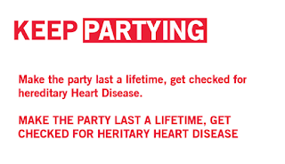
The poster design originally explored that of a white background, in reference to the research conducted it became evident that a red background would be more effective. Not only would this allow the poster to stand out against its environment, but it would also promote the 'redify' aspect of BHF's brand guidelines.
As the campaign focuses upon the aspect that you can only 'keep' doing things if you are alive, the 'doing' aspect of the poster was highlighted. This promotes the idea that hereditary diseases can lead to death if not controlled. Other information in which outlines the posters purpose would need to be added to this poster if it is to be taken further.
Similar to the original design idea, the word 'doing' was altered to 'living' in order to promote the importance of being tested for CHD. This was also highlighted using a white 'label'. By completing this action direct attention is drawn to the living element of the poster. As this is the most important piece of information, hierarchy has been implemented. Again further body copy would be needed if this design was to be taken further.
Keep partying
As traditional poster designs focus upon a portrait approach, a landscape design was explored with. This in turn making the consumer engage with the poster design further. This also allows the typography to be increased in size and thus legibility from a distance is increased.
A white background was explored, although it became evident that a red background is far more eye catching.
A highly minimal design was explored with in which focuses directly upon a hashtag. Although this is effective at gaining attention, the hashtag 'keep partying' would appear as if for some kind of club event and thus is not appropriate. A design of this nature would be far more suiting to that of a social media campaign, as a tagline/further hashtags may implement the meaning behind the hashtag.
A simple illustration was explored with, although this seemed to draw attention away from the typography. As the illustration would only be an aesthetical aid, it is not appropriate that it draws the attention away from the typography and therefore this design idea will be reverted back to the original typographic piece.
Relevant information was added. The heading/subheading are depicted throughout capitals in order to comply to the brand guidelines. Hierarchy has also been implemented into the composition of type, and type scale in order to promote a legible design piece.
The arrangement of the hashtag has been altered in comparison to the previous one line experiment. This action was completed in order to promote #KEEP as its own hashtag, as well as the corresponding hashtag of #KEEPPARTYING. By completing this action a wide variety of BHF hashtags will be implemented on social media, in turn promoting the issue.
The final design explores a clean and clear layout. The design is highly legible and hierarchy has been implemented in order to develop attention towards the most relevant aspects of the poster. Minimal type has been used in order to promote a vast read, a factor that is highly relevant as the consumer only has a 4 second attention span. Links have also been added to the campaign to promote the active audience to gain a greater knowledge upon their likelihood of inheriting CHD.
Critique
When discussing the poster designs with peers they suggested that the most effective approach was that of the final as it promotes the brand guidelines of the BHF as well as effectively targeting a younger demographic. It was stated that the clear nature of the hashtag allowed the design to be easily linked to social media, as well as developing a resource for the consumer to uncover more information. It was stated that the two tone approach was bold and impactive, in turn gaining the consumers attention from a far distance.


No comments:
Post a Comment