Colour trends 2018
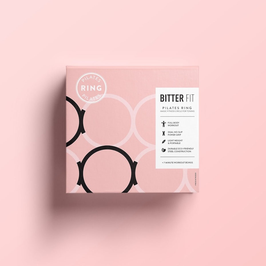
Pinks
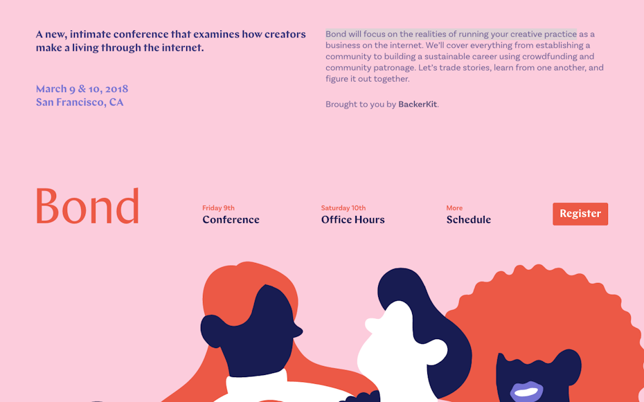
- variety of hues available
- highly impactful (pink on pink)
- stronger pinks can imply power
- gradients added (apply to the previous blogpost)
- strong colour combinations
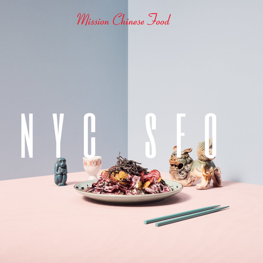
- pink and red combinations
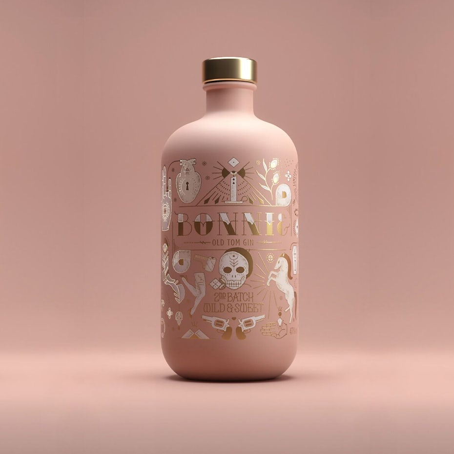
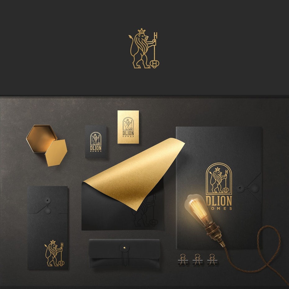
Metalics as neutrals
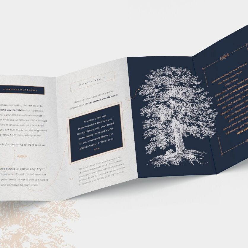
- metallics and foiling may be used to add quality towards a product
- makes the product seem 'upper class'
- works well with line illustrations
- metallics on a dark background is most effective
- works well on a range of mediums
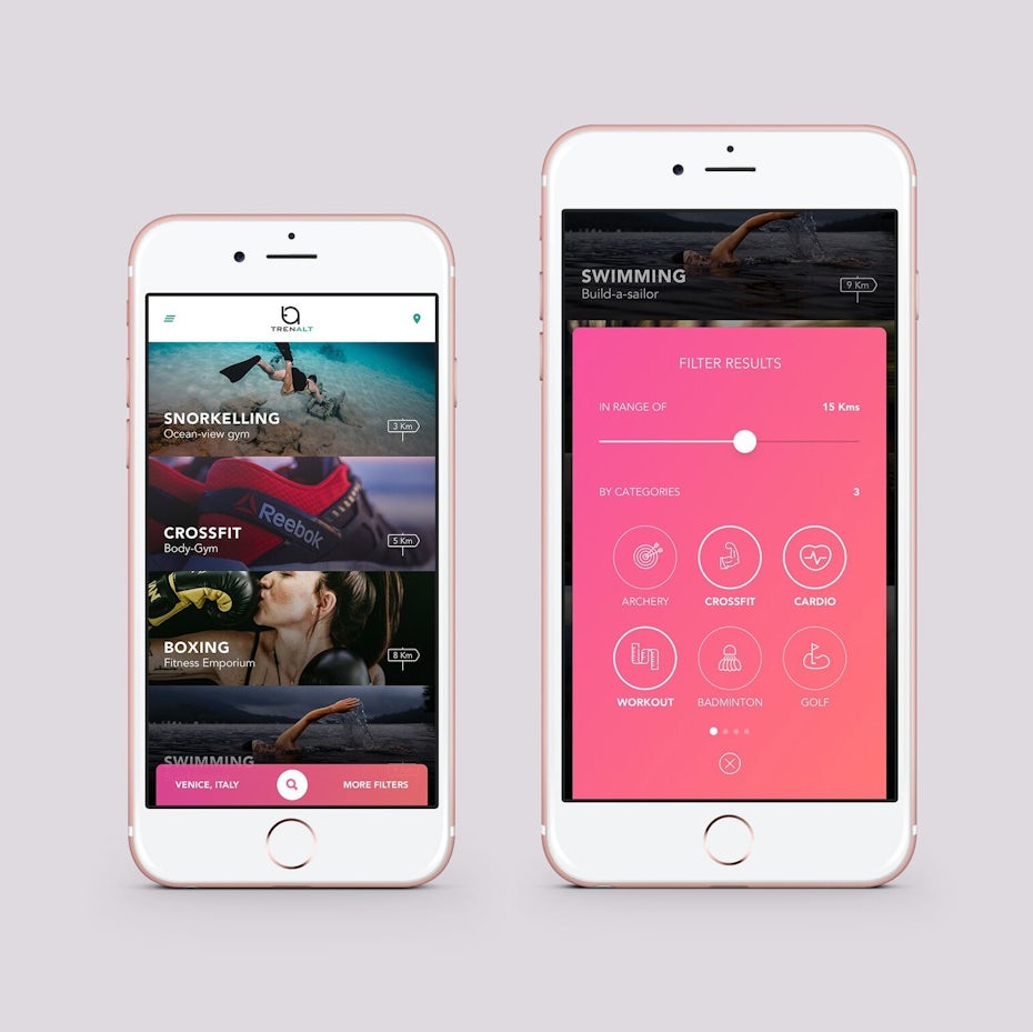
Bold
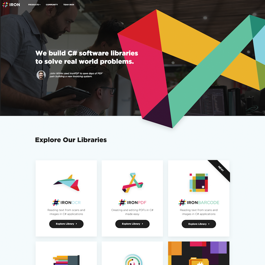
- Bold colours create impact
- in a block colour situation they can be highly effective
- works most effectively when combined with other block colours
- visible from a distance
Pantone colour of the year
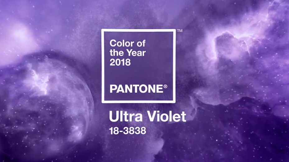
- Pantone colour of the year is often a theme in which people mimic
- Ultra Violet is highly pertinent
- other colour combinations
- could this be used as a block colour?


No comments:
Post a Comment