The foremost purpose of a grid – in graphic design at least – is to establish a set of guidelines for how elements should be positioned within a layout. Not only does an effective grid provide the rhythm for a design, but it also defines the meter.
This is an important part of making the content accessible, and helping the viewer understand where to find the next piece of information within the layout. It sets expectations and defines the rules, timbre and – in some cases – voice of the design. Think of a grid as providing the road map along which your viewers travel.
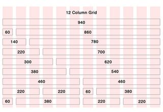
02. Grids define and reflect proportion
A key aspect of the grid is its ability to help determine and define proportion. In print, proportions most commonly echo the size of the media; the shape and orientation of the paper are often reflected in the size and shape of images included within a layout, for example.
This feels comfortable because the reader subliminally understands the context of the layout as a result of the physical shape and size of the delivery mechanism, such as a piece of paper.
On the web this idea of reflection isn't quite so important, but grids can be used in the same way to anchor content back to the screen. Screens can be more fluid, and as a designer it's not possible to know with the same confidence what size and shape of screen will be used to view content.
Regardless of this, proportion and scale are important tools in a layout, so using a grid to determine and enforce rules helps define that all-important set of signposts that enable the reader to access and understand content.
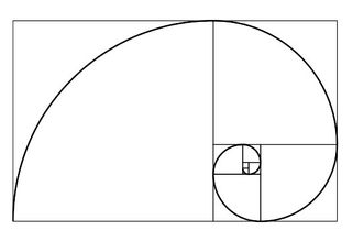
03. Grids work with the Golden Ratio
The whole concept of a definitive grid 'system' is a relatively recent invention in the world of design. Grids have existed intuitively since the earliest days of man drawing and writing, but it's only recently that layout has been considered in a scholarly fashion, and as such it has never existed in isolation from other best-practice layout rules. One such example of crossover is where the Golden Ratio meets the grid.
The Golden Ratio (also known as the golden mean) determines the most pleasing set of proportions for an element, and is simplified to the 'rule of thirds'. When used in combination with a grid, these simple rules for size, position and proportion can help ensure a layout feels coherent, but also aesthetically appealing.
This is important because, once again, it can help make the content more accessible. Remember that a grid is the invisible glue behind the content – in most cases it should be transparent to the viewer.
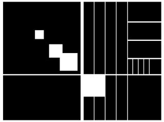
04. Grids provide a solid foundation
As we've seen, grids exist primarily to help determine the positioning and balance in a layout. Providing this kind of firm foundation can help ensure content is presented in an easy-to-understand order, but it can also be used to highlight specific areas of content simply by breaking them out of the grid.
The viewer will naturally identify these break-outs and be drawn towards them, giving the designer the opportunity to play with the hierarchy of a layout and tweak the meaning of a piece of work.
05. Grids work with other key design principles
Don't forget that the grid is just one tool alongside many basic principles you can use to enhance your layouts. Don't get caught up in using a grid too rigidly – some of the best designs break all the rules of grid layout and are all the more successful for doing so.
Understanding how and when to use a grid can only really come from experience, so experiment. Check out our other articles below on design theory to pick up other handy tools and principles you can use to enhance your designs.
No comments:
Post a Comment