Showing posts with label brief3. Show all posts

Tuesday, 30 January 2018

Final feedback/evaluation


When discussing the final product with my peers some key comments were made surrounding the design/structure of the publication. In aesthetical terms it was suggested that the magazine promoted a 'loud and proud' nature showcasing that LGBTQ members should be proud of their sexuality and not hide it. Adding to this it was suggested that the bold photography and type styles showcase an eye-catching, impactful design that would capture the consumers attention.


When thinking about the project as a whole I would suggest that it was fast passed, fun and allowed myself a greater insight into editorial design. It also allowed myself to use a professional printers for the first time, allowing a greater knowledge of industry.

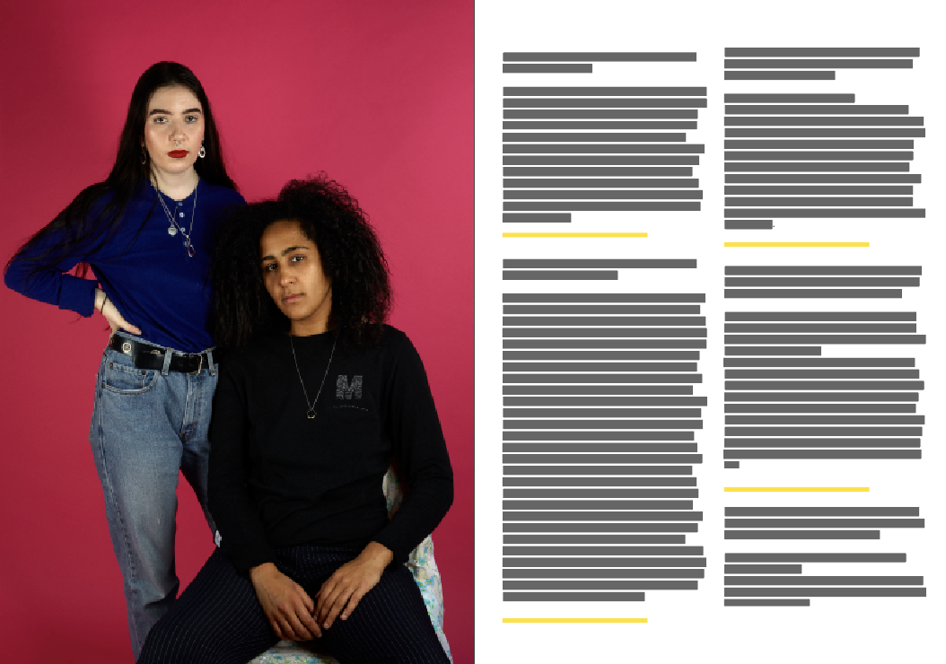
I would suggest that the final piece portrays LGBTQ members as strong and powerful individuals who have overcome discrimination in many forms. Promoting a strong hierarchical label, the design showcases that the individuals present a rhetoric of mimicry, removing negative connotations associated with the words:Gay, Bisexual, and Queer. This is further embedded within the use of colour within the publication.

As the final piece was to function as an outlet for discussion within the LGBTQ community, the content presented showcases this, highlighting that Queer individuals are often discriminated against. As the other function of the magazine was to work as a portfolio piece for Erin, I would suggest that her photography has been presented in a strong editorial in which highlights her imagery as a key piece of hierarchy.

Absurd Magazine Collaboration

In terms of Erin as a collaboration parter she was efficient, fast passed and very enthusiastic. She allowed myself creative freedom whilst suggesting ideas and design styles in which she enjoys.

The content needed was efficiently given (on time) through google drive files. The only issue really found was that as the images were tifs they were difficult to export/upload to drive. Other issues faced included that of update issues with software as the University computers do not contain the latest version of InDesign.

Cost was even, a factor in which widely differed from my Herbivore collaboration. This meaning that the total spend for this brief was around £22.

When thinking about this collaboration compared to the previous it was far more efficient, easy going and the final outcome is preferred. Erin was a massive aid throughout the project and helped rather than complicated the brief. Her time management was also excellent.

Ethical design for an ethical designer

As I want to showcase that I am an ethical designer within my portfolio, stock was largely considered when developing the final piece.

Recycled stock was used throughout the publication in order to ensure all stock was ethically sourced. Considerations were also made surrounding whether the finish would effect recycling efficiency.

Inks were also considered (such as vegetable ink) although these cannot be used on a small scale as a result of the cost, it may be mentioned that this method would be undergone if the magazine gained interest and needed to be mass produced.

In terms of ethical considerations the content was largely discussed ensuring that there were no factors in which may appear offensive/discriminative. Any issues in which arrose were removed after feedback sessions and tutorials. LGBTQ members were also asked to read the publication to further ensure no offense could be made.

Portfolio piece


As Erin is a photographer she was able to professionally take images of the publication, allowing for strong imagery to be presented within my portfolio, in turn providing a professional edge.

Although the images may be presented within my portfolio I may also take the physical copy in order to showcase the final design, this standing out from PDF mock ups often presented within portfolios.

Monday, 29 January 2018

Did I stick to the timeplan


Although the blogging of the publication was largely delayed (by placements and COP), the actual brief itself was completed in little over a week. This showcasing that if the design is directly focused upon the process itself can be fast. This being an essential skill if I am to go into an editorial based career.

In terms of blogging for the brief, it became as if a daughting task and was largely put off. As a result of this issues were later discovered in terms of missing artefacts/files, although all have now been successfully found. As I will not be expected to blog within my professional career, I believe that this not an area of concern although I will blog alongside following projects in order to combat this issue.

Professional printing

When getting the publication professionally printed two key factors were considered: the quality and the price. Therefore a range of websites were visited to find a printers in which would provide both of these key factors.

After searching an array of websites it was discovered when printing mass, Hobbs may offer a practical, efficient printing solution. If over 25 copies were printed it was outlined that the price would be as little as £4 a copy. As a result of this, and time running out for Erin's COP deadline this printers was selected.


Issues with digital print

When attempting to print a final copy myself and Erin found some rather limiting restrictions. Firstly it was discovered that if the publication was to be printed in the universities digital print each publication would cost around £7, this not making the magazine more expensive for the consumer. As the 18-25 year old demographic does not have a disposable income cheaper methods were also considered.

When developing the mock up (using digital print) it was discovered that the double sided printer was broken, in turn making the quality of the magazine weak. The inks used also did not promote the bright colour palette and did not justice for Erins photographs. As the final piece is to be presented as part of her portfolio we decided that we would get the final piece professional printed.


Uncut down variation (the final would appear much more proffesional)


Large white creases (as there is not a sufficent creasing machiene available) 


Some of the images appeared grainy, making the overal quality of the publication weak. 


Above are four examples of the issues with the printer and the effects in which it was having on the coloured background.


Final Spreads


The final spreads use hierarchy as a key tool in order to create balance and engage the consumer. This being specifically impactful with the 'labelling' of protagonists. These labels have been devised in order to promote the stereotypical associations made by society in turn developing a rhetoric of mimicry.

Another key design trait repeated throughout is that of a loose grid system. The grid system instantly adds structure to the design promoting legibility. Although the general structure is used, the grid system is sometimes broken, challenging the idea of 'breaking the norm'. In turn embedding the written concepts within the design structure.

Yellow has been used throughout in order to promote a neutral, strong colour palette in which install engages the consumer. As yellow is highly popular within contemporary design this is also highly relevant.

In relation to the feedback given by my peers it is evident that the final outcome is a niche publication as not all would want to be associated with the traditionally taboo topic. Therefore a peer suggested that the final outcome should be presented carefully within my portfolio. I somewhat disagreed with this comment and felt that I wouldn't want to work for a company in which discriminates and therefore will keep it in my portfolio.

Final front cover


In conjunction with the feedback given by Erin, the final front cover explores impact. Alterations were made towards the type, providing a black outline, in turn making the type stand out.

As the selected image itself breaks traditional gender expectations, it promotes a piece in which is highly impactful and would stand out upon a shelf, whilst also gaining the consumers attention. Yellow has been used as the key colour in order to promote impact as well as promoting an androgynous colour palette.


Thursday, 11 January 2018

CAD Mock ups of front cover


Below the best examples have been outlined in which showcase the title and photography most effectively. 


Using the negative space at the top of the photograph, the title balances the image. The placement of the protagonists hands seems to somewhat uplift the title, making it a key focal point of the page. 


By placing the text over the body it allows for the negative space to be present at the top of the page. As Vignelli frequently states that negative space is important within book design this has been largely considered. 


Placing the text over the body and face relates to the content of the publication, as LGBTQ members are often forced to conceal their true feelings and beliefs. Although this is effective at promoting the context of the publication, it reduces the impact of Erin's photography and therefore a key aim of the publication would be lost. 

When discussing the covers with Erin she suggested that the first was her favourite, although she wanted the text to have a black boarder. I was unsure about this, although it was decided that it would give the title hierarchal presence over the page.

Wednesday, 10 January 2018

Drawings (front cover)

In conjunction with the magazines aesthetic, a range of sketches were devised in which attempt to promote the publication to the consumer, whilst also envisioning Erin's photography.


Scale was widely explored with, although larger images seemed to appear more in keeping with the publication. The nature of the photography on a large scale would also create impact, due to the formatting of the images themselves. This, in turn, engaging the consumer from the initial point of contact.

In hierarchical terms, the title is the most important with the image embedding the context. As a result of this a range of compositions were explored, all of which attempt to highlight the masthead.

When discussing the drawings with Erin she suggested as there was an image already selected for the front cover the type arrangements should be explored digitally. She also went on to suggest that the larger the image the more impactful it will be.

Friday, 22 December 2017

Research-front cover design

As the imagery is to be the key focus of the front cover (similar to how it is the key focus of the content), research was undergone into front cover in which promote imagery. 


This type and image combination highlights the relevant imagery. The contrast of colour, makes the imagery appear less important than the type, a factor in which would not promote Erin's photography within my design. 


The above design uses a sleeve in order to promote the text. This leaves the publication itself having a full page of imagery, undisturbed by any text. Although this would work well with my design, the sleeve may be disregarded, leaving the publication without a name. This also makes the design appear confined and trapped, this, in turn, going against the context. 


Although not being the key focus of the above design, the imagery used works effectively with the type. Vast white space has been used in order to promote the effectiveness of the imagery. 


Overlapping type has been used in order to embed the type and imagery coincide well together. This also adds recent design trends towards the pieces. 


Developing an introduction page

Following the same format as the previous grid systems, a range of introduction formats was explored. As no imagery was to be presented in this spread, other decorative formats were explored.


Embedding the colour scheme within the spread, the design follows a similar format to the rest of the publication. Flush left has been used in order to ensure the type is legible. The design appears very simple and lacks the effectiveness of the other spreads. The arrangement as well as shapes may resolve this.


A block shape has been used in the above design in order to create a more visually pleasing aesthetic. This also makes the type stand out. 


An arrangement of type and shape layouts were outlined,  with overlapment being a key feature. 


In the above spread, the design micks that of a grid system present within the publication. The text appeared somewhat illegible and thus this is an element in which needed to be altered.  


A square shape was used in order to embed a theme within the design. This also promoted legibility a key factor within the design. 

Discussing my designs with Erin
Erin stated that she preferred the final design, as it felt clean, clear and consistent. 


Peer feedback 
Feedback given suggested that the final design promoted the best legibility. It was also suggested that this may be a good place to include editors details etc.

Thursday, 21 December 2017

Changes made & peer feedback


After completing the alterations, feedback was gained from my peers surrounding these and the general design of the publication. 

Relating to changes 
  • They suggested that as the kerning was now larger within the crease, the type should not be effected by the fold. 
  • It was also outlined that the type size did not distract from the relivant imagery. 

General


  • The general reception was strong, with my peers suggesting that the design was bold and impactive. 
  • Unfortunetly they also told me during the crit that the double sided printer within digital print was not working properly, and that I should test it in due time as this may reuslt in the publication having to be printed elsewhere. 
  • In terms of ethical deisgn, they said that the loud and proud nature of the design supported the protagonists, ensuring that they are precieved in a strong manner. 

Increasing the page count

Including the not yet designed front cover and reverse cover, two spreads are needed in order to make the publication a multiple of four.

Suggestions made by myself: 

  • That a contents page would allow the magazine to appear proffesional 
  • an introduction page, outling why the publication has been devised
  • a page highlighting all the participants and their social media hadnle (so that others can reach out and discuss their sexuality)
  • large spreads containing key imagery. 

Erins response 

Erin suggested that she would complete an introduction page, to inform the consumer about the publication. And that the final spread should promote further imagery. 

Whilst I waited for Erin to develop the written element (the only waiting part in which I have had to do so far with Erin), I decided to fix the previous errors, as well as gain reserach surrounding the front cover design. 


Outlined spreads

In order to highlight any errors in the design, it was essential that the design was to be seen as a whole. 


Error: kerning must be altered between the U and E, in order to ensure the letters are not lost in the crease.


Error: part of the Y would be lost in the crease. The text also takes away from the imagery as a result of its size.


Error: cropped image (Erin stated when showing her the current design that she did not like how this image had been cropped and that she would like the whole image to be present). 


Error: Patterned backgrounds do not coincide with the rest of the design. This was discussed with Erin whereby she stated that she still wanted them to be included. 


Error: as publications have to be devised in sets of 4 (for saddle stitch etc) the page number is down.


Resolving errors 

In order to resolve the outlined errors, key steps must be taken. 


  • Kerning must be adjusted where type runs into the crease. 
  • The overly large type must be reduced in size so that it does not take attention away from the imagery unless this is intentional. 
  • Cropping in which Erin does not like must be dealt with. 
  • The page numbers must be increased (this will be discussed with Erin).