Perfect bound this magazine was constructed in a manner in which appears expensive. Although the front cover explores a design containing postmodern values, the inner information was presented in strict grids. A large amount of text was contained within the publication, making it appear as a book. Little images were apparent, making the reading of the magazine highly daunting. The front cover is also white, a factor stated by Vigneli as a design flaw, as it would become dirty easily.
Eye magazine focuses upon a range of compositions, some including images, others including decorative type. The broad range of layouts is highly effective at engaging the consumer. This is also evident through the variation of colour presented throughout, making each spread appear individual.
Fuk magazine, similar to Eye, uses a broad range of compositions. Relevant text is enlarged in order to make the design appear less daunting. Body copy is also broken down in order to create an 'easy read' for the consumer.
The design journal explores black and white inserts, this instantly reducing the interest of the consumer. The images used are also very rigid, not following an illustrative or photographic format. As the size of the magazine is relatively large, this also makes it difficult for the reader to consume.
Focusing upon grid systems, Turps magazine uses images to balance the vast amount of type present within the magazine. Although this is more visually engaging than some of the designs previously seen, I believe that this format would not appeal to a younger demographic as they are not able to easily consume the relevant information.
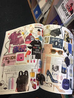
Focusing upon a glossy magazine nature, Bazaar focuses upon the traditional magazine format. Beauty pages highlight mass images being overlapped, making the design appear exhausting, as the consumer finds that there is a vast amount of information in which to gather. This promoting that the consumer can be daunted by both text and image.
Summary
From completing this task, it has been discovered that a broad range of magazines are currently available to the consumer. Designs in which contain mass text, do not appeal to that of the younger set demographic, as they often scan for relevant information. Eye magazine is a key example of how this younger demographic like to consume their information. A variety of text sizes allows the relevant information to stand bold, waisting less of the consumers time. The older set demographic also finds large paragraphs of information daunting, this largely due to their eyesight. As a result of this, if body copy is presented within my magazine it is essential that it is broken down into smaller paragraphs, in which are of a relevant type size.


No comments:
Post a Comment