Dominance
Compare any two elements in a design. Either the elements will be equal in every way or one will exert some level of dominance over the other. The more dominant element will attract the eye and get noticed first. It might even appear to exhibit some sort of control over the less dominant element.
The more dominant element likely has greater visual weight than the elements it dominates. It will seem to exert force on what’s around it.
 The circle exerts dominance over the square due to their relative sizes.
As you develop a composition, you’ll see numerous elements exerting dominance over each other. Some elements will dominate, and some will be subordinate. Without conscious control, you’d just hope that things all work out and that the important information will attract attention. Fortunately, you do have control.
HOW TO ESTABLISH DOMINANCE
You design one element to have more dominance than another by giving it more visual weight. The greater its visual weight, the more an element will attract the eye and exhibit dominance.
You create dominance through contrast, emphasis and relative visual weight. Identical items can’t dominate each other. To exert dominance, an element has to look different from the elements it’s meant to dominate.
Your goal is to create elements with noticeable differences in visual weight.
You can vary the same characteristics that we talked about in the last couple of articles in this series. As a reminder, here are the most common characteristics you can vary to set different visual weights:
- size,
- shape,
- color,
- value,
- depth,
- texture,
- density,
- saturation,
- orientation,
- local white space,
- intrinsic interest,
- perceived physical weight,
You can create dominance through visual direction as well. For example, you might surround an element with arrows all pointing to that element. If there are enough directional cues, the element could become dominant even if it’s of lesser visual weight than other elements on the page.
You can also have co-dominance, where two dominant elements exist within a composition. However, both will compete for attention and could ultimately be distracting without the right overall balance in your competition.
Ideally, you want a single dominant element.
THE DOMINANT ELEMENT
The dominant element in a design is the one with the greatest visual weight (or the one that everything else points to). It’s the element that attracts the eye first, more than anything else on the page.
Be careful not to make the element so dominant that it completely obscures everything else, but do make it stand out in the design.
Your dominant element is the starting point for the story you’re telling. It’s the entry point into your design. It should attract visitors to the first place you want them to look.
This is how you start a conversation with visitors. The dominant element is noticed first and sets the context for what’s seen next. It’s at the top of the hierarchy. It should emphasize your most important information, because it might be the only thing anyone will see. Whatever message you want people to take away should be clearly communicated in or near your dominant element.
Without an entry point, viewers will have to work harder to find their way into your design. They’ll have to pause and think where to look first and think about what’s truly important on the page. A lack of entry point will increase the cognitive load on visitors. Don’t make them think. Provide an entry point into your design.
Focal Points
Focal points are also elements or areas of dominance, just not to the same degree as your one dominant element, which could be defined as your most dominant focal point. Focal points are areas of interest, emphasis or difference within a composition that capture and hold the viewer’s attention.
The focal points in your design should stand out but should be noticed after the element with the most dominance. The graphic below shows a lone circle amid a sea of mostly gray squares. The circle is not only a different shape, but is larger and bright red. It’s likely the first thing your eye notices in the graphic.
Three of the four squares are also reddish in color, though not as bright as the circle. They’re the same size as the other squares in the image, but they do stand out from the gray squares due to their color.
The circle and the three reddish squares are all focal points because they stand out from the majority of other elements in the graphic. They contrast with the mass of gray squares. The large bright red circle stands out the most. It’s the dominant focal point, or the dominant element in this image.
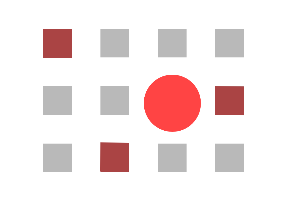 The red circle and squares are focal points. The circle is the dominant element or dominant focal point.
As with the dominant element, you can create focal points by giving them more visual weight than everything except the dominant element — which, again, is your most dominant focal point. You can also create visual direction that leads to different focal points.
Contrast is a good way to create focal points, because contrast calls attention to itself for being different. Anything that can be contrasted and anything that can affect visual weight or direction can be used to create a focal point, in the same way that it can be used to create a dominant element. The difference is simply of degree.
Levels Of Dominance
If you create focal points and make one of those points the dominant element, then you’re starting to create different levels of dominance. The dominant element will sit on one level and will be noticed before all others. The remaining focal points will sit on another level. How many levels of dominance can you realistically have in a design?
Three is a good number. As a general rule, people can perceive three levels of dominance. They notice what’s most dominant, what’s least dominant and then everything else. There needs to be enough difference between these levels for people to distinguish one from the next. You want to create distinct levels, not a continuum.
You could create more than three levels of dominance, but each additional level will reduce the contrast between neighboring levels. Unless you’re sure you can contrast each level well enough, stick with three.
- Dominant This is the level with the most visual weight and the one that gets the most emphasis. Your dominant level will usually consist of a single element in the foreground.
- Sub-dominant This is the level of focal points, with the exception of the dominant element or dominant focal point. It gets secondary emphasis. Elements on this level get less emphasis than the dominant level but more than the subordinate level.
- Subordinate This is this level with the least visual weight. It should recede into background to some degree. This level will usually contain your body of text.
It’s possible for different people to look at a composition and think that different elements are focal points or even the dominant element. Remember to go big enough with your differences in visual weight to make clear which level is more dominant. You want your dominant element and focal points to be as obvious as possible.
Visual Hierarchy
As you design distinct levels of dominance, you create visual hierarchy in the design. Ideally, this visual hierarchy will match the conceptual hierarchy of your content. If an article’s heading is more important than a caption in the article, then the heading should be more visually dominant.
Base your visual hierarchy on the actual priorities of the information being presented. First, prioritize everything that will go on the page, and once it’s set, design a visual hierarchy to follow that prioritization.
Visual hierarchy enables visitors to scan information. It helps you communicate a message quickly and effectively. The top of the hierarchy (the dominant element) should help to answer questions a visitor might immediately have upon landing on the page.
Within seconds, visitors should be able to pick up the key points and main message of the page. They can do this if you make the most important information the most visually prominent.
People who stick around longer than a few seconds should be able to scan through the focal points in your design to gain the next most important message(s) that you want to communicate, and so on with the rest of your information.
THE INVERTED PYRAMID OF WRITING
Establishing hierarchy in a design is similar to the way journalists use the inverted pyramid of writing. The most important news is all in the first paragraph or two. The lead covers the who, what, where, when, why and how. It tells you everything you need to know.
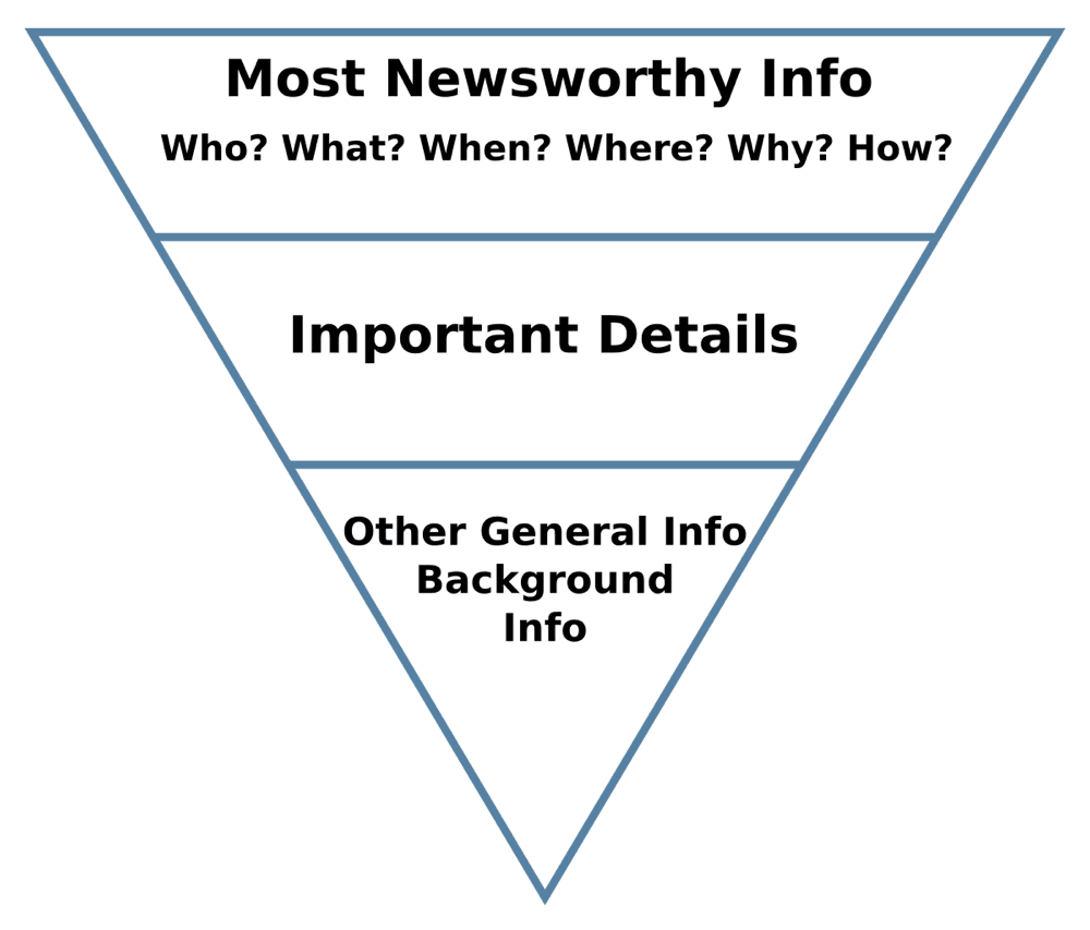
The lead is followed by important details that fill out the story. They’re details that provide context or help you understand the story in greater depth. Toward the end of the article is the general and background information that’s nice to know but not necessary to understand what’s going on.
If someone reads only a sentence or two, they should come away with the most important information. The longer they stick around and the more they consume, the more details they’ll get.
Visual hierarchy works the same way, except that it doesn’t have to flow linearly from the top of the page. You get to control where people look first, second and so on
Again, three level of dominance or hierarchy are recommended, although four or five are still possible.
Gestalt Principles And Visual Hierarchy
Visual hierarchy evolves out of gestalt. Focal points are one of the gestalt principles. Your dominant element is an extreme focal point. Both use contrast to stand out. The other side of the coin is similarity, which helps us to see things as the same. Similarity and contrast are necessary ingredients in hierarchy.
Such laws as the ones of prägnanz and symmetry are about creating order and making things simpler and clearer. That’s exactly what you’re doing when you build hierarchy in a design. You’re organizing design elements to establish a sense of order.
The dominant element is likely seen as the figure. The least dominant elements are likely seen as the ground. Really, any principle related to connection or separation can be applied to dominance and hierarchy.
No comments:
Post a Comment