
After completing mock ups, it was decided that a range of compositions should be drawn, making each spread appear slightly different. Although suggesting this, it was also highlighted that re-occuring layouts should appear throughout the design in order to promote continuety.
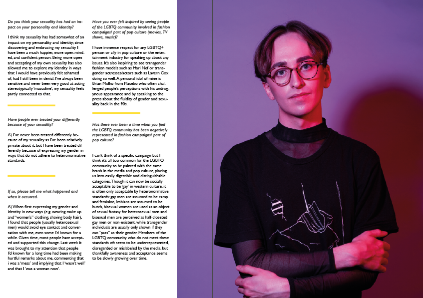
Focusing upon a minimal layout (in order to promote the imagery), the two spreads above explore different ways in which information may be formatted. Body copy has been divided into sections, making each question and answer stand out. This has been further embedded with the usage of shapes. In order to promote continuety between the desigsns, the yellow colour theme has run throughout. Black text has also been used for body copy.
To ensure that this is the style in which Erin would like the photographs to be displayed, feedback was gained.

She suggested that the spreads 'looked amazing', when later discussing the designs with her in person, she suggested that she would like the following spreads to appear simailr. As I had cropped some of her imagery, I asked if this was okay, she suggested it was as it highlighhted key details within the images.
No comments:
Post a Comment