In conjunction to the meeting with Calum, research was undergone into impactive poster designs. The focus was upon loud colours, showcasing that London is a bright, bold city that never sleeps.
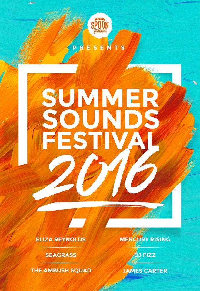
- Brush strokes appear creative and artistic. They also promote a relaxed, friendly atmosphere.
- Contrasting colours have been used to create impact.
- Contemporary type has been used to promote a fresh aesthetic
- Hierachy has been implemented in the above design in order to instantantly inform the consumer.
- Contrast between type and image has been made
- Bold colours create a lively atmosphere, whilst promoting a friendly tone

- Contemporary design
- Combination of text and image

- blocked type makes for an interesting design

- Block colour illustrations create impact, especially from a distance
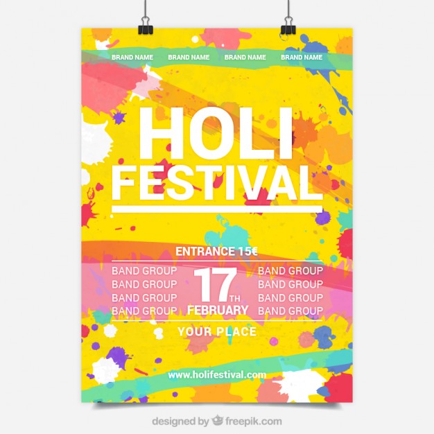
- 4 basic colours have been used, although I personally believe that this appears overwhelming and somewhat confusing.
No comments:
Post a Comment