
- A mixture of type and illustration have been used in the above packaging designs in order to create impact
- Black and white have been used in order to express a upper-market aesthetic
- Separate colours have been given to different variations in order to create a distinct range


- illustrative characters have been devised as the basis of the Magic Rock branding, promoting a distinctive eye catching brand.
- Again separate colours have been used in order to present a range of product for the brand.
- The colours used express the taste represented

- Bright, bold block colours have been used in order to create impact
- The colours used appeal to all sexes
- Black has been used for the background in order to create a stronger impact
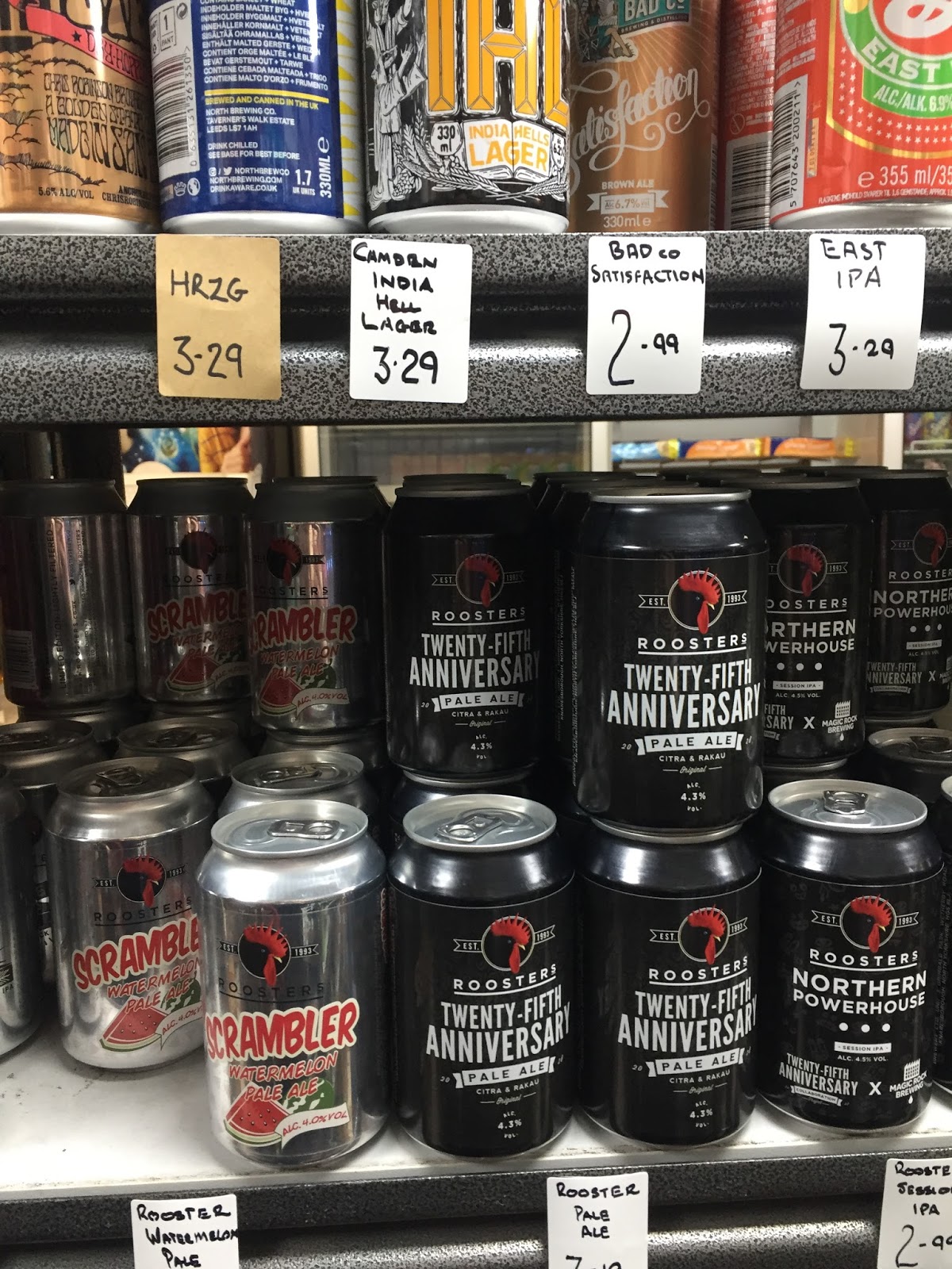
- Black is often used to express the beer within (in this case a black porter)
- White type has been used to create contrast

- Large type is impactful, although this does not represent the taste as clearly
- The colour of the beer/ale/stout is often represented through the packaging design

- Brewdog is a key example of a craft ale brand in which has grown enormously
- Primary and secondary colours are largely expressed.

- Another key example of Magic Rocks branding

- Modernist and simple, the illustrative style of this ale packaging stands out from its competitors.
- Geometric shapes have been used to implement contemporary design trends.
What have I learnt from this?
- Contempory design trends are often mimicked within ale packaging.
- Illustrations are highly common
- Colours are often used to diferiniate beer flavours
- Branding is often simple, although colourful
- Charactures make for a friendly, fun approach
No comments:
Post a Comment