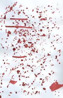
Blood splatter approaches were explored using ink. Multiple styles were experimented with, including smearing, finger prints, droplets and text.
These blood splatters were then placed behind the previous text and scanned in. The positioning of the text was explored, in order to gain multiple approaches in which contain diffrent amounts of blood. One piece of feedback was that the more blood apparent the easier the style is to read, as otherwise it appears somewhat illegible.
In order to increase the intensity of the blood it was edited using photoshop. The original scan was layered multiple times, with the opacity being altered. This in turn allowing a layered approach to appear apparent. Colour was also explored, with a deeper red being used in order to express the passing of time from the murder to the current event.
The left hand approach follows that of a similar style as previous, although this time the background exhibits blood splatters. The pale nature of this design does not allow it to appear effective, and grab the consumers eye from a distance. Due to this it was decided to not take this design forward but to alter the key components within it in order to express another piece. From doing so the right approach was developed. Using the same blood splatters as previous, and the same cut type, this piece is a re-working of the previous elements. The bloods intensity has been widely increased in order to promote shock factor. The text also uses a layered approach in order to convert back to its original origins of scalped text. This approach appearing far more gruesome than others. One factor in which limits this piece is that of the legibility of the text and thus further approaches were expressed.


These two approaches follow a similar style although the text size has been increased in turn promoting legibility. The first approach is simple, and allows the reader to gather the information straight away, whereas the second approach focuses upon a banner format and thus the information is not initially given-making the process of consuming the cover far more interesting to the target audience.


No comments:
Post a Comment