


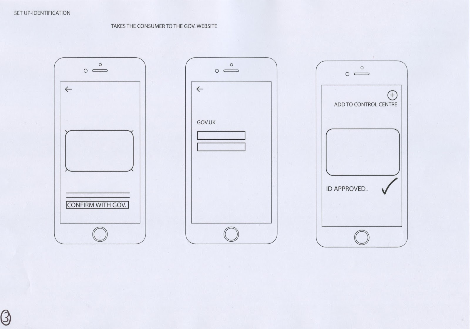


From the previous sketches wireframes have been developed in which express a clear indication of the intended layout, including image and text. By doing this it is evident how many transitions are needed in order to set up the app. Consistency is also a factor in which may be monitored.
The general layout is simple, and easy to navigate. Two factors in which would allow the design to be easily interacted with. As the app is a new variant of a previous, some layouts have been taken from that of the original and then altered. This is present with the landing page. This therefore allowing pre-existing consumers to not be confused by the new layout, but to embrace it.
Feedback
As a range of feedback was wanted surrounding the navigation, security, and aesthetically presence of the app, questions were derived in order to gather such response. The following questions were asked:
- Would using the control centre be an easier way in which to access the app?
- Is the app easy to navigate?
- Would icons be a good way in which to represent information?
- Is the layout clear?
- Would you feel safer using the in app version or the control centre?
- Would you yourself use this app?
- How does this app make you feel?
The responses to these questions are expressed below:
Would using the control centre be an easier way in which to access the app?
- "I wouldn't feel safe using the control centre unless security measures were in place as otherwise others may access the app. Maybe a double tap feature could help this?"
- "It's a quick and easy way to access the app, with a smaller click count you would be more likely to use this on a daily basis."
- "The home screen seems simple and easy to use"
- "Makes the app more accessible".
- "Security risks appear higher and thus mass research must be done".
Is the app easy to navigate?
- "The app flows"
- "Make the experience as clear and simple as possible, especially for security-make the consumer feel safe".
- "The set up appears somewhat complicated, make it as simple as possible".
- "Straight forward and simple".
- "Yes, simplicity on screen looks easy to use".
- "Yes, it is simple but conveys the concept well-easy to use, navigate and function."
Would icons be a good way in which to represent information?
- "Icons would be good for time, so you can quickly recognise the icon, but have to be simple in design to not overcomplicate the screen".
- "yes, as long as you don't use too many"
- "Icons could make it appear engaging although make sure they are clear and professional".
- "Would make the app fun and easy to use".
Is the layout clear
- "Appears clear and well organised".
- "Appears clear, the less text the better".
- "Straightforward with clear steps to follow".
Would you feel safer using the in app version or the control centre?
- "The in app approach seems safer as if a password was used they can be easily stolen".
- "The control centre, is also easy to use"
- "If a contactless limit was added this may help security risks".
Would you yourself use this app?
- "Yes".
- "Yes".
- "When applicable".
- "If I forgot my card, yes".
How does this app make you feel?
- Tech savvy
- Mature
- Safe
- Unsafe
- Happy-when forgetting card
- Intelligent
Key factors that can be gathered from this
From the feedback gathered there has been a diverse input of ideas and suggestions, it which will be considered further. When discussing the control centre it was evident that some people were unsure upon the security risks, and felt that the control centre should be restricted. In order to remove fraudulent behaviour a fingerprint will be needed to access the app. This being the one in which you have previously set your iPhone 6 up with.
The general navigation and layout of the app was said to be clear, although it was suggested that minimal information should be used, as this may complicate the screen. The idea of using icons was also highly recommended as it suggested a clear layout. When discussing icons individually it was said that their general design must be simple, in order to inform the consumer directly. It was also stated that humans direct using images firstly rather than text and thus the icons would be a good way in which to tackle this.
When asking whether they would use the app or control centre more, a diverse outcome was developed, with both sides being highly commended. Due to this a favouritism should not be expressed through the designs.
The feelings around the app widely changed, although unsafety was a key feature. To eliminate this, key security features must be put in place. It was also suggested that the app make the consumer feel mature and tech savvy, two factors in which should be promoted further.
No comments:
Post a Comment