
The colour palette used within this design appears very clinical due to the vast amount of white being present. The colours depicted on the leaflets edge make each leaflet distinctively different to the rest of the set, but still allows the designs to be perceived as part of a set. The general aesthetic is dull, and would not appeal if distributed through a leaflet dispenser.

The use of image within this design is impactful, although the second page appears very text heavy and thus is difficult to read. Four different colours have been used to present typography, a factor I feel is too complicated for a formal design. I also believe that the red text appears out of place against the other typography therefore when developing my own design I will use a minimal colour scheme to divert attention away from the aesthetic and towards the content.

Although the same principle as the first leaflet discovered this design appears to have a much more stylised approach. When comparing it towards the first design is it obvious that the impactful nature of imagery allows this brochure to appear far more interesting and thus is more likely to grab the consumer's attention. The white used in correlation to vivid colours allows for the distinctive colours to appear brighter and bolder. This is a factor I will consider when developing my own C.A.D designs,
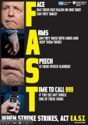
This campaign is definitely the most iconic related to strokes. The quick slogan and steps allow for a design in which is easy to navigate, straight to the point and is likely to save someone's life. The last thing that you want to do during an emergency is to scroll through endless amounts of text. The leaflet also appeals to all ages due to its minimal content and large typography. I feel that an approach in which is hard hitting rather than full of content is much more effective, thus I will attempt to mimic this within my designs.

A simple slogan is thought provoking, impactful and creates an enigma. This instantly intrigues the consumer to discover more information and to read the leaflet. A strong sans serif has been used in this case to develop a hard hitting, legible question. The text is also visible from a far away distance, thus is likely to engage with consumers before any other designs.
No comments:
Post a Comment