When thinking about how myself and Amy would work as a collaborative team, it was decided between us that Amy would develop the initial pattern/illustration of the design, and then I would compose the design, adding key relevant text. The structure will also be an area in which I will focus, with discussions being made between myself and Amy ensuring that we both have the same visual understanding.
Although the pattern is to be developed by Amy, visual research was undergone in order to gain an understanding upon what kind of pattern would be most suitable.
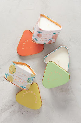
The above design uses white as the main colour, with secondary colours changing depending on the colouring of the actual product. This therefore adds continuity to the design, and allows all areas to link effectively.
Bold and colourful, the above design explores a strong pattern in which brings the product to life. Distinguished shapes have been used in order to promote a detailed yet impactive design. The usage of animals allows the product to appear natural, and thus this may be an area in which myself and Amy discuss.
Soft variations of bright colours have been used in the above design in order to connote a fun, and friendly product. Yellow, orange and green are all colours in which appear in nature and have been tailored to each product.
Natural mediums for example ink have been used in order to express the above designs. This appears far more natural than a heavily CAD developed piece. The soft lines also connote a friendly and welcoming atmosphere. When discussing mediums with Amy this may also be a route in which we explore.
Although highly impactful the above design explores harsh shapes and vivid colours, two features in which would not make the product appear natural but rather artificial. The logo is also difficult to see as a result of these features.
Nude pinks have been used, as well as minimal detailing in order to promote the above product as natural. The paper material also further embeds this.
Although black and white, it may be suggested that this design is highly impactful. Using no colour, it is suggested that the product is pure. This may also highlight the product if the packaging was clear.
From completing this exercise some key points should be noted.
-Hand rendered methods appear more natural than CAD, and allow a soft relaxed feel towards the design.
-A natural colour palette should be considered, as this will promote the organic nature of the products.
-Shapes work well.
-Animal characters may be discussed.


No comments:
Post a Comment