As I wanted to maintain a young free feel, pencil illustrations were developed. These were completed in order to showcases the different ways in which a pencil may be depicted. Being 'ultra' feminine the set attempts to market women from all cultures with the notecards playing a vital role. The notecard set is specifically for individuals who attempt university, with stationary being expressed in order to show this. Embodying the idea that no matter what your religions/cultural beliefs are, every women has the right to an education.
Initial sketches highlighted different ways in which the illustration may be drawn. As the target audience is 18-25 year olds I felt it important to select the more detailed design, in turn showcasing maturity. Although the set is to be developed for that of 18-25 year olds I wanted to express a set in which feels young, and light in design terms therefore allowing the design to be used in many circumstances.
The pencil ink drawing was scanned in and manipulated using Photoshop in order to express a pink hue. The pencil was then placed alone upon a pink background, with the pink again expressing a connection to the previous cards as well as expressing the concept of femininity within education.
Composition was widely explored in order to gather a strong, visual outcome. The idea of the pencil writing was tested although this felt somewhat immature and thus would not appeal to that of a 25 year old. When comparing the design to that of the card set it was evident that a similar nature was not expressed. When looking closely at what ties the cards together as a set it was evident that the 'repeat pattern' nature allowed for continuity. As a result of this it was decided to explore a repeat pattern effect.
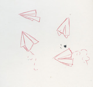
Paper planes
The concept of paper planes were selected in order to formulate a design in which showed fun within education.
Simple structures were explored with in order to gain a strong illustration. 'Flight marks' were also explored with in order to dictate movement, this was a design element in which I felt lifted the design and made it appear contextually stronger. It was decided that the slimmer designs felt more elegant and would be positioned within the set more effectively.
Again composition was explored with one of the illustrations feeling out of place and thus it was decided that the pattern approach should be again completed.
Movement within the design was expressed with planes being situated within different positions. Although this made for a more visually engaging piece, it did not comply to the patterns expressed upon the cards/other notecard and thus it was decided that a more traditional format should be explored.
As throughout the set movement has been expressed ( a key example of this being the movement of the balloons), it was dceided that the planes did not have to follow a strict side by side format. When completing the pattern large limitations were drawn as I could not repeat the pattern as I could previously but rather had to develop the pattern by hand.
Colours were again largely explored, taking into consideration of the cards. As planes are most often depicted within the sky it is fair to suggest that the consumer is more likely to feel a connection towards a design in which mimics familiarity. As a result of this the turquoise blue was selected.
As time was quickly running out the same illustration was used but without the 'flight marks' in order to complete a new piece. The regimented format in which was expressed within previous cards was used in order to appear different from the first design as well as expressing contiuenty with the set. Colours were widely explored in order to gain a strong outlook. The green was chosen as it had not previously been used within the notecard aspect of the set.
Clouds/speech bubble
Thought clouds/speech bubbles were explored with in order to express the concept of 'getting your ideas out there', highlighting that young women can make a change.
The thought bubble ink drawing was explored with in terms of size and colour although I felt that the large negative space apparent within the design felt somewhat distracting and took away the impact of the design. As a result of this it was decided to move on from this design. If i had more time I would have liked to have pushed the design further
From my initial drawings a speech bubble in which contained further details was selected. Again a one approach was explored, with this feeling unengaging.
The text bubble was then enlarged in order to attempt to resolve this. Gain I personally felt that the design appeared distant.
Further speech bubbles were added to the design but compared to that of the pencil illustration the pattern appeared week. Due to the large intensity of the pencil notecard I felt it important that more speech bubbles were included within a regimented format.
Once more bubbles were added to the composition the design began to feel far more fitting to the set. As purple had not been previously used within the notecard set it was included, in turn relating further to the cards. Purple is also associated with mystical thoughts and thus I felt this suiting.
Hearts
As an extra a heart design was quickly formulated. Due to the illustration style not suiting that of the previous designs, it was discontinued. The details present within the heart were far too complex to be expressed upon a small scale.


No comments:
Post a Comment