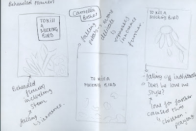
Beheaded flowers
- As the flowers demolished within the novel were from a camellia bush, the beheaded bush is expressed within the initial design. A classic square then incorporates the text, this again relating to the classical element expressed within the brief.
- The second design follows that of fallen petals, an idea in which shows the diminish of innocence throughout the novel.
- The third shows the weltering of the plant, a slow and delicate process in which again shows the innocence lost. This may also apply to death.
Childs Perspective
- The first approach expresses the protagonists legs through a suit. As no race is indicated, it is therefore suggesting that the children within the novel do not see race, and thus are viewing the case through an innocent perspective.
- The second design again is from a child's perspective but highlights the court. Tom is on the stand, with an all white audience again showing the prejudice of the time.
Clock
- The first approach dictates that of a mantal clock. A period clock in which was highly prominent through the 30's and was most likely present within the finches home. In relation to black families of the time it would have been very rare for them to even own a clock, never mind one of this calrbra and thus the reasonings behind the usage of such a clock. The clock has also been used to express the long period in which it took the jury to find Tom guilty
- The second approach explores the same sentiment with the clock face, although the racial tensions of the time has been highlighted with a half black and half white approach. This is to build tension, but to also express the segregation in which was occurring throughout America at the time.
- The third approach is the same again, but express a minimal design in which is so minimal that the feelings behind the design appear to engage the consumer rather than the design itself.
Typographical
- Within the first typographical approach, all characters are higher case apart from that of the 'i' this is to further embed the theme of innocence within the design.
- The second approach is similar although the 'i' will be in uppercase, and made larger. This is to highlight the theme of innocence within the book.
- On the third approach, a halo effect will be subtly used in order to express the themes of death and religion within the novel.
Tree
- The first approach explores typography merging from the tree's roots, in turn expressing the novel as being rooted within American history.
- The second design explores a minimal design whereby the tree is leafless. This again promotes death of innocence.
- On the third approach type is situated on a tree's branch in a similar way in which a mockingbird would perch. This is a key theme expressed within the book.
FEEDBACK
As I was unsure upon where to take the sketches, and how to select specific designs to develop further, feedback was gathered. This was to help gain a real life insight into how people would interpret the covers and whether some were too ambiguous or too obvious.
When discussing the concept of the beheaded flowers it was stated that the approach may appear too ambiguous as you would have to read the book first to understand the design and thus this may be more appropriate to the secondary target audience.
In terms of the child's perspective it was stated that this would make the book's design appear somewhat purely about the case, and thus may make it appear as if a crime novel, in turn drawing in the wrong audience.
When discussing the clock approaches it was stated that the divide between black and white was strong and that this should be explored about with further, taking the clock face into special consideration.
The typography approaches were commended, with it being stated that the approaches may appear highly effective if type set and produced in a high format. It was also stated that it is best to explore with digital type versions as it is difficult to gather a grasp of them through sketches.
With the tree approaches it was stated that a minimal, non flourishing tree would be best to explore with, and that it relates back to the classical nature of the book.
From this feedback it has been decided to explore with designs further through the medium of CAD in order to gain a greater sense of book cover design.


No comments:
Post a Comment