Using the basic format from my initial ideas, I formulated a design in which appears more human like. I did this by incorporating muscles, and weight proportions. I personally feel that by doing this it gives an edge over the basic shape idea presented within my sketches.
Although not monotone, I felt it important to show how the symbol could be used in different contexts. Within this design I attempted to manipulate the olympic rings into appearing similar to that of ribbon, in which is involved within certain gymnastic sectors. Overall I felt that this design works well although the rings may be difficult to differentiate when the pictogram is rescaled.
Again to see how the image could look in a different context I decided to strategically place the olympic rings on the symbol in connotation to sectors of the sport involving ribbon. I felt that by doing this it allowed me to see the potential of the pictogram without it having to be purely monotone, although if I did choose this idea as my final I would have to choose the simplistic design not involving colour.
Following my initial sketches I began to create a figure formed from basic shapes. As I previously thought that the sketches appeared too formulated, due to the grid, I began to shape them with much more flexibility. Although my design would appear in black I again wanted to create some context towards where the pictogram could be manipulated further, this is displayed within the below designs.
I experimented with multiple body shapes to display a wide variation in context. I also did this to recognise which symbols appear the most strong and balanced, as those are key characteristics of the sport. I manipulated colour to involve the colours of the olympic rings, although when I asked my peers about this design decision they stated that it made the shapes appear separate and not a part of the gymnasts body.
Using a similar format to the designs previous I developed a pure shape version, in an attempt to create balance, and a solid structure. Compared to my other designs created in a similar format I feel that this lacks personality, and also doesn't initially appear human like, due to these reasons this design will be discontinued.
As creating a monotone symbol was my set brief, I decided to take the most impactful image from my previous designs and incorporate colour. I decided upon yellow due to its relationship with optimism, and as gymnastics is one of the hardest/most competitive olympic sports it is generally seen as optimistic to achieve that goal. The colour also has correlations to medals thus my intent.
Again with this image I attempted to mimic the body shapes of two athletes, although not monotone the design doesn't not work in one colour due to the separate people emerging as one and thus being identifiable as a 'H'. Due to these reasons I will not be taking this design further.
Again using the athlete's body as a basis I developed a simplistic design that portrays body shape. Due to the vast amount of negative space involved within this image I feel that it appears imbalanced, also as multiple sharp edges appear visulant the design appears very aggressive. Green was chosen as the base colour due to its extensive relationship with health and organic matters. This specifically applies to the organic shapes that gymnasts are profound for making within their routines.
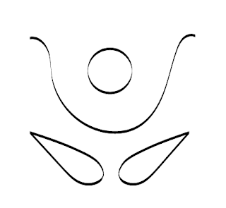
I experimented with different styles and formats to display the characters in. Within the lower design a curved brush was used to demonstrate the flexibility present within athletes. I felt that these designs resembled very much the format of yoga and therefore lost their appeal for me, although the concept of using a curved brush tool appealed to me greatly.
Taking influence from my initial design and the curved brush tool, I developed a flowing design, again resembling flexibility. Although this design was appreciated, I felt that if it appeared on a smaller scale it would appear illegible due to this reason I decided to experiment this same technique on a basic line, the produce of this is depicted below.
When developing this symbol the importance of stroke width became very apparent to me. The bolder, lower image appears much more impactive than the top. I experimented with using just one colour but felt that the shadow effect depicted the passion bursting from the protagonist about their love of sport, thus due to this contextual reason I feel it would be worthless without the two colour, and therefore is not applicable to my monotone brief.


No comments:
Post a Comment