Wednesday, 30 December 2015

Public Information film- Hard Shoulder

The general themes displayed within this video are that the hard shoulder mustn't be misused and that doing so is severely dangerous.

The video contains other key information such as:

  • The usage of motorways purley being for fast moving traffic
  • Hard shoulders are only for emergencies
  • That hard shoulders are not for: casual stops, checking maps, changing drivers.
  • £1000 fine if insistent to stop without cause
The general tone of voice was formal, and conducted by a male, which at the time of the 70's would authenticate power. 

As the video mentioned children and depicted a middle aged couple arguing it would suggest that the advert was primarily targeted at both male and females aged 25 plus, from an ABC1 demographic. Although the secondary audience for this advert is generally anyone who can drive and thus 17 plus.


Further information surrounding motorway safety, that is in place now:
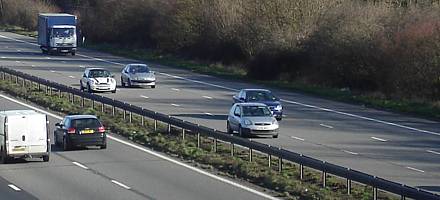
  • More than 800 people killed or injured each year on hard shoulders and lay-bys
  • 24% of drivers have risked their life unnecessarily by non-emergency use of hard shoulder
  • Illness, toilet breaks and running out of fuel most common excuses
  • Non-emergency use of hard shoulder incurs up to £100 fine and three points 

Excuses for non-emergency/avoidable use of the hard shoulder

  • Driver or passenger had to go to the loo - 5%
  • Driver or passenger was ill e.g. travel sickness - 5%
  • Run out of fuel - 4%
  • Reading a map - 2%
  • Driver needed a rest - 1%
  • Non-emergency phone call - 1%
  • Problem with a pet or animal being carried in car/trailer - 1%
  • Other - 5%
  • Total - 24%

Hard shoulder safety

Drivers must shoulder responsibility for Motorway misuse

Drivers must shoulder responsibility for Motorway misuse
With millions of drivers expected to hit the road over the Easter weekend, AA research shows that around a quarter of them have potentially endangered their lives unnecessarily by stopping on the hard shoulder in a non-emergency.
Since 2000, 836 people* on average in the UK have been killed or injured each year in incidents on hard shoulders and lay-bys.
An AA-Populus poll of 18,806 AA members** established why people make non-emergency stops on the motorway.

Excuses

Illness or toilet breaks (both 5%) were the most common excuses, followed by running out of fuel (4%), reading a map (2%) and making a non-emergency phone call (1%).
  • More than 800 people killed or injured each year on hard shoulders and lay-bys
  • 24% of drivers have risked their life unnecessarily by non-emergency use of hard shoulder
  • Illness, toilet breaks and running out of fuel most common excuses
  • Non-emergency use of hard shoulder incurs up to £100 fine and three points
Overall, 56 per cent (59% men; 48% women) of respondents have stopped on the motorway hard shoulder at some point, particularly those in North-west England (64%) ahead of South-east England (60%).
Just over a third (34%) had to pull over due to a mechanical breakdown and a further fifth (21%) due to a puncture or tyre damage.
What to do if you break down
Breakdown advice

Excuses for non-emergency/avoidable use of the hard shoulder

  • Driver or passenger had to go to the loo - 5%
  • Driver or passenger was ill e.g. travel sickness - 5%
  • Run out of fuel - 4%
  • Reading a map - 2%
  • Driver needed a rest - 1%
  • Non-emergency phone call - 1%
  • Problem with a pet or animal being carried in car/trailer - 1%
  • Other - 5%
  • Total - 24%
You should only stop if it is a genuine emergency and have no choice – it really is the last resort.
Mark Spowage, AA patrol of the year

Hard shoulder perils

Mark Spowage, AA patrol of the year, says: “The hard shoulder is a highly dangerous place with vehicles thundering past just feet away but some people don’t fully appreciate the risks involved in stopping on it.
“Most weeks we have incidents where a member’s car is struck while on the hard shoulder and it seems to be an increasing issue, which is a serious concern. Thankfully most people heed the safety advice and get out of the car and behind the barrier before calling for assistance.
“You should only stop if it is a genuine emergency and have no choice – it really is the last resort.
"It’s best to try to drive to a safer place off the motorway rather than stopping on the hard shoulder, even in the event of a breakdown. For example, if your car has an amber warning light, it’s fine to continue to the next exit; and, likewise, say you get a puncture or an alert from your car’s tyre pressure monitoring system, it’s better to risk having to shell out for a new tyre than be a sitting duck on the hard shoulder."
If you are forced to stop, safety is paramount, so exit the vehicle on the left, get far away from your vehicle and behind the barrier and then call for assistance
Mark Spowage, AA patrol of the year

Penalty

If you stop for any other reason, you could be fined up to £100 and receive three penalty points, as well as potentially putting your life at risk. No phone call or loo stop is worth it.”

Exit to the left

Mark Spowage continues: “If you are forced to stop, safety is paramount, so exit the vehicle on the left, get far away from your vehicle and behind the barrier (if one is present) and then call for assistance – it’s just not safe to remain in the vehicle. If you’re unsure where you are,  look for the blue location signs or the AA app can use your smartphone’s GPS to pinpoint your location, which can be sent to the AA’s operational centre.”

Highway Code

The Highway Code (rule 270) states that you must not stop on the carriageway, hard shoulder, slip road, central reservation or verge except in an emergency, or when told to do by the police, Highways Agency traffic officers in uniform, an emergency sign or by flashing red light signals.
Inappropriate use of the hard shoulder is an offence under motorway traffic regulations and incurs up to a £100 fine and three penalty points.

AA-Populus research

Reasons for stopping on a motorway hard shoulder:
  • Car broke down - 34%
  • Puncture or tyre damage - 21%
  • Driver or passenger had to go to the loo - 5%
  • Driver or passenger was ill e.g. travel sickness - 5%
  • Stopped to help someone - 5%
  • Run out of fuel - 4%
  • Emergency phone call - 2%
  • Reading a map - 2%
  • Caravan or trailer being towed failed - 1%
  • Driver needed a rest - 1%
  • Non-emergency phone call - 1%
  • Problem with a pet or animal being carried in car/trailer - 1%
  • Other - 5%
  • Never stopped on a motorway hard shoulder - 44%

Wednesday, 23 December 2015

Final Wayfinding Critique

During my final feedback session it was discussed whether my signage coincided well with the adaptation of the way finding map. Overall the feedback received supported this as the typeface and colours used were consistent throughout both designs, although it was suggested that to create further consistency I could involve a layered approach similar to that in the way finding map. If I were to revisit this project I would definitely create a mock up of this, and explore similar option's.

Friday, 11 December 2015

wayfinding placed on building


The above image depicts how my wayfinding system will appear in context. It is visually impactive from a distance and each of the maps section can be clearly visualised. The strongest holdback of the map is that the text should be larger, especially on the section in which depicts the meaning of each pictogram,

Thursday, 10 December 2015

basic layout-leflet


Although not completly finalised the above examples show a reality towards the brochure. It projects how the basic structure of the leaflet would appear, and which pages would be oppositional to one another. Altering factors will be that of type size, as the text is difficult to comprehend a larger type size will be used. Another issue I feel that holds this leaflet back is that of its images. When discussing imagery with peers it was discussed that I should explore different realms eg.paints, clothing, logos and food.

layout and image -leaflet


Taking influence from that of the circle C.A.D design, I deicded to centralise the text and imagery. I felt that by doing this it really embeded the deisgn as being that of a modernist approach. The basic structure is direct and easy to read. As each page is the same, time isn't wasted navigating each page for information. The pages are balanced in respect of text and image.

Flush left was used within the formating of the typography to allow for legibility, as the eye does not have to adjust when reading each line. The typeface was chosen to again embed simplicity. Although when using a vast majority of text serif typefaces are recomended I did not feel that this design decision was applicable to this brochure. As each line contains less than the recomended 12 words, that vigneli suggests, I belive that the deisgn can bypass using a serif font.

Experimenting with colour-leaflet


Although I had decided upon the pairing of purple and grey, I was unsure what pantone to use. I explored multiple pairs, with highly differing outcomes, my favourites being the above three. When comparing the designs my main focus was what would appeal mostly to the target audience of designers/design students. As the designs are targeted towards people of the arts, I felt the first colour scheme was far too restricting and formal. Due to this I decided to use purple as the main colour and grey as the secondary, to allow a formal component that wasn't overwhelming. When comparing the colour schemes, it is evident that the second design appears very dull and therefore wouldn't be a design in which you'd likely pick up from a brochure rack. I also find that the text appears somewhat illegible upon the dark background. Overall due to these reasonings I have decided to process further with the 3rd colour scheme. The colours compliment one another, and do not appear overwhelming. The text also clearly stands strong against the background and thus would be legible from a distance.

new cad- front cover


As purple is a colour which either gathers a love or hate response I felt that using a triangle within the design would be much more appropriate than a circle. I decided upon this as a triangle conveys warning and danger. Thus embedding the idea that the colour purple can be a 'dangerous' colour to use due to the lack of people being pleased by its aesthetic. 


I experimented with both size and scale focusing upon balance and hierarchy. The typeface was chosen due to its simplicity yet impactful nature, very similar to that of the uses of colour. The typeface is also highly legible on multiple scales, and thus could be embedded throughout the whole leaflet. 


As purple can be conceived as overpowering, I experimented with other colours in an attempt to balance the design.The most effective colour I felt worked for this was grey. This conclusion was derived due to the grey empowering the purple to appear much brighter, but also in turn adding a sense of formality to the design.

I also experimented with the overall structure of the triangles trying to allude to something minimalistic but not boring, like the original triangle design, which allowed the importance colour to be lost among shape.


As the previous design appears to trap the text between the two shapes, it creates a design in which appears extremely compact and visually displeasing. To counteract this, I decided to create a design that appears very open and spacious. To create this approach I strategically placed smaller triangles to appear as if they are bursting away from the original. I decided to do this to display the concept of pigments building up a colour.

pushing cad further-leflet


As complicated designs can often appear messy and poorly constructed, I began to think about a minimalistic approach. As the leaflet would be aimed at design students in a professional manner a clean sophisticated layout would be most successful. Taking influence from my intial ideas I began to involve shapes within the design.

I experimented with scale and typefaces to allow the design to appear as impactful as possible. The circle was initially used to display trust within the design.


inital cad leflet

When developing the brochure using C.A.D I began by incorporating the basic structure from that of my sketches. I experimented with type, scale and colour.  The below example demonstrates a formal design. Due to the unenthusiastic nature of the design, and it's appearance looking like any average leaflet I have decide to discontinue this design. 


When creating the below design I had not anticipated the way in which the leaflets may be stacked. If they are placed within the average magazine/brochure holder the masthead will become covered by he aperatus. Due  to this reason I don't not feel that the layout of this design is effective. I also dislike the chosen purple colour and feel that it is bland companied to other hues thus within my following designs I will experiment further with colour.  

Following the initial masthead idea I decided upon creating a design that was much more visually aesthetic. To allow for me to do this I incorporated an image. Although I feel this helped improve the design, I still sensed a clinical approach, and as the booklet is intended for graphic designers it would only be appropriate to create a visually pleasing design. 


During the following design I attempted to follow the guidelines of that of modernism. Simplistic design has been applied to deliver the impact in that purple can have on the consumer. Although I like the concept behind this design I feel that a lot more development would be needed before the design is finalised. The use of shape and colour works well but the positioning of the text looks amateur. The text is also positioned on the page so that it would be covered when displayed. Personally I also do not feel that the typeface used is appropriate.


grid layout

As I wanted a consistent house style to run throughout the booklet I began to develop sketches displaying how this demand could be met. Whilst doing this key factors I considered were legibility, purpose and design in relation to the front cover. I found that the layouts with a similar text and image grid running throughout were much easier to comprehend, as each page's layout was recognisable. Due to this reason I will focus upon creating a strong repetition for each pages layout.

leaflet inital ideas


After narrowing down some of the layout ideas, I began to develop more in depth sketches of the booklet's front cover and 'house' style. During this process I became very aware how important the positioning of type can be alongside image. Another factor I had to consider during this stage was which element of the booklet is most important. The colour itself, the company, or the image. This was probably the hardest design decision I had to factor during this stage, as a result of this I developed a range of approaches to allow for an informed analysis of this decision. From completing this task I now have confidence in the structural order I want my leaflet to display. The text should definitely provoke more attention than the image due to it explaining the booklets content, although stating this an image may be used to gather the consumer's initial attention.

Using this information to assist me I have decided to progress with the single circular design due to the texts impact upon the consumer, this is also the same reason I have decided upon the large masthead approach.

Leaflet thumbnails

Drawing influence from the basic structure of the leaflets discovered during research, I developed simplistic thumbnails. When doing this I experimented with a variation of approaches, some working effectively and others not so. From completing this exercise I found that I much prefered designs in which highlight the 'set'. Designs in which I felt did this most effectively include the circle approach, the masthead approach, the layered set approach (3,3), and approaches in which cordon off the text. During the next stages of development I will experiment with the layout of these selected, expressing a much more detailed approach.

Inital ideas for leaflet


To begin the leaflet project I firstly thought about the content of the book and thus how it will affect the book's design. As I found the colour lectures endearing the idea of creating a booklet based upon colour became very apparent to me. Using colour as the main context for the book I then began to think of a unique ways in which I could represent color. This lead me to the idea of creating a colour specimen for graphic designers considering the pros and cons of each colour.

The booklet will be aimed at junior graphic designers and students, aged 18-30 with a demographic profile of ABC1. The booklet will focus primarily on the colour purple and will be part of a set introducing others to the importance of colour. The booklet will contain content such as the atmosphere purple conveys and also it's origin.

After developing a hypothesis for the booklet, a variation of folds was explored. With content in mind I narrowed down the folds to two, the Z fold and the gate fold. As the gate fold isn't as commonly used as the Z fold it appears much more interesting to the consumer and due to its design allows the consumer to interact with its appearance more. Although stating this the Z fold is much more corporate and is frequently used within 'information' leaflets thus the consumer recognises them as being trustworthy. After considering these factors I feel that a Z fold is much more suitable due to the leaflets content and business like appeal. This also conveys with the idea of graphic designers developing products for that of corporate companies.

Design Board Layout


To create consistency within my work I have developed a specific grid system unique to me, I have completed this action so that my future presentations and design boards follow a specific format that is easily identified to me. The system is built up from 6 column grid, with a 4 column overlay specifically for imagery. A sector at the bottom of the page has also been dedicated towards personal information including: my name, module code and page number. 


Post modern and Modern concrete poetry


As a study task we were asked to develop two pieces of concrete poetry, one for modernism and the other for postmodernism. To help me in aid of this I decided to research these artistic styles in the form of concrete poetry. 


Firstly I looked at modern concrete poetry and found that the design basically followed an image format that was discussed within the text. This lead me to think about the given text's meaning and how I could resemble it within a modern format. 


Modern:


To allow my approach to follow the same format as modernism but to also differ I decided upon placing the text around an image rather than placing the text within the image. I did this to allow for a cleaner approach. To also comply to the rules of modernism I followed a flush left system when placing my text.


Post Modern:


The above image follows that of a postmodern approach to concrete poetry. The text does not appear in a legible format and is particularly difficult to communicate. The overall aesthetic is messy, the shape of the text is also difficult to recognise as an object.  


Unlike the modern approach to concrete poetry, this approach is much more difficult to recognise as a shape. The text appears at different sizes, and with lines overlapping the text is somewhat illegible. 
The aesthetic is messy, and overall appears similar to that of postmodern design.

Wednesday, 9 December 2015

Booklet Research


I really like this booklets relationship with composition and colour. Each page contains reasonable amounts of text and important aspects are highlighted in bold, thus not only being strong in deisgn but also contextually. Each page also contains a masthead that has been scaled into a circle, this being a much more modern approach than most booklets. Overall the deisgn is strong, but I feel that the front cover lacks imagination and although a modern approach would work well individually I personally feel that it does not coincide with the rest of the booklets deisgn.

A simplistic approach to a set of booklet guides. It is clear that these booklets work as part of a group but also contain individual difference. The consisty throughout each booklet has been developed through using a grid system, something I must consider throughout the deisgn process, as my booklet will also be part of a set.

As composition is a factor I find difficult I felt it appropriate to look at the basic composition of booklets. The above design enabled me to see how impactful minamlistic deisgn can be, and also to not overload each page with text, thus developing an informed yet visually impactive deisgn. When developing my own booklet I will therefore keep text to a minimal and try to develop a visually impactive, image heavy piece of deisgn work.
The overall layout of this booklet is poor. The relationship between text and image is very inconsistent and looks very packed in deisgn. I also feel that from a distance the overall essence of the booklet would be lost due to the illegibility of text, and inconsistency of colour. Taking influence from this deisgn, I will focus on using minimal colours that will be impactive from a distance. As my booklet will also be part of a set, I will have to consider the usage of colour throughout multiple designs.
This modern approach towards booklet deisgn is highly impactful from a distance, and is also visually pleasing when looked at closely. Its unique nature allows for a deisgn that is rememerable for all the right reasons. I specifically feel that the booklets relationship between text and image, as the body copy is obviously influenced through the placing of image.

Types of purple:


In order to gather a greater understanding of the visual componants surrounding purple, I decided to look indepth at the diffrent shades available. When discovering the colours I came to the conclusion that a much lighter shade should be used within the booklet. I decided upon this due to the darker purples appearing much more univiting that the lighter tones.