Showing posts with label brief7. Show all posts
Showing posts with label brief7. Show all posts
Saturday, 21 April 2018
Portfolio piece
In terms of a portfolio piece, the logo developed showcases both typography, and iconography skills, as well as implementing versatility to the portfolio. It also suggests a fast paced working environment, highlighting a capable designer who is able to resolve briefs of both a long and short period.
Evaluation
Due to the fast paced nature of this brief strong time management was essential, with separate tasks being set for each half day, (this is evidenced within the accompanying timeplan.)
Research undergone was precise, ensuring that the most relevant information was correlated, this including visuals in which highly informed the structure of the end product. The main forms of inspiration throughout this brief have focused upon visual research and peer feedback, with peers providing comments upon legibility and structure. These comments most importantly exhibited confidence in the usage of both a symbol and type combination, as there were previous uncertainties surrounding its effectiveness.
The final outcome itself reveals the character of the brand, whilst communicating the company's ethos. Quality is established as a key component of the brand's image through the well established typeface of Avenir, which has been used by brands of status such as Apple and Disney. In adjustment to this, type alterations have been applied in order to formulate a typeface in which evokes speed and agility, with these characteristics relating to the initial brand statement. The accompanying symbol, explores dense outlines, creating balance, this again a factor in which complies to the sports outlined with the initial statement. In terms of concept, the symbol promotes water, providing connotations of relaxation, peace and weather conditions of outdoor sport.
In situ mockups were developed showcasing how the logos components can work jointly and singly, as well as exploring a range of mediums, this relating to the set brief which outlines material consideration. The mock ups may also be applied as portfolio pieces, showcasing the versatility of the logo.
Thursday, 12 April 2018
Mock ups
A vast range of mock ups were completed in order to showcase the logo in situe. The following mock ups will be analysed as to their purpose with their relevance to the client being a key influence before the design boards are created. The colour scheme has also been embedded.


The company is more than likely to complete a postal service and therefore mock ups were devised in relation to how the products may be dispatched. A range of designs were developed, allowing the client to be selective.


A range of sign mock ups were devised in order to showcase different ways in which the brand may be presented. Two very different sign variations were explored, showcasing that the logo can be positioned in a variety of contexts, highlighting its versatility.


Labels were explored, as this may be an essential element to the clothing brand. Colour variations were explored in order to offer the client a range of options.

A bag design will be offered in order to show the client as to how the symbol may work separately. As a result of its contemporary aesthetic it is more than likely that the consumer would reuse the bag, gaining further attention for the brand.

As the brief stated that the logo should be versatile and work upon multiple mediums, a mock up was developed showcasing how effective it may be upon leather. This therefore directly answering the brief.
final logo design

Bespoke in nature, the Ooff logo showcases a fast paced, independent sports clothing brand. Alterations to the original typeface have allowed for a unique logotype in which explores key characteristics relating to the sports of question. The connecting symbol can be used separately or with the logotype in order to clearly resemble the brand image.

A dark blue has been selected as the colour of choice in order to embed the concept further. These colours may be embedded within other elements of the brand identity, this will be explored further with mock ups.
Colour variations

Although a range of colour variations will be displayed to the client, one selected colour will be displayed within mock ups and other deliverables. This applying to the pieces expressed within my portfolio.
As a result of this a range of colours were explored. In order to create a trusted brand, the type will remain an off black, ensuring that stability is a key factor embedded. The symbol explored a range of colours, although the concept of water was lost when using colours other than blue and thus a blue hue will be selected.
When discussing with peers which colour variation was most effective they suggested that the darker blue was most impactful, and embedded the concept most effectively.
Cad variations

Using Avenir Next Oblique as the base type, alternations were devised in an attempt to convey a more organic, flowing typeface. The connecting elements showcase the 'coming together' for sport, and the bond in which may be made through physical sports.

Cad variations

A broad range of typefaces were explored in order to gain a better understanding as to the connotations they express.
Hand rendered scripts:
- convey uniqueness
- express an organic aesthetic
- niche/small scale
- feminine
Serif:
- strong
- legible on a small scale/body copy
- embed a historic understanding
- appear sturdy
San Serif:
- contemporary
- easy to read
- impactive
- independant
Through this stage it became evident that a sans serif would be most effective at conveying a contemporary logo in which expresses the previously listed criteria. In conjunction to this, a range of sans serif were outlined, with Avenir Next Italics appearing the most suitable.
The word avenir is French for "future". As the name suggests, the family takes inspiration from the geometric style of sans-serif typeface developed in the 1920s that took the circle as a basis, such as Erbar and Futura.

A range of weights were explored in order to express an impactive piece of typography in which still inherits a sleek nature as a result of its italic characteristics. Symbols were briefly explored, although it came apparent that if the symbol was to physically interact with the text, a two tone variation would have to be applied, this meaning that a black and white variation would not be assessable.

A large variety of symbols were explored with weight and balance being influencing factors. The shapes themselves were kept simple so that they would be visible on a variety of scales, and may be impactful when filled with a block colour.
Some shapes appeared to have pre-associated connotations such as the internet symbol. In order to ensure client satisfaction this must be removed.
All the logos devised felt extremely sharp, with a need for a more natural logo symbol appearing apparent. This relating to the organic, outdoor nature of the brand.

To combat this circles were explored with, as well as type alterations. By altering the typeface, a bespoke type would become the image of the brand.
Initial ideas
Gaining an insight from the previous research undertaken, logos designs were developed. These largely focused on the idea of combining two elements, type and symbol, so that either or may be displayed. This complying to trends discovered within the research.

A range of symbols were explored, relating to sports outlined within the brief. Speed, strength, flexibility and precision were all elements in which were attempted to be captured.

From the second sketches produced decisions could be made surrounding the formatting of text and its compliance with the symbol. It became evident at this stage that the type should be formatted using both capitals and lower case letters as logo designs devised using purely capital letters felt aggressive and lacked precision. It also became apparent at this stage that the joining of letters conveyed opulence, as well as a bespokeness, relating to the independence of the clothing brand.
Further notes:

All the symbols devised had individual concepts relating to the brand and its image. It was thought that a straight line may not convey elements such as flexibility, and thus these will need to be manipulated within the following design stage.

A range of symbols were explored, relating to sports outlined within the brief. Speed, strength, flexibility and precision were all elements in which were attempted to be captured.
- Sharp lines express precision, although this may add connotations of danger.
- Speed has been captured within multiple components, such as italic type and arrows. The usage of italics being most impressionable as it also conveys forms of flexibility and precision.
- Strength has been implemented through the stroke and density of the type expressed.
Focusing on these components, further sketches were devised. These focus largely upon the formatting of the type and how the symbol/type may integrate with one another.

From the second sketches produced decisions could be made surrounding the formatting of text and its compliance with the symbol. It became evident at this stage that the type should be formatted using both capitals and lower case letters as logo designs devised using purely capital letters felt aggressive and lacked precision. It also became apparent at this stage that the joining of letters conveyed opulence, as well as a bespokeness, relating to the independence of the clothing brand.
Further notes:
- Italic variations are most impactful as they convey speed.
- The symbol and type combination is effective, although the symbol should stand separate to the type, allowing for an easier transition.
- thick stoke lines convey strength as well as allowing the logo design to stand out.
Peer feedback:
Although gaining individual specific character notes, a decision was not made as to which of the designs should be developed, and thus peer feedback was gained.
It was suggested that the sixth design was strong, although the symbol appeared to mimic the internet symbol, and thus would not be suitable. It was then suggested by one of group that an exploration of symbols should be undergone.
In conjunction to this, symbols were devised.

All the symbols devised had individual concepts relating to the brand and its image. It was thought that a straight line may not convey elements such as flexibility, and thus these will need to be manipulated within the following design stage.
- curved edges comply to the research undertaken.
- symbols need to be simple yet bold in order to gain the consumers attention.
- Peers suggested that rigid designs were not effective
Tuesday, 10 April 2018
Ooff: Colour theory
Colour systems
There are two primary colour systems – methods by which colour is reproduced: additive and subtractive (also known as reflective). We use both on a daily basis – the screen you're reading this article on uses additive colour to generate all the colours you see, while the book you're reading uses subtractive colour for its front cover.In simple terms – anything that emits light (such as the sun, a screen, a projector, etc) uses additive, while everything else (which instead reflects light) uses subtractive colour.
01. Additive
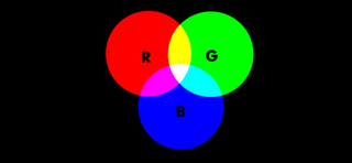
Additive colour is based on red, green, and blue - RGB for short
Additive colour works with anything that emits or radiates light. The mixture of different wavelengths of light creates different colours, and the more light you add, the brighter and lighter the colour becomes.
When using additive colour, we tend to consider the building block (primary) colours to be Red, Green, and Blue (RGB), and this is the basis for all colour you use on screen. In additive colour, white is the combination of colour, while black is the absence of colour.
02. Subtractive
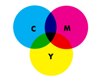
Subtractive colour is based on cyan, magenta, and yellow
Subtractive colour works on the basis of reflected light. Rather than pushing more light out, the way a particular pigment reflects different wavelengths of light determines its apparent colour to the human eye.
Subtractive colour, like additive, has three primary colours - Cyan, Magenta, and Yellow (CMY). In subtractive colour white is the absence of colour, while black is the combination of colour, but it’s an imperfect system.
The pigments we have available to use don't fully absorb light (preventing reflected colour wavelengths), so we have to add a fourth compensating pigment to account for this limitation.
We call this "Key", hence CMYK, but essentially it's black. Without this additional pigment, the closest to black we'd be able to render in print would be a muddy brown.
The colour wheel
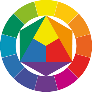
The modern colour wheel has been in use since the 18th century
In order to make it easier to see the relationship between different colours, the concept of the modern colour wheel was developed around the 18th century. These early wheels plotted the different primary colours around a circle, mixing different primary colours together in strict ratios to achieve secondary and tertiary colours.
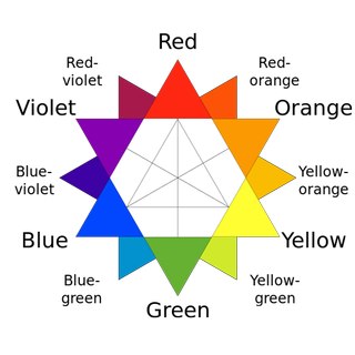
The three component parts that help us define a colour are hue, saturation and brightness
Yellow is yellow is yellow, right? Well, actually, no; there are many different colours we could refer to as yellow. Different shades or tints, saturations and hues are all possible while still being within the yellow part of the colour wheel. As a result, there are three primary component parts that help us define a colour:
01. Hue
This is the position on the colour wheel, and represents the base colour itself. This is typically referred to in degrees (around the colour wheel), so a yellow colour will appear between 50 and 60 degrees, with the perfect yellow appearing at 56 degrees. Green, meanwhile, appears at 120 degrees on the wheel at so on.
03. Brightness
Colour gamut
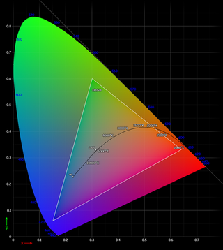
Colour gamut describes the range of potential colours a system can reproduce
Colour gamut is a way of describing the full range of potential colours a system can reproduce. It may surprise you to learn that the range of colours achievable in CMYK is different to that you can achieve with RGB.
This is partially because of the nature of the two different systems, but also (in the real world at least) as a consequence of limitations in our technology - screens aren’t always capable of producing the same range of colours as each other, and pigments reflect light at a non-uniform rate as you reduce their saturation.
Colour perception
Finally, it’s worth looking at how different colours can affect the way we perceive other colours. A typical illustration of this features a mid-grey tone placed over a light grey background, and the same mid-grey tone shown over a dark grey background.
The apparent brightness of the mid-grey is altered according to the context in which you see it - a trick of the eye, working to make sense of its surroundings. Hues works in the same way as tones when placed adjacent to other colours, allowing you to create different effects using the same palette of colours.
The apparent brightness of the mid-grey is altered according to the context in which you see it - a trick of the eye, working to make sense of its surroundings. Hues works in the same way as tones when placed adjacent to other colours, allowing you to create different effects using the same palette of colours.
Bad/Good logo rebrands
The logo is definitely the most important part of any brand. Its aim is to reveal the qualities of a product or of a society and to communicate what the company mission is.
Logos should not be too processed or intricate because they need to be effective and striking in order to evoke impressions in customers’ minds.
Logo creation is not easy and there are no perfect rules to create the best design. While creating a brand-image, there are many aspects to take into consideration, such as the kind of message that is going to be transmitted, the history of the society and the target audience.
Years after a logo is produced, some companies need to rebrand themselves or make changes in their trademark-images. Some of the reasons that lead people to this choice may be the extreme attempt to rise from an economic crisis or maybe the will to get a wider consumer base.
Just as logo creation is a difficult process, logo updates are not free of risks.
Sometimes, even brands with great logos make mistakes while trying to refresh them. Here, we will look at some cases of logo changes (of course we’ll look at positive and negative examples). We recommend you to read the Origami Inspired Logo Designs.
GAP – Bad Result
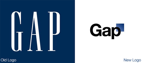
This entire situation was probably caused by the fact that Gap didn’t realize the fondness people had for the old logo, which was printed on t-shirts, shopping bags and other places. Thanks this example of a poor redesign, it is possible to realize that when modifying logos you don’t only have to follow the trends but must consider the possible effects of changes on your audience. Sometimes, drastic changes are not the best choices.
MASTERCARD – Bad Result
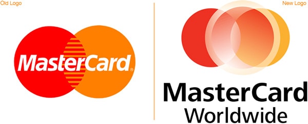
The new logo was certainly more modern, but it was characterized by too many colors which seemed faded. Mastercard recognized that the new picture was not impressive and decided not to use it. From this example, it is possible to understand that it’s not always painless to pass from a simple and plain logo to a more complex and processed one.
Most successful logo redesigns, such as those of Starbucks or KFC, were characterized by a transformation toward linearity and neatness. Sometimes, as Mies Van der Rohe said, “less is more.”
SPOTIFY – Good Result
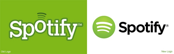
Let’s continue with an example of a good process of logo redesign with Spotify, a music streaming service.
The old logo seemed to be playful, not serious and it saw the presence of a sparkling font. Conversely, the new logo features the same colors and name but has a completely different style. It is more ordered and less vivacious, all the letters are aligned, and there isn’t any shadow effect. (This last point contributes to give a two-dimensional look.)
The changes were appreciated by Spotify users who happily accepted the new logo. One reason for this positive attitude, was that the company didn’t try to create a more complex brand-image, but it followed a process of simplification. Unnecessary elements were cut off and fewer details were inserted in the new image. .Another key point for the success was that Spotify undertook a process of logo redesign because it really needed it, and not just because they wanted to give a fashionable look to the company. In that period (and still today), their purpose was to expand their business and it was important for them to appear professional. From this example, you can see that a logo rebrand should not be the aim of some actions but it should be the mean to reach a particular target.
WENDY’S – Good Result
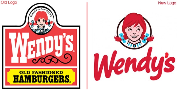
Let’s have a look at another example of positive changes for the logo of a famous fast food company, Wendy’s — the third largest fast food chain in the world.
After 29 years without even a small change, in 2012 Wendy’s decided to undergo a process of reinvention. The new logo didn’t reproduce a wild west style sign anymore but was still characterized by the presence of the freckled girl, Wendy, and company name.
The lack of the sign structure evokes feelings of freedom, while the use of a sans-serif font gives a more contemporary look to the brand. This last element was probably one of the main ideas which lead the process of rebranding. Wendy’s decided to change the logo and to modify all the product-packages, it wasn’t in a positive economic situation. The fast food chain tried to use graphic aspects to express a new fresh personality and boost sales. And, according to Wendy’s management, using the new logo corresponded to a reported increase ins sales.
The Wendy’s redesign shows that having a precise goal in mind is important to realize an effective process of rebranding.
sports clothing logos
Adidas — the trefoil logo is still used on the heritage product division
- strong & bold
- balanced design
- negative space
Asics
- typographic symbol
- curved type/logotype
Champion — originally designed in the early 70s by John Calleri
- flowing type
- hand drawn
- logotype
Diadora
- all caps-implys strength
- close kerning-creates tension
Ellesse
- the iconography intergrates with the logotype
- bold type creates a central point
Fila
- thick typography
- logotype
Head
- logotype and typography combination-works seperatly
- curved edges
K-Swiss
Lacoste
- symbol
- black and white variations but also colour
Lotto Sport Italia
- combined within a shape
- black/grey variations
Mitre
- part of the type has been transformed into an illustration
- curved type has been used in order to embed speed within the design
Mizuno
- difficult to read
- sharp edges
New Balance
- speed is implied by italics and N pattern
- logo accompanied by type
Nike — 1971 by Carolyn Davidson, modified in 1978 and 1985 by Nike
Prince
- tight kerning creates tension
- bold promotes strength
- italic promotes speed
Puma
- jumping puma shows athletes
- strong sturdy type
Rbk — designed in 2001 by Arnell Group
- difficult to read
- cross over symbol
Umbro — view the Umbro logo evolution
- strength
- usually resembled as seen above not separately
Wilson
- joined type promotes precision
- bold typography stands out
Themes found within sports logos:
- bold may express strength
- often a symbol is combined with type, these can be used together or singularly.
- italics may be used to suggest speed
- logos can often be stripped back to b&w
- all caps implies strength
- tight kerning can create tension
Subscribe to:
Posts (Atom)