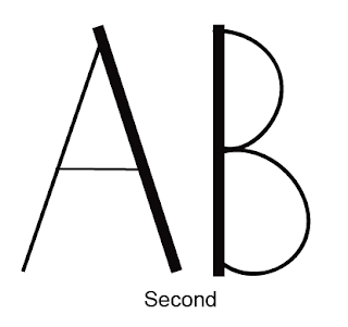
The typeface in which I decided to progress further in the design process with is the one depicted below. I decided upon this design due to it gaining the most positive feedback within the critique in relation to the word sharp, it was also my personal favourite beforehand as the design idea is minimalistic and not over complicated. The typeface also still looks very similar to that of Caslon, in order to develop my own bespoke typeface, I feel as if the design should appear more unique. For this reason I have decided to use a combination of two typefaces. I decided upon the combination of these two typefaces due to how different they are; one is a serif and the other san serif. I also much prefer the ‘A’ apex upon the second typeface, a component in which I included within my final approach.


No comments:
Post a Comment