Friday, 27 November 2015

Wayfinding

Colour, layout and typefaces are all factors that combine together to make a strong graphic design piece, and are some of the key areas I will focus upon during the wayfinding task. I specifically like how the above wayfind system is very simplistic, being built up from minimal symbols and solid typography. This design piece is also a good example of  how effective one colour design can be, when used correctly, as this design promotes strength, clarity and direction.


Both symbols and type have been used in combination to express a route clearly. The usage of pictograms makes the whole experience much more direct for the consumer, allowing them to quickly navigate a building rather than finding the location after viewing numerous amounts of text. This system also works extremely well when directed at children, as they are more likely to understand imagery.

This modern approach to signage expresses both clarity and strong design. The design itself is most likely to be allocated in an environment that primarily targets a younger audience, but could with slight design alterations be used in a much maturer environment.

Colour Psychology

BLUE. Intellectual.
Positive: Intelligence, communication, trust, efficiency, serenity, duty, logic, coolness, reflection, calm.
Negative: Coldness, aloofness, lack of emotion, unfriendliness.

YELLOW. Emotional
Positive: Optimism, confidence, self-esteem, extraversion, emotional strength, friendliness, creativity. 
Negative: Irrationality, fear, emotional fragility, depression, anxiety.

GREEN. Balance
Positive: Harmony, balance, refreshment, universal love, rest, restoration, reassurance, environmental awareness, equilibrium, peace. 
Negative: Boredom, stagnation, blandness, enervation.

ORANGE.
Positive: Physical comfort, food, warmth, security,  passion, abundance, fun. 
Negative: Deprivation, frustration, frivolity, immaturity.

PINK.
Positive: Physical tranquillity, nurture, warmth, femininity, love.
Negative: Inhibition, physical weakness.


Shape Physcology

Circle


Circles commonly represent unity, wholeness, and infinity. Without beginning or end, without sides or corners, the circle is also associated with the number one.
In some cases, there is a distinction between that which is contained within the circle and that which lies without.


Triangle


In Western society, the triangle most often has highly Christian meanings when used in a religious context. Because the Christian God is a trinity - Father, Son and Holy Ghost united in a single godhead – he is commonly represented by a triangle.
As a three-sided polygon, the triangle represents the number three, which is meaningful to many groups. As such, triangles and other symbols made of three parts may be used to present such concepts as past, present, and future or spirit, mind and body.
The orientation of a triangle can be important to it's meaning. For example, a point-up triangle might represent a strong foundation or stability, as it is rooted to the ground through a solid base.


Square


Squares are seen as particularly stable and orderly, standing for firm foundations both literal and metaphorical. There are very basic reasons why most building footprints are squares or rectangles: they are stable and encourage permanent structures.
The square can be seen as a symbol of civilization. In nature, things generally have rounded or uneven sides. Temporary structures are generally not square. Cities, however, are filled with buildings with square or rectangular footprints.

Pictogram Research

Using primarily one colour to identify pictograms allows for a minimal design which is easily approachable on various platforms. It also allows for the pictograms to appear much more identifiable as a set, therefore allowing them to be easily recognised by the consumer.


Picotgrams using colour are instantly more appealing to the consumer than basic one tone approaches. Although stating this,  the use of colour can make the design appear over complicated and difficult to comprehend, for this reason when developing my own picotgrams I feel that it would be more effective to stick to a minimum of 2 colours.
The general format of discovered pictograms would suggest simplistic line drawings which resemble a word in its least condensed format. The images are legible on multiple scales and work effectively on each, allowing for design work that is clear and visually impactive.


To allow for the designs to identifiable against busy wayfinding systems, they are often contained within a shape. This approach also works extremely well when using a two tonal system.


Out of all the pictograms I have discovered this design is by far my preferred. The simplistic imagery works well against the vivid background allowing it to be striking in appearance. The designs are also colour coded into specific categories, a component in which would help the consumer greatly.


The detail present within these pictograms is far too complex. The designs themselves are difficult to comprehend on a small scale therefore losing the designs concept. Thin lines also do not work well as they appear unbalanced within the design. I shall consider factors such as these when developing my own pictograms.

Wayfinding Research


The wayfinding system for Chester zoo is unique in the retrospect of illustration and typography. The thin typeface works well with the simplistic illustrations depicting the parks facilities. Although from a previous experience of visiting the park, the map is very difficult to navigate due to its complexity, although vast amounts of signage is put in place to resolve this problem.
Colour is an important factor for wayfinding systems as people often associate colours to certain aspects of a building. An good example of this is that in a multistory car park a colour is usually given to a set floor rather than a number. This makes the floor much more easy to identify.

A range of signage and maps is extremely important when creating the wayfinding system for a large complex. If the consumers are unaware where key aspects are they will be soon to leave. This is one of the main problems of a poor wayfinding system, as it can often loose the business valuable money.
Strong wayfinding systems usually consist of a varying components, of multiple scales. An example of this is that a map should be visually impactive, clear and legible on a large scale, but also contain these factors when rescaled to be placed upon a leaflet.

Thursday, 26 November 2015

Current way finding system


Liberty Park's current wayfinding system is very complex and visually boring. The map appears unclear due to the vast amount of detail present within the design. The grey and black colour scheme is hard to navigate and just adds an overall droll feeling towards the map. Due to these factors I feel that it would be appropriate to redesign the wayfinding system for Liberty Park. I also came to this conclusion as when moving in to liberty Park I personally found it hard to navigate around the complex. My aims for the following redesign, are to develop a fresh modern wayfinding system that follows a simplistic approach yet effectively targets 18-22 year olds.

Wayfinding Audience

As Liberty Park is a student accomidation it would be obviously sutuable to consider them the primary audience. Therefore when creating deisgn decisions for my wayfinding system I will be considering its impact upon young people aged 18-22, with a demographic profile of ABC1.


Wayfinding primary research

Trinity Leeds


When looking around Leeds for examples of wayfinding my first point of call was Trinity. I decided upon this location as hundreds of people circulate the building daily and therefore its wayfinding should be that of high quality.Trinitys wayfinding system uses strategies, these include: Digital maps, floor maps and directional signs.

Simplistic colour coded floor layouts display directions clearly. Individual stores are displayed along the right hand side of the maps and are given a specific number. These numbers are then referenced within the map, allowing for an more accessible wayfinding system. Although larger stores  and their logos are presented on the map to allow for an easy, direct viewing system.

The typeface used is a basic sans serif, and is consistent throughout all wayfinding components.


The Light

In comparison to the wayfinding system of Trinity, the Light is much more relaxed. Informal illustrations are used within a map format to co-inside with four different typefaces. The chosen typefaces are difficult to comprehend from a distance, and do not work well as a collective. The main body copy also appears very immature, something in which high end retailers, such as browns, who are located in the shopping complex would not support. I also feel that a stronger colour scheme should be used, as it is inconsistent.


City Centre:

The city centre wayfinding system is very similar to that of Trinity in correlation to colour and leading typefaces. This is mostly likely occured due to Trinity being one of the main shopping complexs of Leeds, and therefore when the citys rebranded their wayfinding system Trinity decided to follow a similar path. 

The system is colour coded, and focusing upon specific areas of the city depending upon location. Illustations have also been used to landmark the key iconography of Leeds, making it easier if you are not from familar with the city centre.


Primark Floor system:


A digital approach to a wayfinding system. This system compiles of a simplistic floor plan, consisting primarily of text and also an virtual map. The map is minimal, and unlike the trinity map specifc floors are not colour coded, something in which makes it more difficult to understand. The illustations used are also very childish and do not advertise the store to its whole protential.


Debehams:

In comparrison to the store size, Debenhams wayfinding system is very poor. No map is used, and it is primarily consisted from signage. The typeface is clear, and easily legible from a distance.


Tuesday, 24 November 2015

What is a book?

The Oxford dictoniary definition of a book is that of written or printed work consisting of pages glued or sewn together along one side and bound in covers. There are multiple ways in which to bind books including: contrast chain stitch, stab binding, case binding, spiral binding and comb binding. The binding method used often displays the nature of a book, an example of this being stab binding being used for organic projects.

The material used to create this book sugguests an releveance to nature, and an concern for the enivironment as the paper itself is most likely recycled. This would also coincide with the screen printed imagery and typography, which is less harsh than digital type. The structure of the book has also been developed to insure no glue is nessasary, this therefore sugguesting more environmental factors towards the product.


The grid system of the following book allows for a clear readable approach, a factor that is incredibly important, due to it's intended target audience of children. Visually impactive imagery alongside basic type allows for a clear yet bold outlook. Also fold out pages create a more intresting product that allows a younger audience to ingage freely with the book.


Friday, 13 November 2015

Final Evaluation

In my final analysis of the witty typeface I conclude that I effectively expressed the given adjective to a high level in which others could clearly perceive through typography. The typeface itself is constructed from a variation of stroke widths to present the
context of both light and dark humour. As the original typeface, Caslon, contained a vast contrast in stroke width I had to develop the overall thickness of the typeface, due to the remodelled serifs creating a structural unbalance. If I were to develop the typeface further I would definitely consider manipulating the width to exhibit the contrast in humour.

When evaluating the letterforms of Acutus, it is evident that some express sharpness much more effectively than others. A specific comparison is to that of the letterforms, ‘A’ and ‘J’. The ‘A’ clearly expresses humour and sharpness, whereas the ‘J’ appears very much one stroke width and lacks sharpness. I also feel that the ‘J’ looks very blunt compared to the other letterforms, due to its flat rather than pointed tail. I would definitely consider redesigning this character flaw if I could revisit this project.

When considering this typefaces relevance to its manifesto, I believe that it expresses the initial concepts displayed, and clearly resembles a sharp, witty atmosphere. The
typeface could also be expressed through many platforms, but may appear less sharp when used on a small scale, as the sharpness
present within the typeface is very minimal. Despite this the manifesto suggests that the typeface should be used primarily for logo design, therefore such factors are
insignificant.

When developing the type specimen, I decided to express the typeface by using the colours orange and purple. I decided upon the orange initially as it expresses energy something in which is a characteristic associated with being witty. I decided to combine the orange with a purple in order to display imagination, as witty people have a wide imagination to develop their concepts.

Final Critique

In the final critique of the corresponding typeface, I did not make my given adjective obvious to my peers, therefore asking them what word they perceived the typeface to exhibit. Words that were gained from this exercise included: sharp, humorous, intelligent, structure, and balance. Overall, I was enthusiastic about this response, as words such as sharp, humorous and intelligent are synonyms of the word witty. I was also specifically pleased that the sharp approach to the typeface was evidently displayed through the design.


Secondly, I inquired what format they believed the typeface should be displayed in. It was suggested that the typeface would work efficiently in both body text and large-scale mediums; the serifs direct your eyes though the type. Negatives being that the sharp aspect would be lost if displayed in small scale as the sharp intends are very minimal and therefore only evident in a larger scale.
Improvements towards the typeface were also discussed. I found that many comments involved creating a much more impactive expression of the word. A specific design idea made was to cut part of the letterforms off diagonally to create a sharp edge towards each letterform. I really liked this idea as I had not previously thought of the concept myself.

Overall, I found that the critiques for this studio brief were highly influential in the way I constructed my final design idea. I also felt that they specifically directed me on to certain paths that I would have not personally recognised myself.


Wednesday, 11 November 2015

Typeface development

After looking in depth at the selected typeface from the critique I decided that it didn't contain the element of sharpness in which I had pictured within the fist stages of the design process. Therefore I began to redevelop the typeface, looking at specifically sharpening the serifs.


Letterforms such as the 'L' looked inbalanced after I had manipulate the serifs, so I therefore manipulated the stroke width to create a much more balanced typeface.


I specifically struggled when creating the 'E' for Acutus, as I found it hard to extinguish between sharpness and density. I manipulated stroke width, serifs and the cross bar to add a sharpend atmosphere towards the letterform, something in which I felt my inital design lacked.


I began a similar process with the rest of the typeface, focusing primarily on creating pointed edges wherever possible. Again in some circumstaces I had to develop a larger stroke width to balance the text.

Typeface development

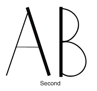
The typeface in which I decided to progress further in the design process with is the one depicted below. I decided upon this design due to it gaining the most positive feedback within the critique in relation to the word sharp, it was also my personal favourite beforehand as the design idea is minimalistic and not over complicated. The typeface also still looks very similar to that of Caslon, in order to develop my own bespoke typeface, I feel as if the design should appear more unique. For this reason I have decided to use a combination of two typefaces. I decided upon the combination of these two typefaces due to how different they are; one is a serif and the other san serif. I also much prefer the ‘A’ apex upon the second typeface, a component in which I included within my final approach.


Friday, 6 November 2015

2nd typeface crit

During the supporting critique I looked closely at the work of others and how their designs had developed from the previous week. I found this really useful; I was able to discover their personal design process and envisage where mine was lacking.
I put forward my initial C.A.D. designs and gathered a variation of feedback. Common trends that occurred were the dismissal of the typefaces involving colour, as they were not seen to display my adjective. Comments also suggested that the chosen colour themes did not resemble the word witty, as a deeper colour should be used to display its association with intelligence. I specifically gained positive comments surrounding the 'A to I' typeface, although it was suggested to focus further on manipulating the serifs creating a razor-sharp effect. Another typeface that I generally gained positive feedback for was the one in which involved negative space. Although I liked this design concept, I just didn’t feel that it presented the angular typeface in which I initially visualised during the initial critique. Concluding from the suggestions made at this critique, I decided to merge two of the strongest design concepts to allow for a visually powerful typeface.  

individual designs and connotations

 The atmosphere created by this text is very heavy and although it strongly resembles the context of light and dark humour, the sharp points get emerged within the thick strokes, loosing the overall representation of witty.
 A minimalist approach to Caslon, this typeface appears weak rather than sharp. By adding serifs to an already thin type, the impact of the typography is lost.
 I created this typeface by gathering inspiration from the negative spaced used with Caslon. The thin lines resemble sharp edges, a similar concept to which was derived within the origami typeface that I initially researched.
 When developing this letterform, I specifically focused upon the apex. Although I enjoy this typeface, I feel it is too similar to that of Caslon, and doesn’t display my design skills.
 Following the design concept to the left, I felt that by adding colour to the typeface it might allow for a more constructed text that appears visually pleasing. Although more impressionable than the original, this typeface does not possess the characteristics in which I wanted exhibit.
I specifically like the way in which the apex of the ‘A’ was altered in this typeface compared to Caslon. The overall atmosphere captures both sharp, and light and dark humour.