The first concept was that of a university inspired range. The range focuses upon stationary and explores a 'quick note to say' feel. Multiple approaches were developed for this range with some feeling more relevant than the others. The triangle approach felt somewhat dangerous with its sharp edges and neglected the friendly atmosphere in which this range attempts to express. As a result of this rectangular/oval approaches were explored. It was decided that a rectangular approach would be the most appropriate as they maintain the same structure as the cards and thus continuity was developed.
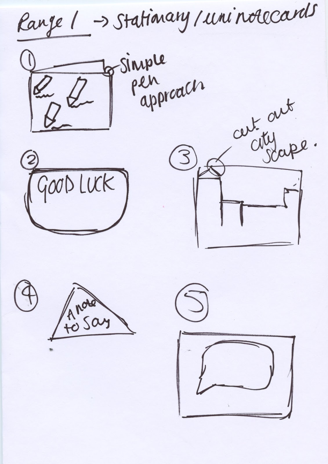
In terms of physical design typographic approaches were again explored although my peers suggested that this did not fit with the overarching theme. As a result of this illustration approaches were expressed in which would focus purely upon the 'cut and paste' method. Cityscapes, pen illustrations and speech bubbles were all explored in terms of iconography, with the speech bubble being commended. When discussing this with my peers it was suggested that a theme in which expressed 'something to say' may appear effective. Suggestions included speech bubbles, thought bubbles, pens drawing, and paper planes.

The second approach was that of 'flower power'. Using key iconography a flower based range would be developed in which explored a variety of flowers. Although I like this idea I was unsure upon whether this would lead some of the original cards feeling isolated in which did not follow a botanical route. When discussing this further with peers they suggested that the notecards may contain flowers but some other forms of iconography should be included in order to form a balance.
The third approach mimics that of the cards with the same key imagery being used just within a different format. Although this would keep consistency I do not believe that it would engage the judges as it appears 'lazy'. It also would mean commercially that the consumers would probably just buy the individual cards rather than commit to a set.
From completing this exercise it has been decided that a 'note to say' theme will be expressed throughout the notecards, although no typography should be used.
No comments:
Post a Comment