Saturday 25 March 2017

Charity advertisement-shock tactics

Charity advertisement-shock tactics 


In the minds of a significant number of respondents aid organisations are positioned as manipulative and self serving. As Cohen (2001) and Van Dijk (1992) would have predicted, the respondents are moving their focus from a moral to a consumerist discourse so as to justify their skepticism as a way to avoid being taken advantage of. Arguably, in this case audience’s moral passivity is not directed towards the sufferers and their situation, but instead it constitutes a practice of power which enables the ‘savvy’ media consumer to evaluate and critique both the advertisement and the trustworthiness of the messenger. The third-less common-way to create distance is to become numb to images of distant sufferers (both happy and sad). As described in the literature review, and as was expected, this reaction is more commonly observed among male respondents. 


‘I cannot engage in it any more…the same stereotypical images again, and again, and again…At first I have to admit these images really moved me, but not anymore.’ (Vlad)

 ‘I think that I am kind of desensitised now…whenever I see these images I change the channel...I see no point in keep seeing these images since I know nothing substantial about these people and their story…it’s just the images but no real background.’ (George)

 ‘I’m tired of the stereotypical images used in these ads…I definitely feel sorry about these people but the image of a crying kid no longer touches me.’(Christopher)


These findings indicate that pity and compassion for the distant sufferers can decrease over time. The endless number of sufferers, the difficulty of releasing the victims’ situation and the incapacity of these campaigns to offer a more detailed background, appear to make the audience less interested or even immune. As Downs (1972) described: even the most powerful images lose their power over the hearts of the people if continuously repeated.

Summary 

From completing this research it is evident that shock advertising in charities is no longer effective. With millennials growing up in a world whereby TV charity based marketing focuses directly upon shocking the audience, little or no contribution is made by the audience in this manner. As a result of this the brand must promote a less guilt tripping campaign.  

Tuesday 14 March 2017

Sets (0.1)

As there are multiple elements to be contained within the sets I felt it important to complete some research into stationary collections. 


Picnic range 


 Within this range consistency has been gained through the stock, colour palette and usage of flowers. The same iconography is expressed within multiple sections of the collection in order to allow the pieces to be seen as a set. One factor in which I personally feel is ineffective within this range is that of the 'graph paper' notecards as I do not believe this stock reflects the rest of the collection. As a result of this it is important that when selecting stock for my collection a consistent theme should be expressed.


Primatey


As a collection I believe that there are certain components that do not appear effective. The pastel colour palette and button approach within the cards design do not reflect he bold colours and illustration style of the rest of the set and thus the set feels very separate. 


Mora Flora 


The same illustrative style has been used throughout the collection in order to express strong levels of continuity. The same pattern is frequently repeated, a factor in which currently lacks within my design and thus this may be an area to improve. Two typefaces are used throughout the range, a factor in which I must consider if further type is incorporated.


Notecard development

Pencil notecard 


As I wanted to maintain a young free feel, pencil illustrations were developed. These were completed in order to showcases the different ways in which a pencil may be depicted. Being 'ultra' feminine the set attempts to market women from all cultures with the notecards playing a vital role. The notecard set is specifically for individuals who attempt university, with stationary being expressed in order to show this. Embodying the idea that no matter what your religions/cultural beliefs are, every women has the right to an education. 


Initial sketches highlighted different ways in which the illustration may be drawn. As the target audience is 18-25 year olds I felt it important to select the more detailed design, in turn showcasing maturity. Although the set is to be developed for that of 18-25 year olds I wanted to express a set in which feels young, and light in design terms therefore allowing the design to be used in many circumstances. 


The pencil ink drawing was scanned in and manipulated using Photoshop in order to express a pink hue. The pencil was then placed alone upon a pink background, with the pink again expressing a connection to the previous cards as well as expressing the concept of femininity within education.  


Composition was widely explored in order to gather a strong, visual outcome. The idea of the pencil writing was tested although this felt somewhat immature and thus would not appeal to that of a 25 year old. When comparing the design to that of the card set it was evident that a similar nature was not expressed. When looking closely at what ties the cards together as a set it was evident that the 'repeat pattern' nature allowed for continuity. As a result of this it was decided to explore a repeat pattern effect. 


Colour was then explored in order to formulate a range. As the deadline was fast approaching and I was yet to complete the other mandatories I felt that doing this would allow for further exploration throughout the range. When discussing this with my peers they suggested that I should develop other design ideas as otherwise that limits me largely within the competition.


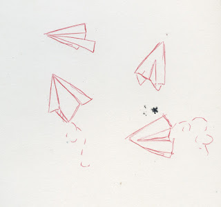
Paper planes 

The concept of paper planes were selected in order to formulate a design in which showed fun within education. 


Simple structures were explored with in order to gain a strong illustration. 'Flight marks' were also explored with in order to dictate movement, this was a design element in which I felt lifted the design and made it appear contextually stronger. It was decided that the slimmer designs felt more elegant and would be positioned within the set more effectively. 


Again composition was explored with one of the illustrations feeling out of place and thus it was decided that the pattern approach should be again completed. 


Movement within the design was expressed with planes being situated within different positions. Although this made for a more visually engaging piece, it did not comply to the patterns expressed upon the cards/other notecard and thus it was decided that a more traditional format should be explored. 


As throughout the set movement has been expressed ( a key example of this being the movement of the balloons), it was dceided that the planes did not have to follow a strict side by side format. When completing the pattern large limitations were drawn as I could not repeat the pattern as I could previously but rather had to develop the pattern by hand. 


Colours were again largely explored, taking into consideration of the cards. As planes are most often depicted within the sky it is fair to suggest that the consumer is more likely to feel a connection towards a design in which mimics familiarity. As a result of this the turquoise blue was selected. 


As time was quickly running out the same illustration was used but without the 'flight marks' in order to complete a new piece. The regimented format in which was expressed within previous cards was used in order to appear different from the first design as well as expressing contiuenty with the set. Colours were widely explored in order to gain a strong outlook. The green was chosen as it had not previously been used within the notecard aspect of the set.


Clouds/speech bubble

Thought clouds/speech bubbles were explored with in order to express the concept of 'getting your ideas out there', highlighting that young women can make a change. 


The thought bubble ink drawing was explored with in terms of size and colour although I felt that the large negative space apparent within the design felt somewhat distracting and took away the impact of the design. As a result of this it was decided to move on from this design. If i had more time I would have liked to have pushed the design further 


From my initial drawings a speech bubble in which contained further details was selected. Again a one approach was explored, with this feeling unengaging. 


The text bubble was then enlarged in order to attempt to resolve this. Gain I personally felt that the design appeared distant. 


Further speech bubbles were added to the design but compared to that of the pencil illustration the pattern appeared week. Due to the large intensity of the pencil notecard I felt it important that more speech bubbles were included within a regimented format. 


Once more bubbles were added to the composition the design began to feel far more fitting to the set. As purple had not been previously used within the notecard set it was included, in turn relating further to the cards. Purple is also associated with mystical thoughts and thus I felt this suiting.


Hearts 


As an extra a heart design was quickly formulated. Due to the illustration style not suiting that of the previous designs, it was discontinued. The details present within the heart were far too complex to be expressed upon a small scale.

Monday 13 March 2017

Notecard iconography


A list of key iconography in which may be used was outlined within a mindmap. A vast amount of visual ideas were recorded in order to develop a broad spectrum. Envelopes, stationary, British teacups and balloons were all highlighted as paths in which I may wish to follow. As the notecards have to be maintained within one set it is pertinent that all the design iconography links. As a result of this the key ideas were separated into groups. These are listed below. 

  • Teacup, kettle, teapot and cutlery. 
  • Balloons, streamers, cake, banner
  • Speech bubbles, thought bubbles, stationary and paper planes, post it notes 
  • Waving hands, fingers crossed
Once listed within specific groups it became evident which groups appeared strongest in nature. With set 2/3 appearing the most relevant to the project. Idea 2 felt somewhat 'tied' to a birthday theme and thus I asked my peers what they thought. They suggested that the usage of cakes/banners lead the design towards a birthday theme and that this must be changed if I wanted to broaden the usage of the notes. 

The 3rd idea felt far less restrictive with multiple usages of iconography being listed. The 3rd theme also specifically relates to the work hard youth in which is the intended consumer of this product. As a result of this the 'Speech bubbles, thought bubbles, stationary and paper planes, post it notes' theme was selected. 


Initially rough sketches were developed in order to outline some specific ways in which the designs may be formulated. Structure was key when developing these ideas as when completing the designs using ink the process can often become messy and feel 'unstructured'.


 Iconography was explored widely with ink. Green was used as the base colour as this can be easily manipulated using CAD. Multiple approaches of the same piece of iconography were developed in order to explore the design fully. This allowed myself to select the designs in which I felt most appropriate. A key example of this was that a variety of shapes were explored with in order to formulate the speech bubble. This was to allow for a design in which felt friendly yet focused upon the cards structure. The oval design was selected as this felt far more friendly than the square, and felt more imbalance than the circle.


Notecard design

As the structure of the 'box' has now been developed it was decided that an exploration of ideas should be produced in which showcase the notecards in different ways. From this the below sketches were developed.


The first concept was that of a university inspired range. The range focuses upon stationary and explores a 'quick note to say' feel. Multiple approaches were developed for this range with some feeling more relevant than the others. The triangle approach felt somewhat dangerous with its sharp edges and neglected the friendly atmosphere in which this range attempts to express. As a result of this rectangular/oval approaches were explored. It was decided that a rectangular approach would be the most appropriate as they maintain the same structure as the cards and thus continuity was developed. 

In terms of physical design typographic approaches were again explored although my peers suggested that this did not fit with the overarching theme. As a result of this illustration approaches were expressed in which would focus purely upon the 'cut and paste' method. Cityscapes, pen illustrations and speech bubbles were all explored in terms of iconography, with the speech bubble being commended. When discussing this with my peers it was suggested that a theme in which expressed 'something to say' may appear effective. Suggestions included speech bubbles, thought bubbles, pens drawing, and paper planes. 


The second approach was that of 'flower power'. Using key iconography a flower based range would be developed in which explored a variety of flowers. Although I like this idea I was unsure upon whether this would lead some of the original cards feeling isolated in which did not follow a botanical route. When discussing this further with peers they suggested that the notecards may contain flowers but some other forms of iconography should be included in order to form a balance. 

The third approach mimics that of the cards with the same key imagery being used just within a different format. Although this would keep consistency I do not believe that it would engage the judges as it appears 'lazy'. It also would mean commercially that the consumers would probably just buy the individual cards rather than commit to a set. 


From completing this exercise it has been decided that a 'note to say' theme will be expressed throughout the notecards, although no typography should be used.

Initial ideas


The general structure of the notecards was firstly explored in order to gain a greater stance upon how the notecards themselves will be positioned within the set. A strong analysis was conducted upon the pros and cons of each mechanism, focusing upon the environment, durability and general aesthetic. From completing this activity it became evident that certain mechanisms were not suitable, and would not entice the audience to buy the product. First of all the slip attempt did not enclose the notecards and thus I believe that I would not get the same credit from the judges. The greyboard approach would not be suitable as I pride myself on being an environmental designer, and I believe this design to be environmentally harmful. Plastics were also removed from any packaging in relation to environmental issues. As a result of this I believe that the envelope approach would be most effective as it safety stores the product, is environmentally friendly and would appeal to a young audience. 


From the original exercise further drawings were developed in which showcase the workings of the envelope. Measurements were considered alongside the measurements of the notecards. It was also highlighted that if envelopes for the notecards are involved the sizing of the design must be accurate in order to allow mass products to be contained within the larger envelope. 


Notecard research


Generic box approach
The box approach is highly common approach within notecard sets as it allows the cards to be stored in a safe, pristine manor. The box itself may be used for storage once the set is complete, or it may even be thrown away. This is the limiting factor as being developed from grey board this design would be difficult to recycle.  


Individual notecards 
This notecard set follows a plastic wrap approach in order to reduce scuffing. As the envelope is the bigger counterpart within the product it is fair to suggest that a 80gsm paper would bend easily, in turn forcing the product to appear cheap upon the shop shelves. As the set must also be contained within one 'box' this approach would not work for my product. 


Simple lift lid approach 
This approach follows that of a basic box and lid format. Simple in design this box is less likely to be used as storage than the first design viewed, although this depends upon the consumer themselves. 


Simple yet impactive. This design follows that of an envelope format ensuring that mass space is not taken up for the storage of the notecards. The sheer aspect of the envelope allows for an engaging yet classic approach. A juxtaposition is also developed as the bold colours largely contrast the 'blank design'. 


Hidden box
This box design does not express the notecards format within its design and thus the consumer has to rely largely upon the packaging. As you can see from the notecards themselves they mimic that of the box and thus continuity is contained. 


Plastic lid box approach 
This approach allows the consumer to visualise the design of the cards before purchase, thus engaging the consumers attention. Although this is apparent it is important to recognise that Plastic waste is incredibly bad for the environment and thus an alternative should be suggested. 


Simple slip 
This slip design is effective and keeping the designs together as well as showcasing the designs to the consumer. Limitations of this design include the cards getting easily damaged. 


Again a box approach has been developed although this time different section shave been applied. This not only makes the set more engaging but it also may pursued the consumer to buy the product as they feel they are 'getting more for their money'.


This lift lid approach would be effective at storing objects afterwards as no aspect of the box can be lost.